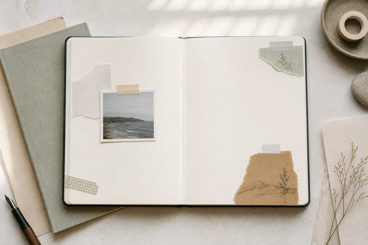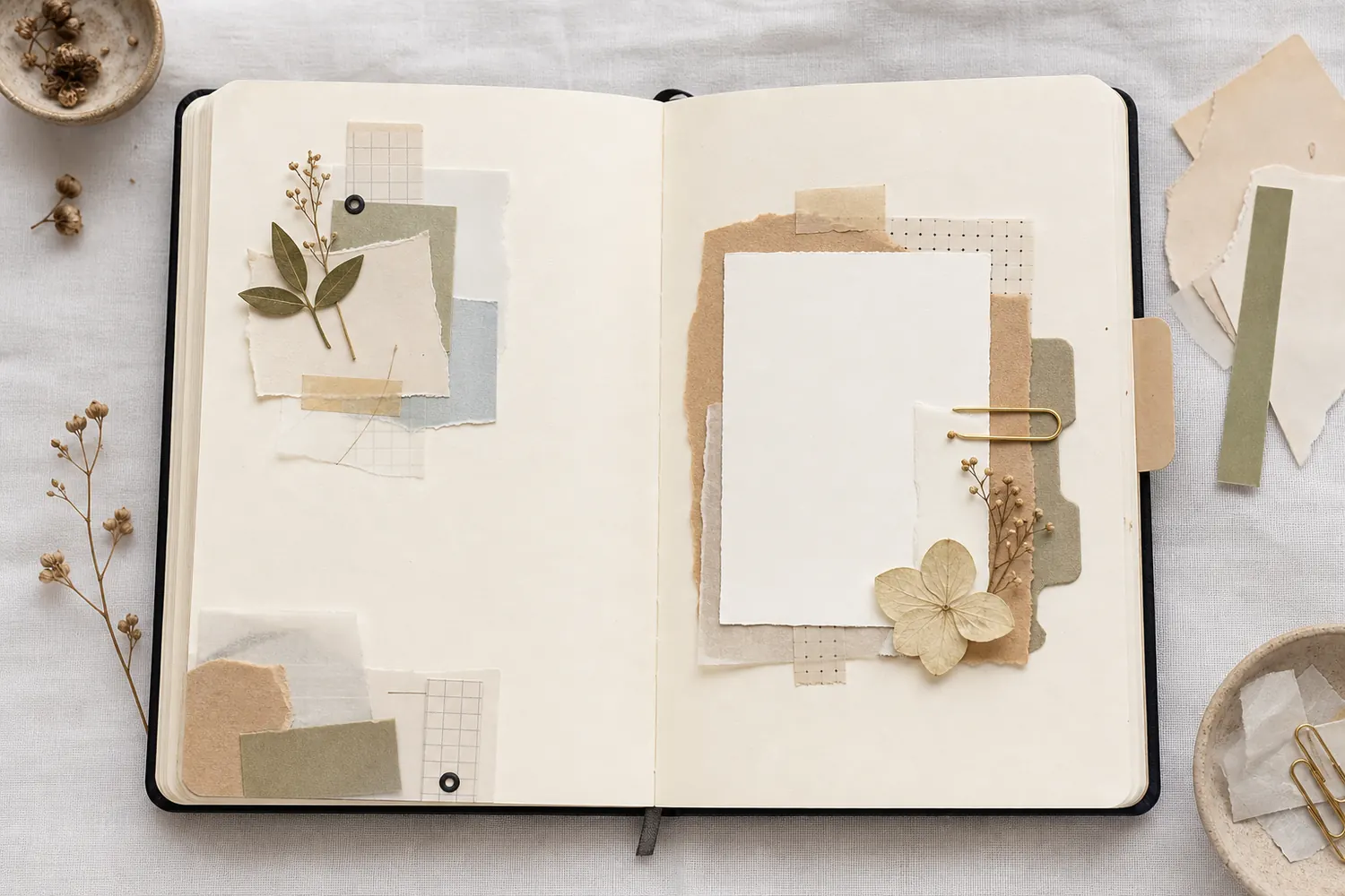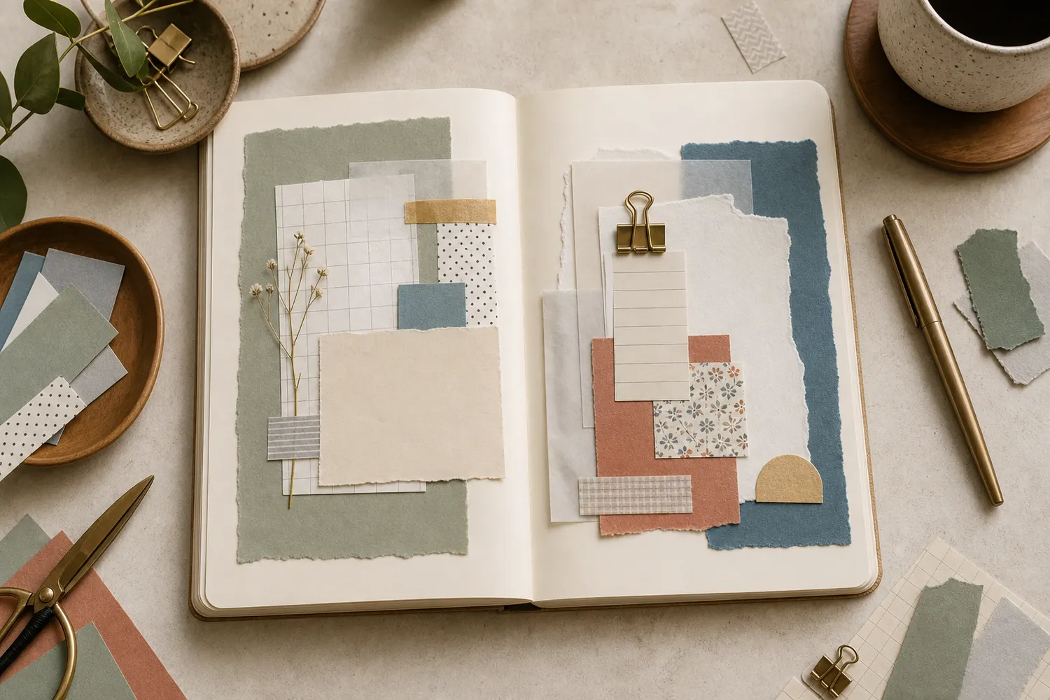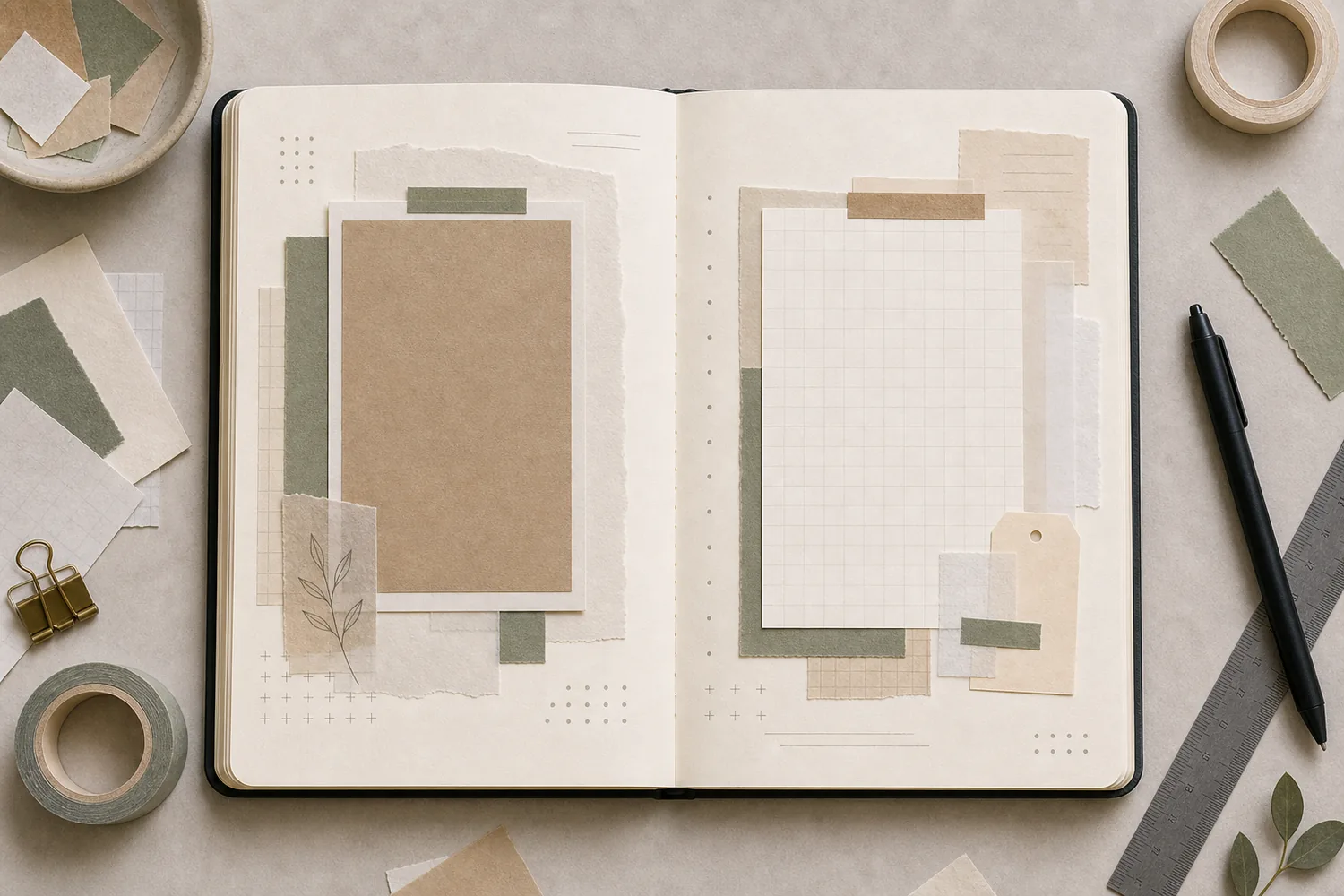
Gather a few things See what you’ll need
- An almost-finished spread or loose arrangement
- A pen or pencil
- A few scraps already used on the page
- Optional: scissors and adhesive
Choose an exercise 4 things to try as you read
Look for something you already want to keep
Look beside the main memory for a detail worth repeating: the shape of the café cup, a leaf from the walk, or the torn edge of a saved scrap. Starting with something already connected to the entry keeps the new marks from becoming a separate decoration project.
Keep your main photograph, note, or title in place while you try the repeats. That piece still needs to remain easy to find. If you haven’t decided what the spread is keeping yet, write a sentence about the memory first. It’s much easier to connect the pages once you know what connects their contents.
ONE WORKED EXAMPLE
A leaf returns beside the dinner note
Your dinner spread has a green paper leaf beside a photo on the left and a handwritten memory on the right. The pages feel separate, and you want one gentle connection.
Before
Several new motifs have been added to make the pages match, but the unrelated blue tape now catches attention before the photograph.
After
A smaller drawn leaf sits beside the note. The blue tape is covered during the trial, and the upper-right margin stays plain. A tiny date accent is left out because the two leaves already establish a clear return.
What changed—and what to check
The repeated shape links the content with fewer competing marks. Testing the third accent by omission makes its usefulness easier to judge.
Try this check. Cover each repeat in turn and check which version leaves the clearest route from photograph to written memory.
Something for a future page?
The Washi Tape ShopAffiliate links: we may earn a commission if you buy through these links.
Bring it back in a different size
Try the clearest version of your chosen detail near the main photo or writing. Put a smaller version on the other page, then see whether a tiny one beside the date helps. For a leaf, that could mean one paper leaf, a smaller pen drawing, and a little curved mark near a caption.
Try changing one quality at a time: make the return smaller, lighter, or drawn instead of cut from paper. A circle and a round label can feel related without matching exactly. If the third repeat makes the pattern too obvious, remove it and compare the two-mark version before inventing another motif.
Compare the optionsKeep the return recognizable without making copies
Keep the return recognizable without making copies
Choose one way for the same paper detail to return beside the story.
Read the words in this example
- photo
- place
- story
- date
A broad label returns as a smaller label.
Keep the main label beside the photograph, then use a smaller related shape near the note. The two labels can hold different information. Their shared outline supplies familiarity while their unequal size keeps them from becoming equal focal points.
Let a color cross the center fold
Find a color that’s already doing something useful on one page and try a small amount of it on the other. A muted green tab beside the photo might return as a short green underline below the date. The materials can differ; related shades often feel more natural than an exact match everywhere.
If choosing colors is part of the problem, keep one main color, a quieter neighboring color, a very small contrasting accent, and a neutral paper tone. You don’t need to use every category. Watch a bright accent carefully: if it pulls attention away from the memory, make it smaller or leave it for another page.
See the differenceCarry the useful color across the fold
Carry the useful color across the fold
Switch one unrelated accent for a smaller return of the existing blue.
Read the words in this example
Separate accents
- photo
- story
Separate accents
The wine accent is a separate strong color event. It may be enjoyable, but it is not repeating the blue that already accompanies the photograph.
GO A LITTLE FURTHERMove the repeats when the spread feels stiff
Move the repeats when the spread feels stiff
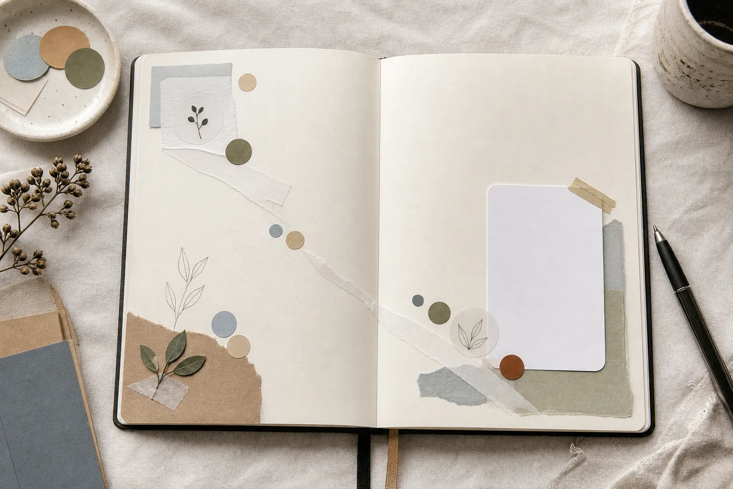
Imagine a loose diagonal from the upper left toward the lower right, or the other way around. Move your main detail, smaller repeat, and tiniest mark roughly along that direction. Keep gaps between them. The relationship can suggest movement without a solid stripe crossing the spread.
Paper strips are another way to try it. A published scrapbook example used strips about 4 cm wide, with longer pieces near the center and shorter ones beside them. In a smaller journal, narrow the strips to suit the page and keep open paper between them. Don’t carry important words or tiny faces into the gutter just to continue a diagonal.
Try a what-ifThe diagonal crosses an important face
The diagonal crosses an important face
Keep the composition around the memory it is meant to support.
Your three loose repeated shapes make a pleasing diagonal, but the middle one covers a face in the photograph. You want that face visible.
Compare the three choices
What should move first?
- Move the middle repeat away from the face while keeping a loose relationship.
The diagonal can bend or become less exact. Preserving the important photo detail serves the spread’s purpose.
- Crop the photograph until the face no longer interrupts the diagonal.
That would remove the detail you said you wanted to keep, just to preserve the decorative arrangement.
- Add another bright repeat beside the face to balance the covered area.
It adds attention near the problem but does not reveal the detail underneath.
A useful visual route can change direction to keep important content visible.
What would you try?
Choose an option to see what it would do. You can explore all three.
Let one margin stay mostly plain
Once the two sides begin to connect, look at the calmest area and resist filling it immediately. A wide margin, a plain writing card, or a quiet corner gives you room to see the other details. It doesn’t have to be white; pale pattern or softly colored paper can work too.
A heavily layered center often benefits from a broader clear edge. If the open area looks accidental, a date or a small aligned edge can give it a little definition. Try covering the calm patch with your hand. If the spread suddenly feels crowded, that space was helping more than you thought.
Compare the optionsChoose what the quiet area needs
Choose what the quiet area needs
Try each small edit and watch how much open page survives.
Read the words in this example
- photo
- story
Let it remain an open margin.
Read the photo and story before changing the empty corner. If the surrounding details are already easy to follow, the blank area may be supplying the pause the spread needs. Give the page another look with that space deliberately left alone.
Return to the spread and change only what it needs
On the dinner spread, keep the green leaf near the photo. Add a smaller drawn leaf beside the note and a tiny repeat near the date. Try a short green underline on the right, then temporarily cover the unrelated blue tape. If the pages feel more connected without it, let it go.
Now gather the writing into one comfortable block and leave the upper-right margin open. Step back and read the spread normally. Can you find the photo, move to the note, and notice the little repeated detail without being distracted by it? Then you can stop.
Use a loose scrap to cover one repeat, then the next. Keep the version that lets you travel from the photo to the note most easily. If you only have a pencil, the same trial works with a repeated curve or bracket; you can make the decision before adding permanent ink.
Where this idea began
This guide adapts visual rhythm, repetition, movement, scrapbook layout, diagonal-flow, and white-space principles into a beginner-friendly journal spread routine.
Want to explore the techniques a little further? Here are the maker tutorials and references behind this guide.
- Design principleLibreTexts: Principles of Design - Rhythm and Pattern
An introductory art reference explains rhythm and pattern; the journal routine is an adaptation.
- Design principleSmashing Magazine: Compositional Flow and Rhythm
Compositional flow and rhythm inform the order in which accents draw the eye.
- Design principleGet It Scrapped: Scrapbook Layout Design
A broad scrapbook-layout reference; each guide’s exact arrangement is an editorial adaptation.
- Design principleMosaic Moments: Scrapbook Page Design Principles
Scrapbook page-design guidance provides general composition principles.
- Design principleMosaic Moments: Design Principle 8, Repetition
Repetition in scrapbook pages informs recurring colors, shapes, or small accents across a spread.
- Design principleNielsen Norman Group: Visual Design Principles
Digital visual-design principles are adapted to paper; exact arrangements are editorial choices.
- Maker exampleEva Pizarro / Pinkfresh Studio: Diagonal paper strips with intentional open space
Eva Pizarro’s diagonal paper-strip layout supplies a named example with intentional open space.
- Design principleGetty Museum: Principles of Design
A museum education reference supplies general visual design principles.