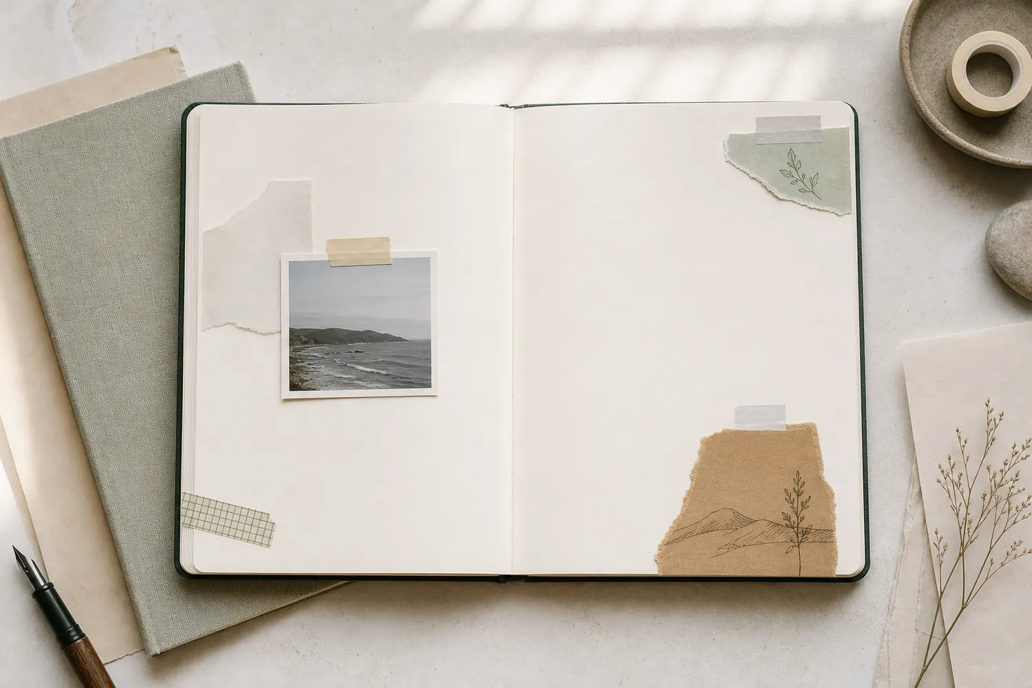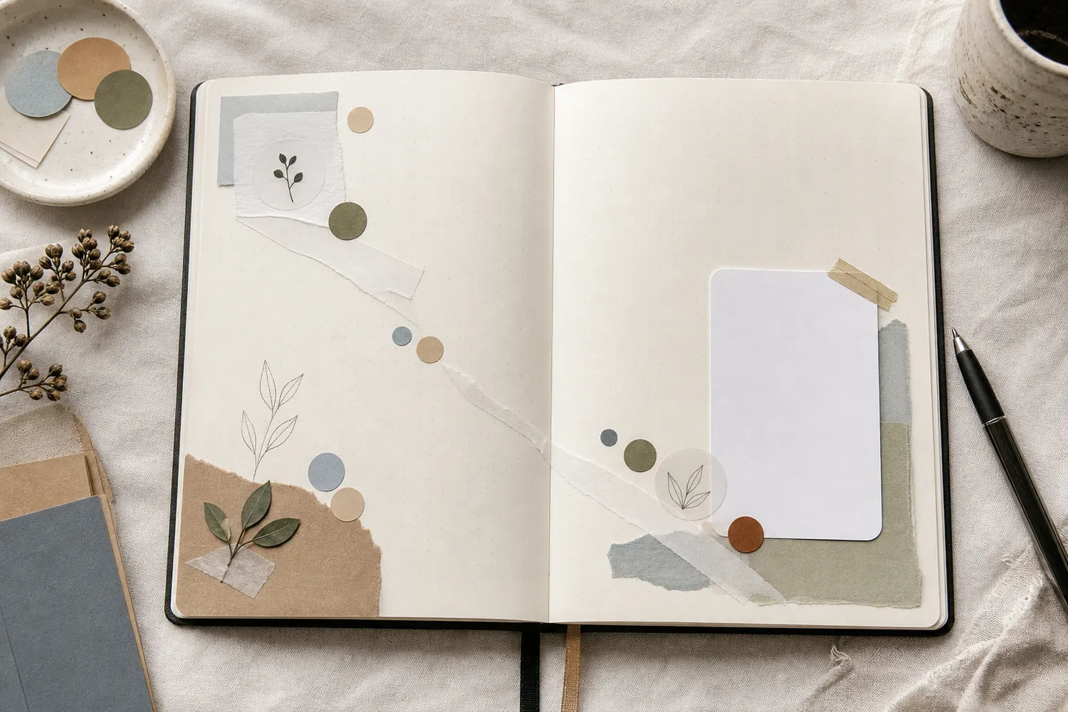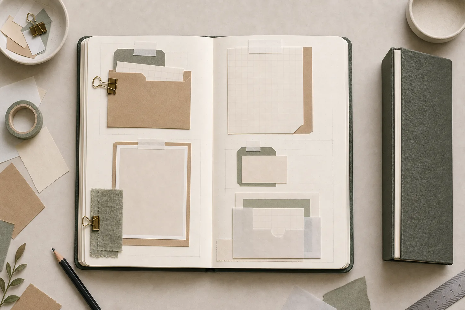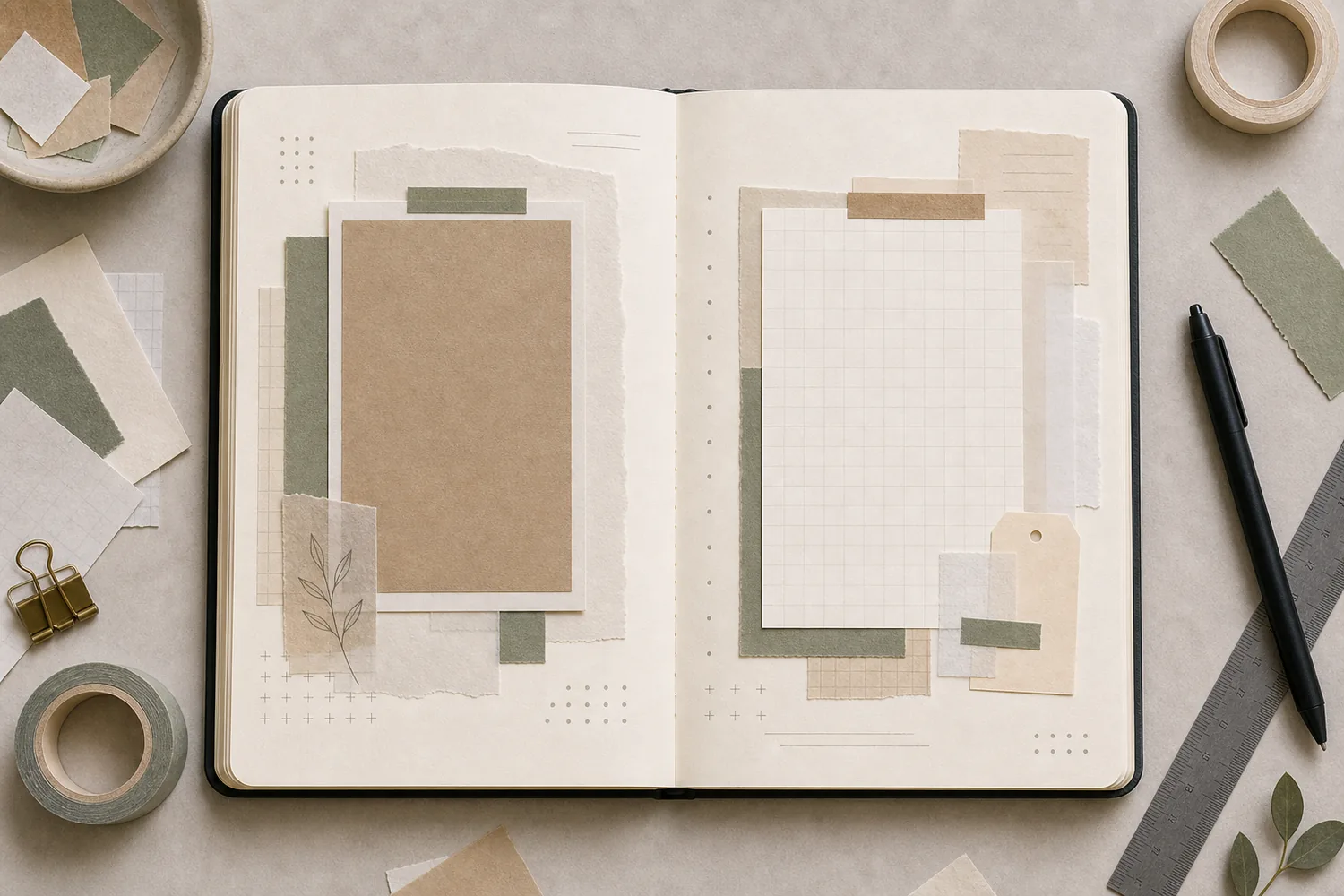
Gather a few things See what you’ll need
- Your journal
- A photo or main paper piece
- A writing card
- A few matching paper scraps
- A pencil
- Glue
Choose an exercise 4 things to try as you read
Let the journal open the way it naturally opens
Let the book rest open with your hands off the covers. Slide a narrow scrap toward the center and notice where it begins to dip from view or becomes awkward to touch. Bring it back onto flatter paper. That little trial shows where an important face or word would be hard to enjoy in this particular spread.
The width will vary between books and even between pages in one book. Keep faces, small lettering, the date, and the part of a tab you need to grab outside that curved area. If you have to hold the book down to see something important, move it a little farther out.
See the differenceKeep the important detail on the flatter page
Keep the important detail on the flatter page
Switch the detail marker from the inner edge to a position farther out.
Read the words in this example
Near the inner edge
- photo
- story
Near the inner edge
The dot represents a face, date, or other detail you want to see. Near the inner edge, it may become difficult to read as the real book curves.
ONE WORKED EXAMPLE
The lake can cross the fold; the face should not
You have a wide photograph from a lakeside walk and six lines about the afternoon. The journal rests partly open, with a curved center that hides a narrow strip.
Before
The first arrangement centers your friend’s face across the binding. It looks complete only while you press the two pages flat with both hands.
After
The photo moves onto the flatter left page, keeping the face visible. A writing card sits on the right with its top aligned to the photograph. Small blue scraps repeat the lake color on both sides; the center stays free.
What changed—and what to check
The aligned edges and returning color connect the pages while the important detail stays readable in the book’s natural shape.
Try this check. Release the covers and find the face, date, and first sentence without pressing the journal flat.
Something for a future page?
The Washi Tape ShopAffiliate links: we may earn a commission if you buy through these links.
Choose one wide scene or two companion pages
If your journal opens comfortably, you can arrange a scene across both pages. Let a low-detail area approach the fold: water, sky, background pattern, or a pale strip. Keep the subject you care about on a flatter area to either side.
For a firmer binding, try a photo page beside a writing page. Or let one page show the walk and the other hold the café receipt from afterward. They don’t need to form one continuous image to feel connected. Different jobs can make the spread easier to use.
Compare the optionsChoose the relationship your notebook can show
Choose the relationship your notebook can show
Compare three ways to give two pages related contents.
Read the words in this example
- scene
- scene
- caption
Keep the important subject to one side.
Use low-detail background near the fold and keep the subject on a flatter part of the page. The two blue panels stand for a scene continuing across a gap, not a sheet glued across the binding. Check the actual image with your hands off the covers.
Repeat something small on both pages
Choose one thing to carry across the pair: the same blue paper, a little label shape, a pencil line, or a repeated leaf drawing. Use it on each page where it makes sense. You can repeat a color in different amounts, such as a large mat on one side and a narrow strip on the other.
Try lining up the tops of the photo and writing card across the open book. Or draw a line at the same height on each page, stopping before the curved center. Your eye can continue the connection across that gap. A strip glued across the binding is not needed to make the pages belong together.
See the differenceConnect aligned edges across an empty gutter
Connect aligned edges across an empty gutter
Switch from unrelated card heights to one shared top line.
Read the words in this example
Separate starts
- photo
- story
Separate starts
Different starting heights are a valid choice, but here they provide little structural connection between the two main blocks.
Let one side be calmer if it wants to be
Place your largest photo or strongest group first, then give the other page a comfortable place for the story. If both pages are full of equally bold pieces, try removing one supporting scrap from the busier side.
This isn’t a requirement to make every spread unequal. Two evenly balanced pages can work beautifully. You’re simply checking whether the arrangement reflects what you’re keeping. If one side holds a single special photograph and the other holds six lines of writing, they don’t need matching amounts of decoration to belong together.
Move the pages before attaching anything permanent
Hold the journal partly open and see what remains visible. Test the opening of any pocket or flap in that position. A tab that works with the book flattened may become difficult to pinch when the page curves.
Bring the covers together gently, then reopen them. Move a thick photo corner, raised embellishment, or folded piece if it catches near the center. When using loose parts, keep a hand on them so they don’t slide into the fold and confuse the test. Attach the pieces only after the arrangement behaves comfortably.
Try a what-ifThe flap opens on the table, but catches in your lap
The flap opens on the table, but catches in your lap
Try the movement in the position you use.
A flap beside the writing card lifts easily when the book is pressed flat. In your lap, its pull corner slips into the curved center and is hard to pinch.
Compare the three choices
What should you adjust before attachment?
- Make the pull corner thicker
A thicker tab may be easier to feel, but it still sits in the awkward curved area and may add pressure when closed.
- Move the flap outward and retest it partly open
The gripping corner needs reachable paper in the normal reading position. Check its full movement and the closed book before fixing it down.
- Extend a connector strip across the binding
That may visually join the pages, but it does not make the flap’s grip more accessible and could restrict the fold.
A moving piece must work in the book’s ordinary shape, not only when flattened.
What would you try?
Choose an option to see what it would do. You can explore all three.
GO A LITTLE FURTHERIf the spread feels split, make one connection clearer
If the spread feels split, make one connection clearer
Try repeating the exact paper or label shape from the left page on the right. Put it somewhere you can see without searching, such as beside the main writing card. One visible connection often does more than several barely noticeable ones.
If a face or sentence is already disappearing into the fold, add a separate copy or rewrite the text on a small card farther out. Let the original area become background. For a future spread, keep only forgiving detail near the binding rather than planning to flatten the book for every reading.
Take your hands off the covers once more, then turn the loaded pages. Read the story and reach for any tab or flap in the position you normally hold the book. If both sides remain usable, add the date and let the spread keep the outing without asking you to flatten it each time.
Where this idea began
These references informed the tutorial logic, especially double-page relationship, gutter safety, binding movement, and repeated visual cues.
Want to explore the techniques a little further? Here are the maker tutorials and references behind this guide.
- Maker exampleHeather Hultgren: The Beauty of a Two-Page Spread
Heather Hultgren’s discussion is a practitioner example of treating two pages as one spread.
- Design principleShimelle: Scrapbooking Double Page Layouts
Double-page scrapbook examples inform continuity and relationships across a spread.
- Design principleGet It Scrapped: Scrapbook Layout Design
A broad scrapbook-layout reference; each guide’s exact arrangement is an editorial adaptation.
- Product techniqueBlurb: Use a Photo Spread Across Two Pages
Blurb’s printed-spread guidance informs keeping important content clear of a binding gutter.
- Design principleUniversity of Wisconsin: Graphic Design, Layout and Composition
General layout and composition guidance is adapted to a notebook page.