Gather a few things See what you’ll need
- Thin tissue or translucent wrapping paper
- A plain journal page
- Glue stick suitable for your paper
- A scrap sheet for testing
- Scissors, or just your hands
- A pen
Hold it over a line of writing first
Draw a dark line on scrap paper and place your tissue or wrapping paper over it. Can you still see the line? If so, you have some transparency to work with. If the line disappears, treat that paper as an opaque piece of collage instead.
Now overlap two small pieces. Look for a visible change in tone, color, or pattern. The effect varies with the paper and adhesive, so one, two, and three layers won’t produce a fixed result. Your little test tells you more than a rule can.
Separate layer count from how see-through a sheet is
Change the digital opacity and count. Notice how the covered writing changes.
The writing sits below 2 sheets; combined digital opacity is 51%.
In the shared overlap, combined opacity is 1 − (1 − 0.3)^2, or 51%. Increasing opacity or adding sheets hides more of the words in this digital model. Actual vellum varies with material, lighting, and ink; this diagram does not establish readability or privacy. These are digital opacity settings, not measured tissue properties. Real paper, dye, and adhesive vary; use the dark-line test on the actual sheet.
- Sheets
- 2
- Each sheet, digital opacity
- 30%
- Overlap, digital opacity
- 51%
- Writing position
- Underneath
Start with one color family
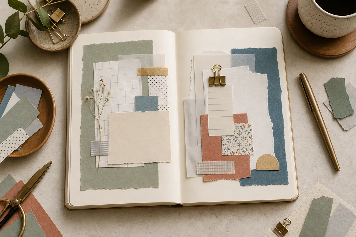
For your first page, try two shades of blue, warm pinks, or cream with pale brown. They don’t have to come from different sheets. Two overlapping pieces of the same translucent paper may give you all the variation you need.
Keep a plain area nearby so you can compare the overlap with the untouched page. If every inch is covered, it becomes harder to appreciate those small shifts. A cluster in the upper corner or a soft band down one side is a manageable place to begin.
“You’ll get visible paper layers rather than transparent color, and the same quiet layout still works.”
Arrange the overlap before you add glue
Tear or cut a piece roughly the size of two fingers, then place a smaller piece across part of it. Offset the edges so you can see both single-layer areas and the overlap. Try a third little piece only if the first two still feel too faint.
Move the group around your page while it’s loose. Leave a clear rectangle large enough for the words you want to write. If you have a photo, let the layers sit beside or partly behind it, rather than covering the detail you want to remember.
Leave single-layer areas beside the overlap
Switch from exactly stacked sheets to offset pieces with visible edges.
Edges aligned
Two exactly aligned pieces produce one shared footprint. Their separate edges and single-layer areas are harder to compare.
Use a light hand with the glue
Work on a scrap sheet so stray adhesive doesn’t reach your journal. Support the thin paper and apply a light, even coat. Some tissue tears when a glue stick drags across it; in that case, apply the glue to the page where the piece will sit, then lower the tissue onto it.
Smooth gently from the center outward. A little wrinkling can be part of the texture, but repeated rubbing can tear damp paper. Let the first layer settle before attaching the next, and test colored tissue first if its dye might transfer when damp.
Give thin paper time to settle before the next layer
Order the checks and handling so the fragile sheet gets fewer unnecessary passes.
One workable order
- Test the paper, dye, and adhesive on a scrap sheetA small test reveals tearing or dye transfer before the journal is affected.
- Arrange the overlap loose on the journalThe loose arrangement reserves writing room and avoids moving damp paper later.
- Attach the first layer with light even adhesiveSupport the thin sheet; if the glue stick drags, apply adhesive to the page instead.
- Let the first layer settle before adding the nextRepeated rubbing or moving while damp can damage thin paper.
Which check needs to come first?
The example shows one workable order. Testing and arranging can swap order. Keep wet materials away from the final writing until they are dry.
Give the words a quiet place to land
Let everything dry before writing nearby. Put your main entry on the plain part of the page. A date can sit beside the collage, and a short title can sit above it. You don’t have to write across the layered area for the two parts to feel connected.
If you’ve already covered your writing space, add a plain paper patch large enough for a few comfortable lines. Match its size to the words you actually want to include. A tiny label won’t rescue a whole paragraph if you have to squeeze every letter.
If it looks muddy, leave out the next layer
Several colors can turn dull where they overlap. If the pieces are still loose, remove one and try again. If they’re attached, keep the remaining page simple or place a small opaque detail over the darkest area. Adding more translucent pieces usually won’t make that spot lighter.
No tissue paper at home? Try any wrapping scrap that passes the line test. If none does, use two thin opaque scraps with offset edges. You’ll get visible paper layers rather than transparent color, and the same quiet layout still works.
Stop when you can see the different paper edges, the overlaps have an effect you like, and there’s room to read your entry without searching for it. A small finished patch is enough.
Choose the next move from what the real paper shows
Try the repair that matches the layer state, rather than automatically adding another sheet.
Remove one piece and compare the remaining colors.
Because the pieces are still loose, you can remove one without adding material. Keep the single-layer areas visible while judging the new overlap. Another translucent sheet generally deepens concealment in that spot; it does not supply a reliable way to make it lighter.
Where this idea began
This guide grew from our original Instagram post. The examples and explanations here expand on that idea so you can try it at your own pace.