Gather a few things See what you’ll need
- An ordinary dark pen, around 0.5 mm
- Your journal
- A scrap of paper for a first try
Choose an exercise 3 things to try as you read
Write the heading before adding its accent
Write the actual heading before choosing an accent. Include the longest word and its hanging letters; “Friday” needs different room from “notes.” A blank rectangle cannot show where your handwriting dips. Use that finished line of words to decide whether the accent belongs below it or at one outside edge.
Leave a little open paper around the letters, especially below any g, p, or y. Those hanging strokes need room too. If you’ve already written a crowded heading, decorate one outside edge instead of trying to squeeze something between the words and the next line.
Try the exampleFit an accent around the heading you have
Fit an accent around the heading you have
Change the accent and its size. Notice how an outside detail can use space without pushing into the writing area.
Read the words in this example
- A drawing beside words
- Your words
- small discoveries
- Separate drawing and writing areas
- Dashed box shows the drawing footprint.
The drawing footprint stays clear of the reserved writing area.
The longer side of “Leaf-End Title Line” uses 35% of the inner page width; its proportions stay intact. The reserved area still contains four sample writing rules. The dashed footprint includes empty space around the strokes; it flags layout overlap, not an exact ink collision or handwritten capacity. The sample shows the accent footprint beside writing. Your actual heading, including the hanging parts of g, p, and y, decides its final position.
- Drawing, longer side
- 35%
- Drawing footprint width
- 35%
- Gap across inner page
- 6.3%
- Reserved sample rules
- 4
ONE WORKED EXAMPLE
A leaf below Friday
You have written “Friday thoughts” above a short entry. You want a leaf underline, but the descending y already reaches toward the space reserved for it.
Before
An underline started directly beneath the other letters would run through the y. Moving only the leaf would leave the collision in place.
After
The underline begins below the lowest part of the y and stops before the right margin. Two open leaves sit beyond the final word. The heading stays readable, with an uninterrupted strip of paper between letters and accent.
What changed—and what to check
The real lettering determines the gap. Moving the whole accent clears the descender while keeping the leaves connected to their stem.
Try this check. Read the heading from your usual distance and trace the paper gap below its lowest letter.
Choose the detail you’d like to see there
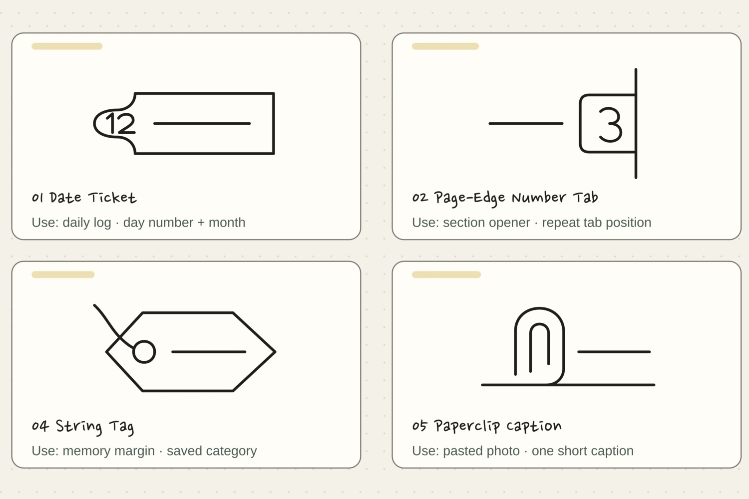
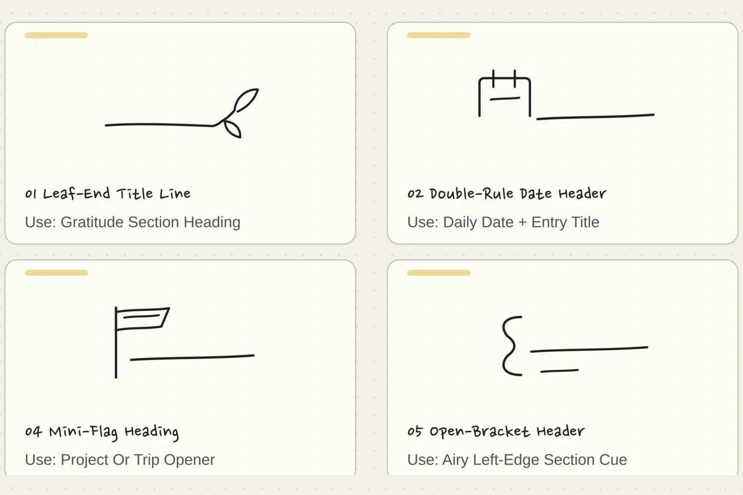
Look through the drawing examples below and imagine each one beside your own heading. The Leaf-End Title Line feels at home above a few gratitude notes. The Mini-Flag Heading can open a trip page. A Bow-Knot Heading gives a birthday entry a small sense of occasion.
You don’t have to follow those pairings. They’re places to begin when choosing is slowing you down. If a plain double rule feels right beside your messy Tuesday list, use it. The best match is the one that lets you keep writing.
Watch where the pen comes off the paper
Watch one complete drawing first, noticing where the pen stops as well as where it travels. On the replay, pause after the stem and try it before adding leaves. A lift between two curves keeps you from dragging an unwanted joining line through the open part of a leaf.
Try the accent on scrap paper at roughly 35–45 mm wide. That’s a comfortable starting size, not a rule for your notebook. Separate pen strokes are useful here. You’re allowed to lift your hand, move the page, and begin the next little piece.
Let the heading decide the final size
Now put the accent beside your real heading. Keep a long rule only as long as it needs to be. If the sprig would reach into the next section, move it toward the outside margin or choose a simpler finish.
For an accent that encloses words, such as the Torn-Tape Title Strip, practice around a copy of the title first. Leave a generous middle and use the torn ends for character. Those ends don’t need dozens of tiny zigzags; a few broad changes in direction will still suggest tape.
Compare the optionsWhat room is left around your title?
What room is left around your title?
Choose the heading situation that looks most like yours. Each option gives the accent a different place to stop.
Read the words in this example
- heading
Use a simple line with a clear gap below the letters.
The words already occupy most of the width, so a short rule can finish the heading without enclosing it. Keep enough space below the hanging letters. Let the line stop where the title stops; it does not need to reach the notebook edge.
A crooked line doesn’t need a second coat
A slightly rising underline is usually easier to live with than a thick underline you’ve corrected four times. Finish the accent once, then look at it from your usual reading distance. Can you still read the heading comfortably? Does the little detail make sense? That’s enough to continue.
If a leaf is too narrow, leave that one alone and give the next leaf more room. If a loop starts closing into a knot, stop the curve early. Save the adjustment for your next attempt instead of darkening the whole drawing.
Try a what-ifA leaf acquires an extra joining line
A leaf acquires an extra joining line
Consider this page before choosing your next move.
Your leaves look open when drawn separately, but a line crosses their interiors when you copy the full accent in one continuous movement.
Compare the three choices
What should you try on the next scrap?
- Widen every leaf while keeping the pen down.
More room may help the shape, but the traveling pen will still leave the unwanted connection.
- Lift between the separate curves shown in the steps.
The lift moves your hand without adding ink. It preserves each leaf’s open interior while keeping the intended attachment.
- Thicken the stem until the extra line blends in.
A darker stem changes emphasis but leaves the line across the leaf, where it can still close the shape.
Pen lifts are part of the drawing route, not interruptions to it.
What would you try?
Choose an option to see what it would do. You can explore all three.
GO A LITTLE FURTHERKeep one favorite close by
Keep one favorite close by
You can try all twelve drawings if practicing is the fun part. For everyday journaling, though, it helps to have one finish you remember without looking it up. Draw your favorite on the inside cover or on a scrap tucked into the notebook.
Keep a small copy of your favorite beside a real heading on the practice scrap. Mark the gap that cleared its lowest letter. Next time, borrow that spacing as well as the shape; you can shorten the rule without relearning every curve.
Pick a drawing and follow along
Choose a drawing below. Watch the whole shape appear, or tap a numbered step to see just that part. The faint outline is there if you’d like a little guidance.
Pick a drawing. We’ll take it one stroke at a time.
Leaf-End Title Line
A long underline ends in a small, gently rising sprig.
The finished drawing. Watch it once, then try one step at a time.
Let’s draw it together.
Give it a place.Write a nature note or daily heading above the line.
If the line wandersKeep the leaves beyond the words; the long line only needs one pass.
Double-Rule Date Header
A tiny date box sits beside two crisp heading rules.
The finished drawing. Watch it once, then try one step at a time.
Let’s draw it together.
Give it a place.Use the box for a day number and write the entry title between the rules.
If the line wandersKeep both rules parallel and leave a small gap beside the date box.
Soft-Arch Section Header
A shallow arch and a quiet baseline shelter a short title.
The finished drawing. Watch it once, then try one step at a time.
Let’s draw it together.
Give it a place.Introduce a new notebook section with a soft, architectural frame.
If the line wandersMake the arch wide and low; it should leave room for the title beneath it.
Mini-Flag Heading
A small swallowtail flag marks the start of a clean heading.
The finished drawing. Watch it once, then try one step at a time.
Let’s draw it together.
Give it a place.Use it for a goal, destination, or plan you want to notice.
If the line wandersKeep the flag compact so the words have most of the width.
Open-Bracket Header
Two open square brackets frame words without boxing them in.
The finished drawing. Watch it once, then try one step at a time.
Let’s draw it together.
Give it a place.Use for a short heading that needs just a little structure.
If the line wandersMatch the bracket heights and keep the horizontal arms short.
Torn-Tape Title Strip
A slightly tilted tape strip gives a heading a relaxed paper border.
The finished drawing. Watch it once, then try one step at a time.
Let’s draw it together.
Give it a place.Use for a two-word title above a pasted image or keepsake.
If the line wandersMake the long edges calm and let only the short ends look torn.
Tiny-Star Title Rail
One little star starts a heading, followed by a long, calm underline.
The finished drawing. Watch it once, then try one step at a time.
Let’s draw it together.
Give it a place.Mark the best moment of a day or a highlight worth remembering.
If the line wandersKeep the star small and leave a full star-width before the words.
Seven-Scallop Week Header
Seven small scallops make a light canopy over a weekly heading.
The finished drawing. Watch it once, then try one step at a time.
Let’s draw it together.
Give it a place.Use one scallop for each day when starting your weekly notes.
If the line wandersCount seven before adding anything else; the repeated curves are the decoration.
Folded-Corner Heading
A small paper corner completes the right side of a roomy heading.
The finished drawing. Watch it once, then try one step at a time.
Let’s draw it together.
Give it a place.Mark a useful reference note that you expect to revisit.
If the line wandersKeep the folded triangle small and leave the title space open.
Loop-Underline Header
A quiet underline finishes in one airy, open curl.
The finished drawing. Watch it once, then try one step at a time.
Let’s draw it together.
Give it a place.Use beneath an evening thought, a quote, or a personal reflection.
If the line wandersStop the curl before it meets itself; the white gap keeps it graceful.
Split Title-Date Tab
A small date tab steps down into a long title baseline.
The finished drawing. Watch it once, then try one step at a time.
Let’s draw it together.
Give it a place.Put the date on the left and the main entry heading beside it.
If the line wandersKeep the step low; a shallow corner is enough to join the two fields.
Bow-Knot Heading
A small bow rests above a generous space for a celebratory title.
The finished drawing. Watch it once, then try one step at a time.
Let’s draw it together.
Give it a place.Use for a birthday memory, gift list, or thank-you note.
If the line wandersKeep the bow knot small and the two loops wide and open.
Something for a future page?
The Washi Tape ShopAffiliate links: we may earn a commission if you buy through these links.
Where this idea began
The twelve stroke geometries and their uses are original editorial constructions. Archer & Olive’s roundup by Neus provided a practitioner example of small decorative headers used across journals, notes, planners, and cards. The accessibility and SVG references support the user-controlled animation.
Want to explore the techniques a little further? Here are the maker tutorials and references behind this guide.
- Creative contextArcher & Olive: 20 Top Easy Bullet Journal Header Ideas
A credited header roundup supplies decorative context; the guide’s stroke routes and artwork are original.
- Website implementationW3C: Pause, Stop, Hide for moving content
W3C guidance informs animation pause controls, not the craft or writing method.
- Website implementationMDN: SVG stroke-dashoffset
SVG stroke-dashoffset documentation explains the on-page stroke animation, not a drawing method.