Gather a few things See what you’ll need
- Journal
- One roll of washi tape
- Pen
- A memo or photo
- Optional: scissors
Help a photo find its words
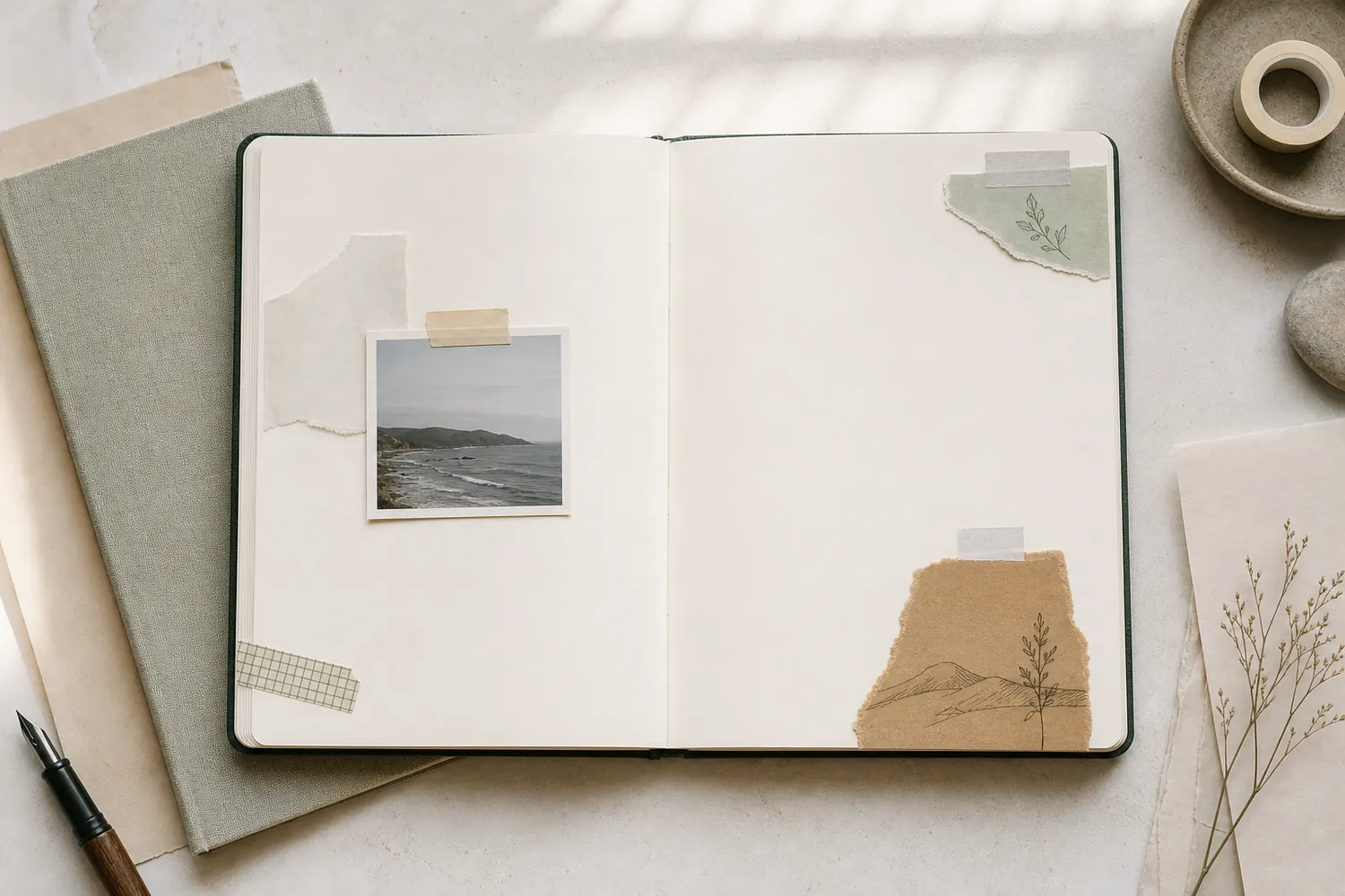
Place a photo beside the sentence that explains it. Run a short strip along the photo's lower edge and let it continue a little way toward the writing, stopping before it reaches the letters. The shared edge helps your eye move from the image to its story.
Or put a small matching piece beside each of two related memories on a spread. Keep the rest of the tape on that spread quieter or different. If every note gets the same bright marker, the matching pieces won't tell you which two belong together.
Which pieces should the strip connect?
Choose the relationship on this page. Notice where the tape repeats, where it stops, and when it is unnecessary.
Carry one edge toward the words.
A short strip can follow the lower photo edge and extend a little toward its sentence. Stop before the letters so the connection stays readable. Position the actual caption first; the tape is helping two existing pieces feel grouped rather than inventing the missing story.
Give the heading a clear place to land
Put a strip of pale tape above your entry and write the title on the paper directly below it. You get the color without having to persuade your pen to write on a waxy surface. Keep the strip about as wide as the heading, rather than stretching it across the whole page by habit.
If you do want to write on the tape, try your pen on a spare piece first and let the ink dry. A dark, busy tape is often better beside the title than behind it. The heading should still be the easiest words to find when you glance back later.
Does this tape give the title a clear place?
Change the pattern and paper values, then try the plain backing. Notice when the words need a quieter surface.
Ink and plain paper have a digital contrast ratio of 13.45:1.
Sample text: “Keep one small memory.” Pattern marks change the background locally; the two shown tones give ratios from 5.79:1 to 13.45:1. The ratios use actual sRGB sample colors. They cannot predict paper texture, ink bleed, handwriting, or individual vision. This is a digital readability exercise, not an ink test. A title can sit on plain page paper just below the tape; test your pen separately if you want to write on the tape itself.
- Ink color
- #1f1f1f
- Background under words
- #e8e8e8
- Plain patch ratio
- 13.45:1
- Two-tone ratio range
- 5.79–13.45:1
“The shared edge helps your eye move from the image to its story.”
Separate a memo from the background
Before attaching a plain memo, place a strip just below where its bottom edge will sit. Overlap most of the tape with the memo, leaving a narrow band showing underneath and slightly to one side. It gives the paper a little visual depth without adding another large layer.
Choose tape that's a shade darker than the page, or use a quiet color already in your photo. If you notice the stripe before the memo, cover more of it. The shadow only needs to make the memo easier to see; it doesn't need to become another featured object.
Give two parts of the day their own space
If you're writing about two different moments on one page, leave a blank line between them and place a short strip there. It can mark the shift from a rushed morning to a quiet evening without putting every paragraph in a box.
Make the divider shorter than your writing lines, and keep a small gap above and below it. A full-width band can look heavy, especially on a small page. If the page already has a bold title, choose a paler tape for the divider. You want to notice the new part of the story without losing your place in the whole entry.
How much tape marks the change of subject?
Switch from a full-width band to a shorter strip while keeping the two writing blocks in place.
A full-width band
The wide band clearly divides the page, but its size can compete with the entry heading or make the break feel heavier than intended.
Help yourself find the page again
Choose a tape color for one kind of page you'll revisit, such as recipes or journal ideas. Place a short piece vertically beside the heading, near the outer edge. Repeat that placement on the other pages in the same group. You can spot the mark while flipping through without adding a protruding tab.
Start with one group instead of assigning a different tape to everything in the notebook. If you already use red for recipes, keep that red off unrelated page edges so the cue stays useful. A tiny matching swatch beside 'Recipes' on your contents page can remind you what you're looking for.
Define one tape cue you can find again
Make a small legend entry for one kind of page you revisit. Keep the group, tape, and position specific enough to repeat.
Recipes I have cooked
The red checked tape
A short vertical piece beside the heading at the outer edge.
Your words have a place now.
Begin with one useful group. Keeping this cue off unrelated page edges makes its repeated placement easier to understand.
- Words on this card
- 19
Check what changed, then stop
Look back at the thing you wanted help with. Does the photo connect to the caption? Can you find the title? Is the change between the two memories clear? If yes, that strip has done enough. You don't need a second one to make the first one feel less lonely.
If the page feels busier but no easier to use, try covering part of the tape with a plain scrap. With no tape available, draw a line to connect two notes, shade a memo's edge in pencil, or repeat a small colored mark beside related headings. The useful idea doesn't depend on a particular supply.
Where this idea began
This guide grew from our original Instagram post. The examples and explanations here expand on that idea so you can try it at your own pace.