Gather a few things See what you’ll need
- One simple stamp
- A compatible ink pad
- Smooth scrap paper
- A journal offcut or practice card
- A pen
Make a comparison on the paper you will use
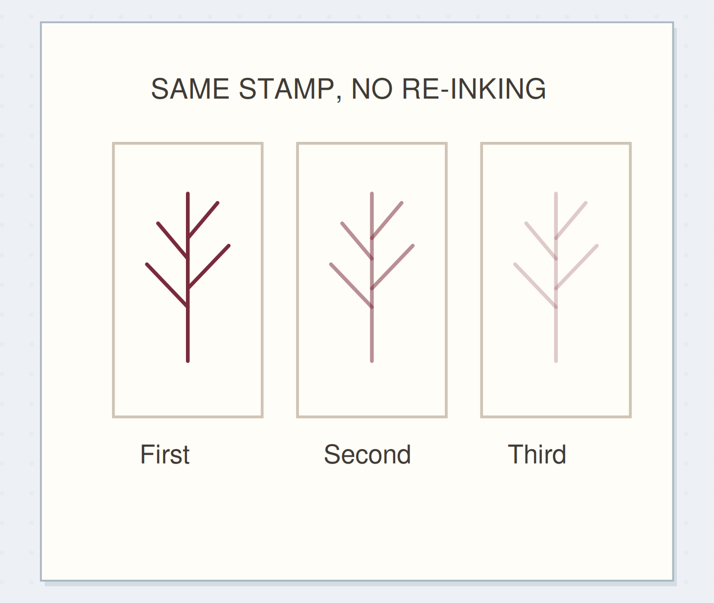
Choose a simple stamp with broad areas or a readable outline. Ink it evenly, then make three impressions in a row on a smooth scrap of the intended paper. Don't re-ink between impressions. Label them one, two, and three after the ink dries.
Keep your pressure and contact time reasonably similar. The marks won't be laboratory measurements, but changing every variable at once makes them harder to compare. Some stamps and inks produce a clear second impression and almost nothing on the third; others retain enough ink for several recognizable prints.
Press down and lift without rocking
Support the paper on a flat surface. Lower the stamp straight down, apply even pressure, and lift it straight up. Rocking the block can leave a doubled edge or print ink from areas outside the intended image. A lighter ink load doesn't fix an uneven stamping motion.
If your stamp needs a mounting block, use it as intended. Make the first test on loose paper rather than over a notebook binding that leaves the surface uneven. A small practice card can become the final decoration if you like the result, so this preparation need not produce waste.
Get a Softer Impression From the Ink Already on Your Stamp
Follow three impressions made from one inking of the same stamp.
Begin with the same stamp and paper for all three tests.
Ink the stamp once for the three-print test. Use the article measurements for the physical version; the drawing is a schematic.
“A lighter impression is useful when it supports the surrounding words.”
Choose the print that suits the words
Lay a sample of your handwriting beside the three dry impressions. The first may work as a focal image; the second may sit comfortably in a margin; the third may be too faint to read. Choose by the job the mark needs to do, not by the assumption that paler is always better.
For a single light impression on the journal page, ink the stamp, make one print on waste paper, then place the next print in the notebook without re-inking. Keep the waste-paper print if it is useful. Stamping off removes some ink; it doesn't guarantee the same shade on every kind of paper.
Order the steps: ink the stamp once first
Check the physical dependencies in this stamping off example. Reorder the actions before trying the paper version.
One workable order
- Ink the stamp onceOne inking provides the shared starting condition.
- Print the first impressionThe first impression removes some ink from the stamp.
- Print again without re-inkingThe second uses what remains and is the comparison of interest.
- Choose a generationChoosing a generation depends on seeing the actual impressions.
Which check needs to come first?
The example shows one workable order. Choosing a generation depends on seeing the actual impressions.
A quiet mark beside an ordinary sentence
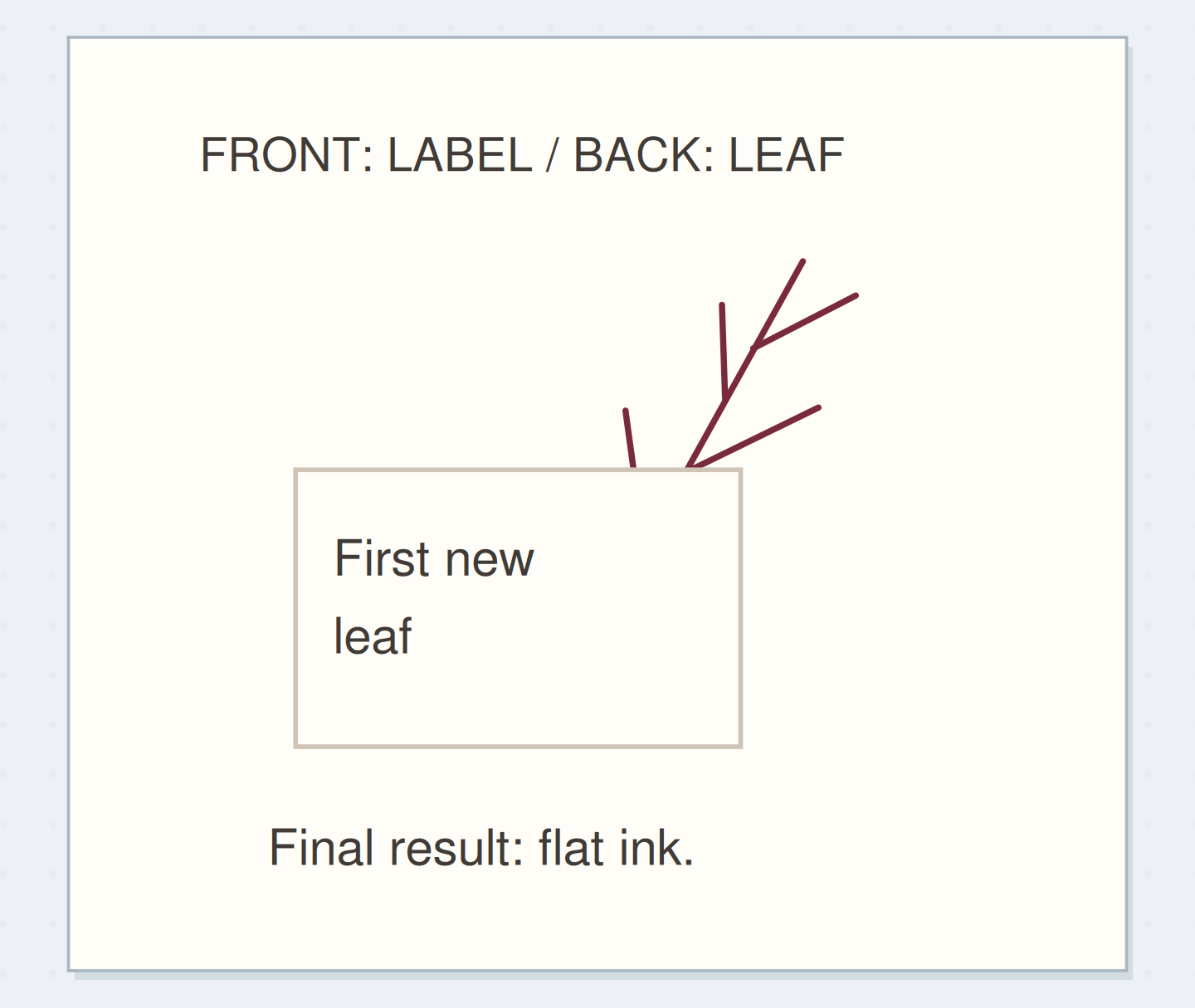
Use one small leaf stamp and a dark green or grey ink you already have. Make the first impression on a loose scrap, then stamp the second near the lower edge of a plain card. Leave the rest of the card for the sentence, “The first leaves were smaller than I expected.”
Write only after the ink has dried. Put the card beside a dated journal note about your walk. The leaf is a low-key companion to the words, while the darker first print can be saved as a future focal scrap. You have two different useful pieces from one inking.
Plan generation I prefer
Select the generation that still reads clearly and choose a place outside the writing area for it.
Generation I prefer:Second, provided the whole leaf remains visible.
Where the mark belongs:Beside the final line, outside the writing area.
Your words have a place now.
Select the generation that still reads clearly and choose a place outside the writing area for it.
- Words on this card
- 22
Don't repair a light print by guessing its position
If the second impression is too faint, use the first generation next time or choose a different stamp. Re-stamping directly over a pale image by eye can create a double outline. Unless you have a reliable positioning setup, it is often easier to make another loose test card.
If the impression is patchy rather than simply pale, check the paper support and how evenly the stamp was inked. A dry area on the pad or a textured paper surface can produce gaps. Clean the stamp according to its material and ink instructions before changing to another color.
Choose the useful ink strength
Place your preferred light impression beside normal handwriting and check whether the mark supports the words.
First print
The first dark impression alone does not show the lighter alternatives.
Use a short tonal rhythm instead of a full background
You can place three successive impressions across the bottom of a practice card so they fade from dark to light. Keep them far enough apart that each remains identifiable. This is useful when you want a small directional rhythm, such as a row leading toward a caption.
Avoid repeatedly filling the writing area just because ink remains on the stamp. Stop the sequence when it becomes too pale to contribute. If you want one stamped image to appear behind another, use masking; changing ink strength alone won't stop the outlines from crossing through each other.
Save the comparison that answers the question
A lighter impression is useful when it supports the surrounding words. Keep the three-print test with a short note naming the paper and ink, if those details will help you repeat the result. You don't need a formal swatch library unless you actually use one.
Stop when you have identified one generation you like and used it on a real entry or a ready-to-use card. Clean and put away the stamp. The remaining ink can make another mark, but the page doesn't need that mark merely because it is available.
Where this idea began
Want to follow the idea further? These community discussions and maker references are a good place to start.
- A cardmaking discussion of second-generation stamping
A reply identifies second-generation stamping as the source of tonal interest in a card.
- Second-generation stamping technique
The tutorial demonstrates obtaining a lighter impression by stamping again without re-inking.