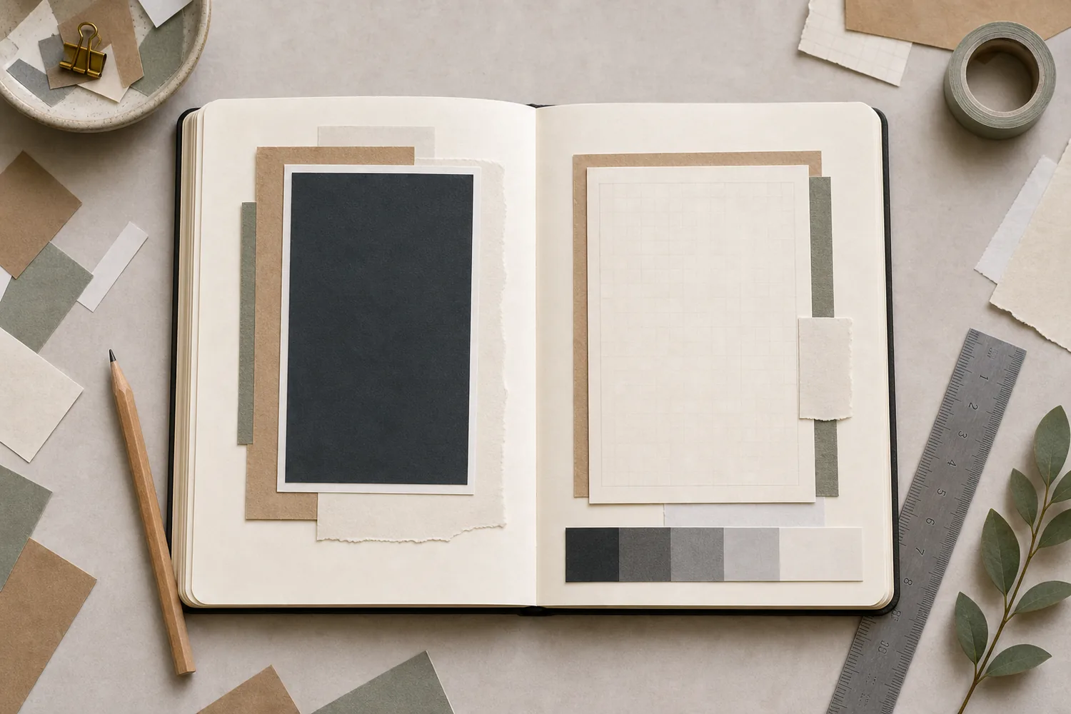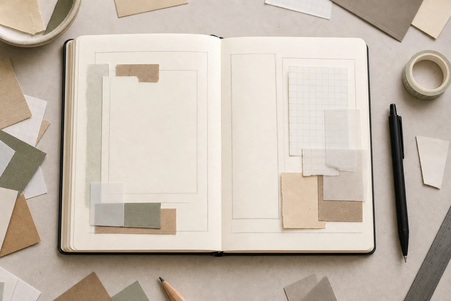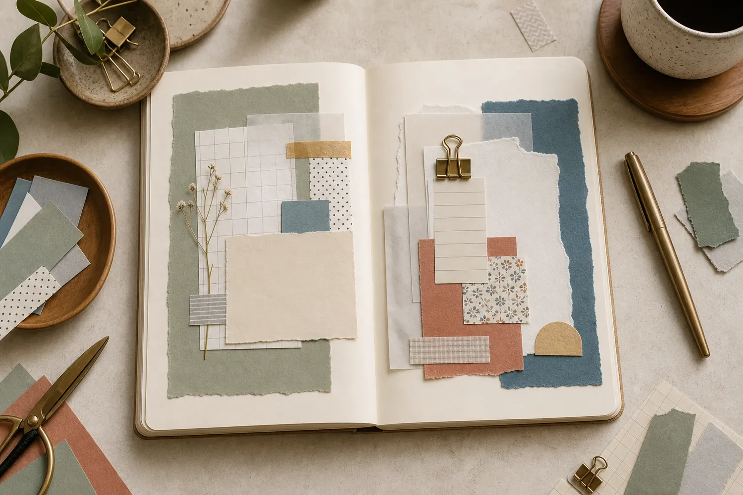
Gather a few things See what you’ll need
- A bold patterned scrap
- One or two quieter papers
- A plain writing card
- Scissors
- Thin adhesive
- A pen
Choose an exercise 4 things to try as you read
Put the writing card on top first
Start with a solid or low-contrast base larger than the other pieces. Put a smaller grid, dot, or ledger scrap over it, shifted enough that you can see one or two edges. Now place a plain writing card on top. Leave enough of the base showing that the layers feel connected rather than scattered.
Write a few lines before choosing a final tab or strip. Sage paper, cream grid, and an ivory card can hold an ordinary walk after dinner. If the sentence runs past the card, try a larger card while the stack is loose. Covering more of a favorite pattern is often easier than living with handwriting you had to squeeze.
ONE WORKED EXAMPLE
One flower beside the evening note
You have a floral offcut with two large flowers and a short note about an evening walk. You want the paper’s color without losing the sentence.
Before
The uncovered flowers dominate the small page, and the note looks stranded between them rather than like the reason for the layout.
After
A plain card covers most of the floral rectangle, leaving about 3–8 mm of pattern and one flower detail visible along a chosen edge. The full sentence fits at ordinary handwriting size. The loose stack closes comfortably before anything is attached.
What changed—and what to check
Showing one part of the print gives it a clear place beside the words. The cover card supplies reading space without requiring a quieter pen.
Try this check. Read the note first from your usual distance, then close the loose stack and check its fit.
Something for a future page?
The Washi Tape ShopAffiliate links: we may earn a commission if you buy through these links.
Keep the best part of the print at the edge
Place a smaller neutral card over a bold patterned rectangle, leaving about 3–8 mm of print showing along the edge you like most. The border can be uneven. Shift the card slightly if that lets one flower, stripe, or little illustrated detail remain visible.
Put a photo or your writing on the plain center. If two large flowers compete with the photo, cover one. You don’t have to display the whole pattern for the paper to feel worth using. This is especially useful for a precious offcut that’s too small to become a background but too lovely to throw away.
See the differenceKeep the flower without giving it the whole page
Keep the flower without giving it the whole page
Switch between the exposed print and a smaller visible border.
More print
A small writing card leaves the print dominant and gives the entry a short, narrow space. The full print is visible, but the words are being sized around it.
GO A LITTLE FURTHERGather narrow scraps along one side
Gather narrow scraps along one side
Choose three strips: one solid, one quiet pattern, and one stronger print. Place them along an outside edge of the page, starting at slightly different heights while keeping their outside edges roughly aligned. Let the strips overlap so they read as one small area.
Write beside them and keep the center open. A date near the top of the strips can help the page feel settled. If the narrow scraps start spreading toward the middle, slide them back together or trim one. You’re making a useful margin, so the writing should still have most of the room.
Compare the optionsChoose a useful home for the offcuts
Choose a useful home for the offcuts
Change the scrap shape and compare the space left for your entry.
Gather the lengths at one outside edge.
Overlap the strips into a narrow margin, varying their starting heights. One solid and quieter print can support the stronger strip. Move the group outward if it starts taking over the center where your hand needs to write.
GO A LITTLE FURTHERBorrow one color and let it return
Borrow one color and let it return
Find a color in the patterned paper that you’d like to repeat. It could be a muted blue flower or a rusty little leaf. Use a related solid behind your note, a smaller tab elsewhere, and perhaps a tiny pen mark near the date.
You can place the color returns at different points around the page, with different sizes. A triangle is one possible arrangement, not a shape you must complete. If a tiny blue dot catches your eye before the sentence, bring it closer to the main group or leave it out; repeating a color should help the pieces belong together.
Show a glimpse of a very busy paper
Cut a small piece of the bold print and slide most of it behind plain paper. Reveal the part you actually love: one coastline, a flower head, or a short run of stripes. An opaque cream card gives the clearest writing surface; vellum or tracing paper softens the pattern while allowing some of it to remain visible.
Don’t assume a translucent layer will make every print readable. Hold your written note over the stack and check it from your usual reading distance. If the pattern still shows through too strongly, use opaque paper. Keep other bold prints away from this area so the little glimpse has room to be noticed.
Try the exampleSee what extra translucent sheets conceal
See what extra translucent sheets conceal
Change the digital opacity and layer count, then move the writing above or below.
Read the words in this example
- Writing below the sheets
- One sentence
- worth keeping.
- 2 sheets at 35% each
- Digital opacity, not measured vellum.
The writing sits below 2 sheets; combined digital opacity is 57.7%.
In the shared overlap, combined opacity is 1 − (1 − 0.35)^2, or 57.7%. Increasing opacity or adding sheets hides more of the words in this digital model. Actual vellum varies with material, lighting, and ink; this diagram does not establish readability or privacy. This is a digital demonstration of concealment, not a measurement of vellum. If a real print still interferes with the letters, try an opaque writing card.
- Sheets
- 2
- Each sheet, digital opacity
- 35%
- Overlap, digital opacity
- 57.7%
- Writing position
- Underneath
GO A LITTLE FURTHERLet tiny pieces stay together
Let tiny pieces stay together
Take five scraps smaller than a postage stamp: perhaps two solids, two quiet patterns, and one stronger print. Overlap them into one compact group, letting every piece touch another. Keep one side a little heavier, and put a short writing strip close beside it.
This works near a photo corner or date, where the little group has something to belong to. If the pieces seem random, tuck them closer together rather than sprinkling more around the page. Remove a piece if it only hides the awkward edge of another. You can finish with four, three, or two.
Look at the big shapes before you glue
When several patterns share a page, different scales help: a large motif, a medium stripe or check, and a tiny dot or grid read more distinctly than three equally busy florals. You don’t need all three scales every time. A bold print beside a solid may be enough.
Read the words from your normal distance, then close the journal around the loose stack. A print that competes may need covering; a thick ridge near the spine may need moving or thinning. Make the smallest change that answers the problem you actually noticed. Attach the pieces only after the words remain readable and the book closes comfortably.
Try a what-ifThe smallest color echo steals the first glance
The smallest color echo steals the first glance
Decide whether this extra mark is helping the page.
A patterned border and blue backing already connect the note. A bright blue dot in the opposite corner keeps drawing attention away from the first sentence.
Compare the three choices
Which adjustment best serves this reading page?
- Add two more blue dots to complete a stronger triangle
That could create a decorative pattern, but the stated problem is attention leaving the sentence. More separated accents may reinforce it.
- Make the patterned border wider to compete with the dot
This adds another strong area. It is usually easier to adjust the optional accent before exposing more busy print.
- Move the dot toward the main group or leave it out
The repeated color already has a role. The extra return is optional, so you can reduce its separation or remove the competing cue.
A repeated color should connect the page, not require another focal point.
What would you try?
Choose an option to see what it would do. You can explore all three.
Let’s take a closer look
These examples show how the pieces can sit together. Follow the written instructions above for the exact attachment and opening direction.


Where this idea began
These references support the pattern-scale, hierarchy, neutral-buffer, and loose-assembly decisions used in the guide.
Want to explore the techniques a little further? Here are the maker tutorials and references behind this guide.
- Design principleScrapbook & Cards Today: Mixing Multiple Patterned Papers
Pattern-mixing examples inform varying scale and keeping one pattern dominant.
- Design principleGet It Scrapped: The 4 Patterns that Make Mixing Scrapbook Papers a Snap
Pattern scale and simple mixer patterns inform the guide’s paper-pairing choices.
- Design principleNielsen Norman Group: 5 Principles of Visual Design in UX
Digital visual-design principles are adapted to paper; exact arrangements are editorial choices.
- Design principleNielsen Norman Group: Visual Hierarchy in UX
Visual hierarchy supplies a background principle for clear focal content and supporting details.
- Design principleGetty Museum: Understanding Formal Analysis
Balance, emphasis, and movement provide art principles adapted to the guide’s page arrangement.
- Maker exampleHip Kit Club: Starting a Layered Scrapbook Layout
Jana Eubank’s layered-layout example supplies a maker reference for beginning a loose arrangement.
- Maker exampleNatalie Strand (QSOgirl) / Vegetablog: Scrap-layer strip assembled before additional stenciling
Natalie Strand’s scrap-layer strip is the named example of loose assembly before additional stenciling.
- Creator attributionVegetablog: Natalie Strand's About page
The About page links Natalie Strand’s name with Vegetablog; it is an attribution reference.