Gather a few things See what you’ll need
- Pencil and eraser
- Gray colored pencil
- Pen
- Scrap or tracing paper
- Ruler
Choose one repeatable displacement
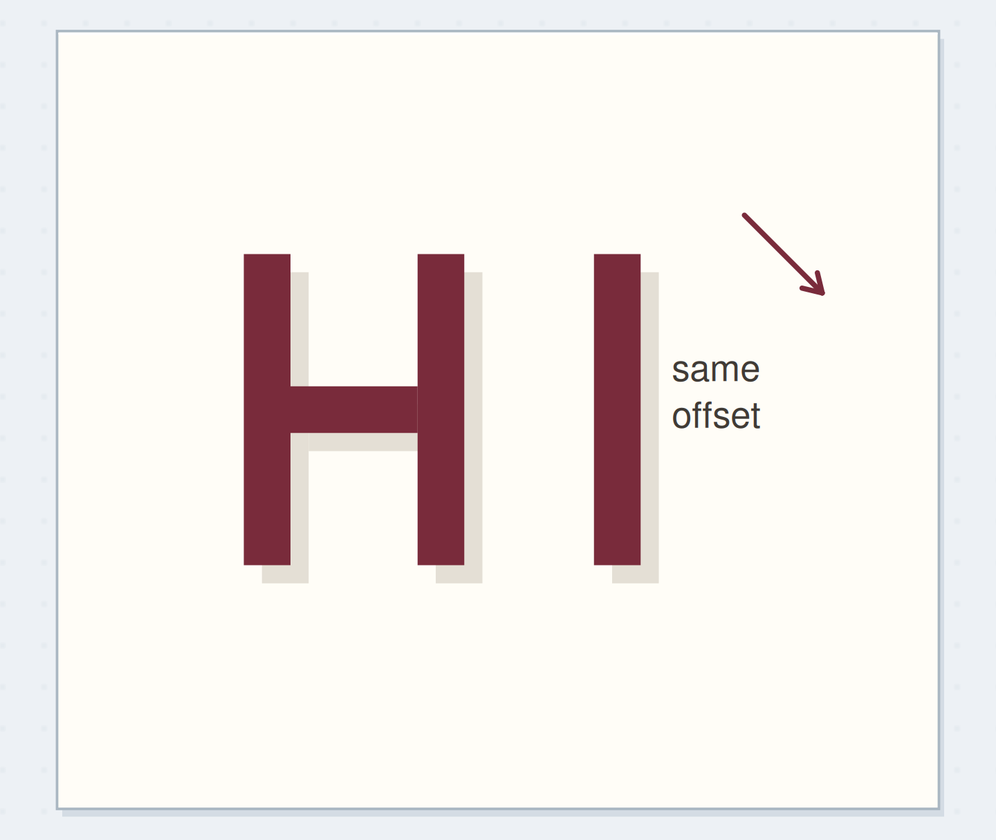
Draw a small arrow down and right on your practice scrap. Label its movement “2 mm right, 2 mm down.” That is the offset for this example. Both Lettering Daily's shadow tutorial and the Signs101 maker discussion emphasize coherent placement, although finished lettering can use many different shadow styles. Keep the arrow outside the final heading. If you later want a different direction, start a new sample and change the entire shadow consistently. A different direction for each letter makes this particular flat-shadow construction harder to understand.
Shift a complete letter shape
Every shadow point moves by the same amount.
Block HI before adding a shadow
Inspect the solid HI before reserving any extra space for its shadow.
Prepare letters with enough open space
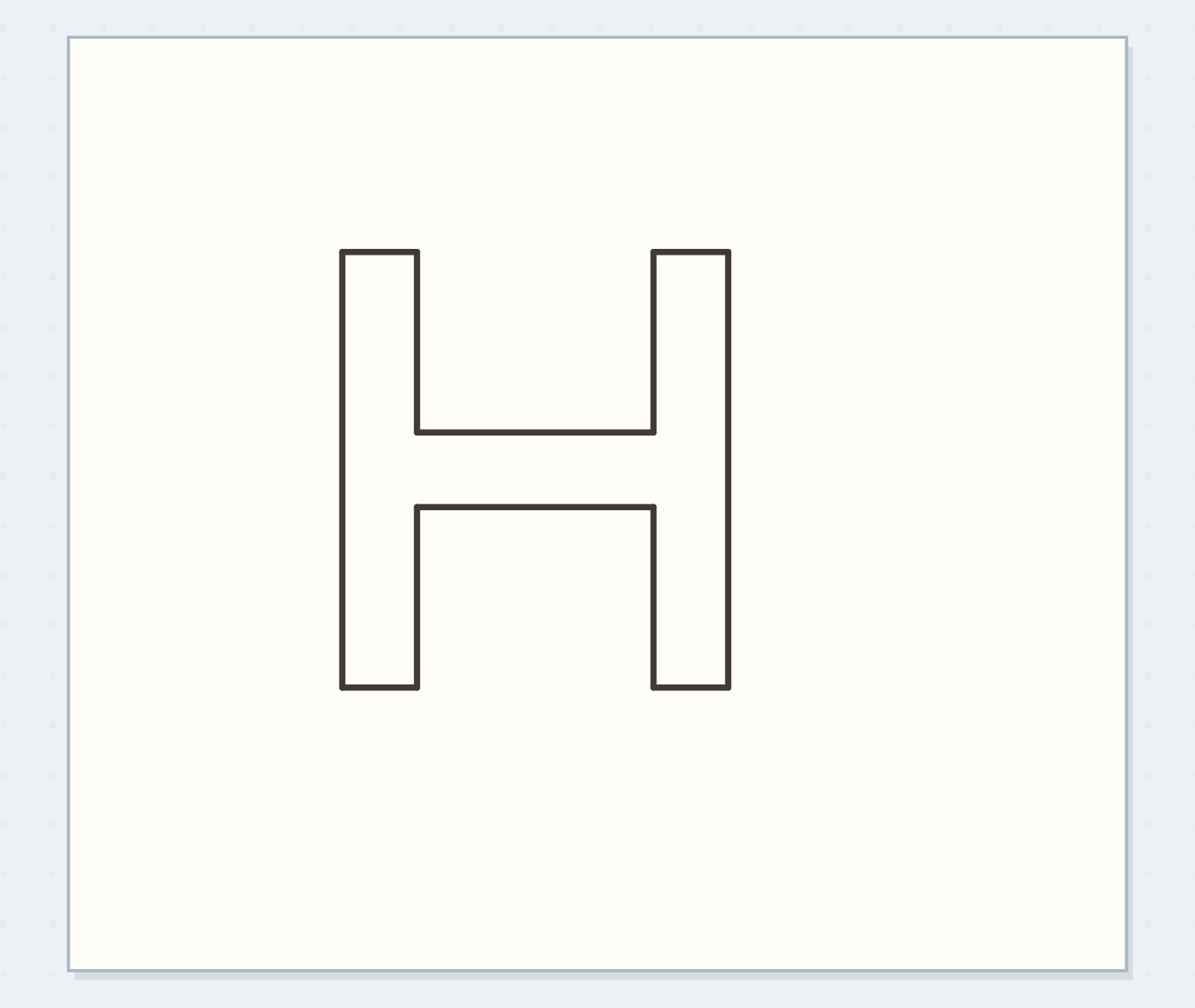
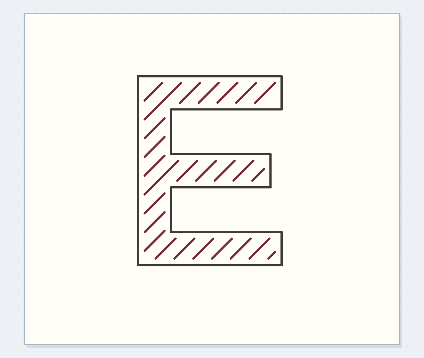
Pencil block HI about 18 mm high. Give H two stems roughly 3 mm thick and an open central area; make I a simple upright block. Leave approximately 5 mm between the visible letters for the first trial. Color the letter faces lightly with a colored pencil, or leave them as paper if you intend a darker outline. Check the letters before adding shadows. If H already has a cramped interior, the shadow may consume its remaining clear space.
“Inspect the upper-left and lower-right corners of both letters, then the H's inside opening.”
Move the whole shape, not selected corners
On tracing paper, copy the block shapes, then slide the copy 2 mm right and 2 mm down without rotating it. If you don't have tracing paper, mark corresponding corners with small pencil dots and join the shifted edges. Every point receives the same movement. The shifted copy sits behind the original; portions hidden by the letter face should not show. At the H crossbar, inspect the interior as well as the outside. Shadows can appear inside an opening where the displaced shape is exposed.
Spot a direction change
Move the reveal control to inspect this specific change.
Different directions
The two shadows move in different horizontal directions.
Finish the HI example
Use a gray pencil to fill the visible shifted areas, then establish the main letter edges with your pen if you want an outline. Keep the original face clean and distinct from the shadow. Compare the rightward and downward extension at the H and I: both should match the same chosen offset. Place the finished HI above a short note with generous clearance below it. Measure the space occupied by letter plus shadow when positioning the heading, rather than treating the shadow as something that can fit anywhere afterward.
Reduce a shadow that crowds the letters
If the shadow almost fills the H opening, try a 1 mm offset on a new sample. Keep the letter shape unchanged so you can compare the effect. If a pencil shadow looks too strong, lift some color before outlining, using an eraser already tested on that paper. For an ink shadow, stop adding weight and keep the rest of the page quieter. Don't draw a second dark outline around the entire effect automatically. More borders can make the crowded opening harder to distinguish.
Write your shadow offset
Measure the letter and shadow together when reserving page space.
Word:HI
Chosen offset:2 mm right and 2 mm down
Your words have a place now.
Measure the letter and shadow together when reserving page space.
- Words on this card
- 11
Compare a gap and a direct overlap
A separated shadow uses a slim paper gap between the letter and its shadow shape; a direct offset shadow can appear attached where their boundaries meet. Try these as separate versions of the same HI. For the gapped version, reserve the light separation in the sketch instead of painting over it later. Keep its width visually consistent. This is a stylistic choice discussed in signmaking practice, not a universal rule of illumination. Use whichever version reads more clearly at the small size your journal heading needs.
Before filling the shadow
Order the preparation before the operation that needs its result.
One workable order
- Draw the base lettersCorresponding offset points are measured from the existing base letter shape.
- Mark corresponding offset pointsThose points define which shifted parts remain visible behind the base.
- Check exposed shadow shapesFill only the exposed shapes you have checked.
- Fill the checked shadowsInspect the upper-left and lower-right corners of both letters, then the H's inside opening.
Which check needs to come first?
The example shows one workable order. Measure the letter and shadow together when reserving page space.
Check the four corners and stop
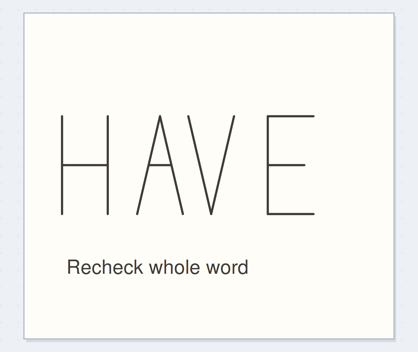
Inspect the upper-left and lower-right corners of both letters, then the H's inside opening. Those points reveal most accidental direction changes. Stop once the offset agrees across the word and the letter faces remain the first things you read. Save the scrap with its 2 mm by 2 mm note. For a longer heading, test the tightest letter pair before completing every shadow. One clear offset applied to a short word is a stronger reference than a page crowded with several half-finished shadow treatments.
Where this idea began
Want to follow the idea further? These community discussions and maker references are a good place to start.
- Lettering Shadows
The opened maker discussion compares shadow directions, relief gaps, and the effect of shadows on legibility.
- 8 Easy Ways to Add Shadows to Letters
Supports a consistent shadow direction and a displaced shape that follows the letter contour.