Gather a few things See what you’ll need
- Pencil and eraser
- Pen
- Paper
- Ruler
Establish the letter before its outline
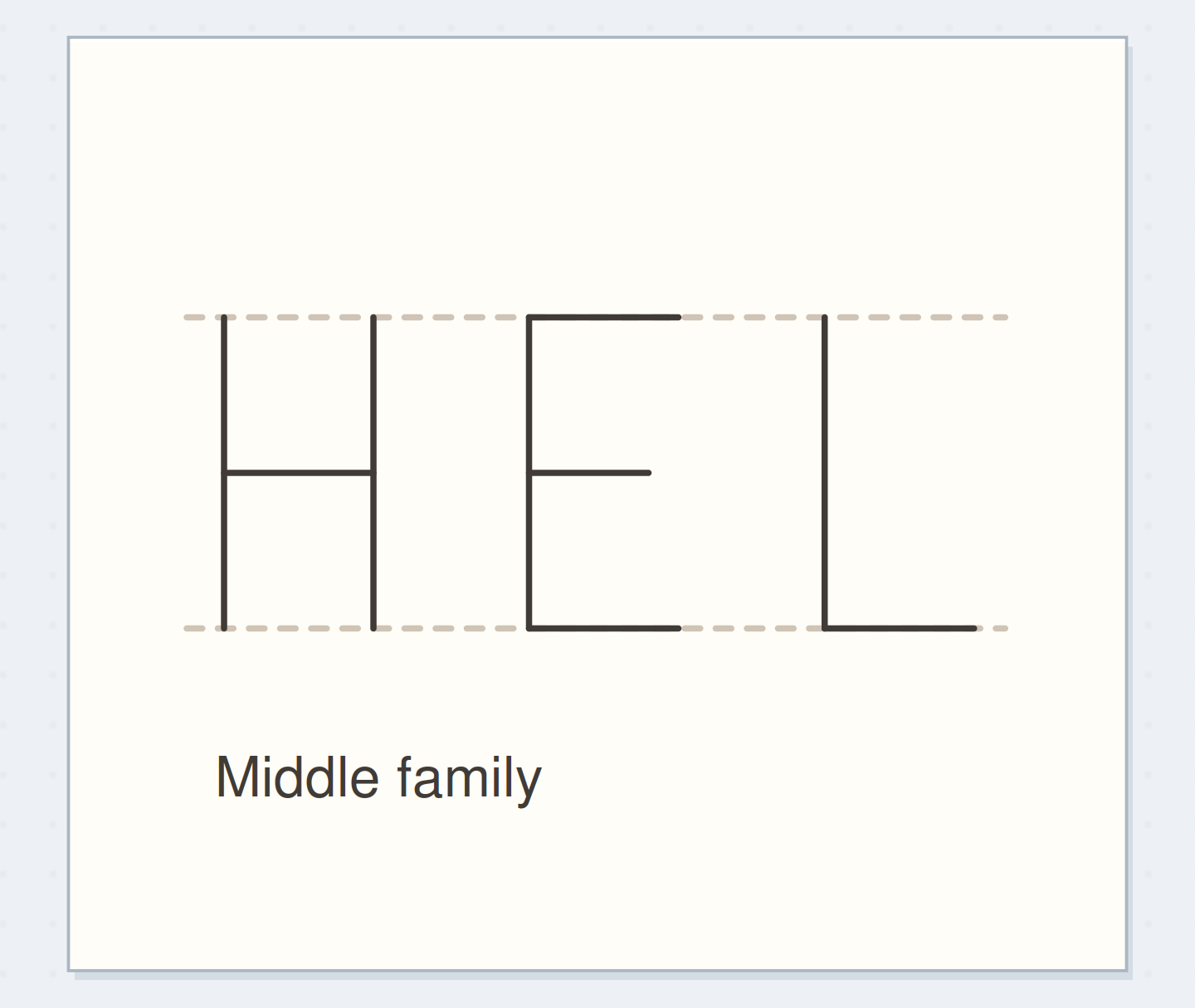
Draw an H skeleton 20 mm high and 12 mm wide. Put its crossbar halfway up for this example. Use pencil and keep the lines light. Look at the two vertical stems and the opening between them; the finished letter will inherit these proportions. Lettering Daily teaches block construction from a skeleton followed by added thickness. We use only straight strokes here so you can see the relationship clearly. If the skeleton feels too narrow, widen it now rather than trying to repair its outer boundary later.
Build H from the center
See a skeleton become one coherent outline.
A skeleton fixes height, width, and crossbar
The single-line H fixes its height, width, and crossbar before any band is added.
Add a band on both sides
Choose a total stem thickness of 4 mm. Mark 2 mm on either side of each vertical centerline, then draw the long outer edges. Add parallel edges 2 mm above and below the crossbar centerline. These bands overlap where the crossbar meets the stems. The overlap is construction information, not a set of seams in the final letter. Keep the penciled marks visible for the moment so you can compare the three bands. Their thickness should feel related even though the crossbar is shorter than the stems.
“Stop when you can follow each letter's boundary without encountering an accidental internal seam, and when the openings remain clearly visible.”
Remove the lines inside the shape
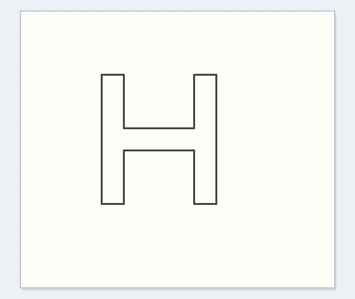
Follow the outside boundary of the combined H with your finger. At each crossbar join, continue around the union of the bands instead of cutting across it. Erase the centerlines and the short seams that divide one band from another. You should now have a single block H outline with an upper opening and a lower opening. If the drawing still looks like three overlapping rectangles, find the construction edges inside the letter and remove them. This distinction makes the outline feel like one designed letter.
Remove construction seams
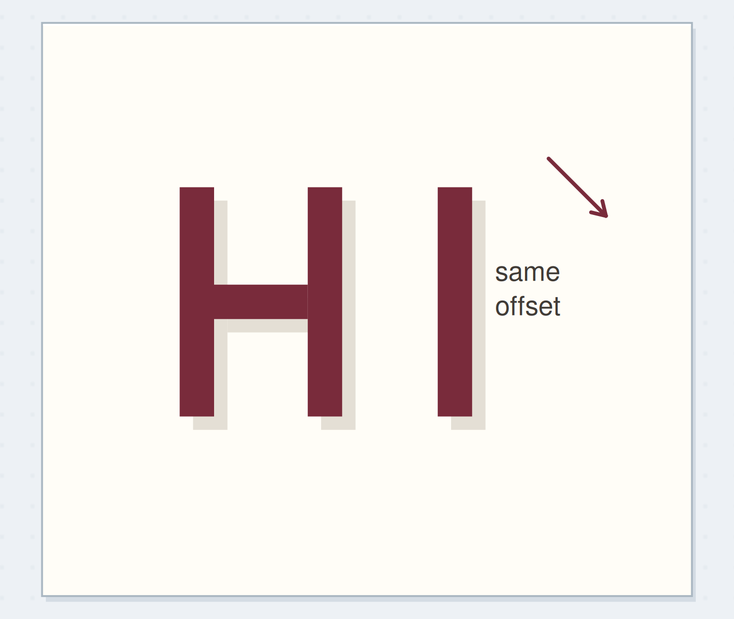
Move the reveal control to inspect this specific change.
Internal seams
Construction bands remain divided inside the letter.
Finish H and derive E
Ink the H perimeter in manageable segments, lifting the pen at corners if that gives you more control. You don't need to draw the whole letter without a lift. Beside it, pencil an E skeleton with the same cap height. Build a vertical band and three horizontal arms, keeping the middle arm a little shorter. Remove its internal seams before inking. Compare the pair at normal reading distance. Shared height and band width should make the letters look related, even though their empty spaces have different shapes.
Open a cramped interior
If the upper opening of H has become a thin channel, reduce the band thickness in a fresh pencil version or widen the skeleton. Thickening the outer outline won't create more space inside it. If one corner protrudes slightly after inking, leave it unless a tiny correction will keep the whole edge straight. Repeated corrections can enlarge a small bump into an obvious dark knot. Community lettering critiques often identify cramped counters and heavy outlines as readability problems; this exercise reserves those openings before any decorative treatment begins.
Write your outline specification
Check the openings before choosing an interior fill.
Letter pair:HE
Height and band width:20 mm high; 4 mm total bands
Your words have a place now.
Check the openings before choosing an interior fill.
- Words on this card
- 14
Test the available interior honestly
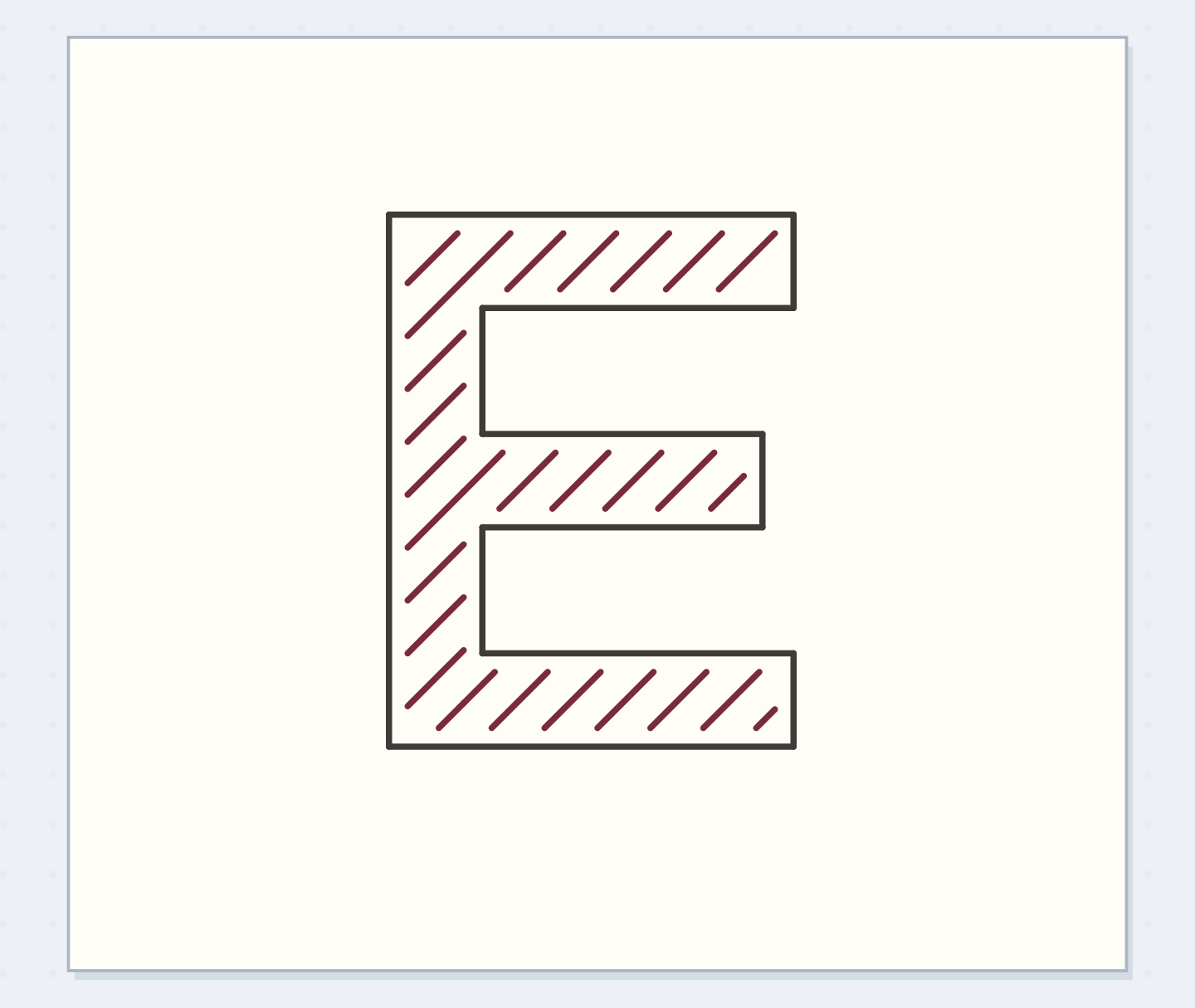
Add a few widely spaced pencil stripes inside one E, stopping each stripe before the outline. Leave the H empty. The comparison shows how much detail the constructed bands can actually contain at this size. If only a crowded cluster fits, enlarge the letter or choose a quieter fill rather than forcing a miniature pattern into every arm. When reducing the letter for a small journal heading, reduce the planned interior detail as well. The physical pen line does not shrink just because your pencil sketch does.
Before inking the perimeter
Order the preparation before the operation that needs its result.
One workable order
- Draw a readable skeletonThe added bands follow the readable centerline skeleton.
- Add planned band thicknessInternal seams exist where the construction bands overlap.
- Erase internal construction seamsRemove those seams before committing the final perimeter.
- Ink the single perimeterStop when you can follow each letter's boundary without encountering an accidental internal seam, and when the openings remain clearly visible.
Which check needs to come first?
The example shows one workable order. Check the openings before choosing an interior fill.
Save a perimeter you can reuse
Stop when you can follow each letter's boundary without encountering an accidental internal seam, and when the openings remain clearly visible. Record “20 mm high, 4 mm bands” beside the practice pair. Those numbers provide a starting point for other straight letters, not a formula for every rounded letter in an alphabet. For a real heading, pencil all the skeletons and check word spacing before building their outlines. That preserves the useful flexibility of the first stage instead of committing one finished letter before its neighbors have room.
Where this idea began
Want to follow the idea further? These community discussions and maker references are a good place to start.
- (1-10) need advise on what to improve. Am I toy?
The search excerpt identifies cramped internal letter spaces as a readability issue.
- How to Draw Block Letters: A Beginner’s Guide to Sans Serif Lettering
Supports skeleton-first block construction and optical rather than purely measured spacing.