Gather a few things See what you’ll need
- One ordinary pen
- Pencil and eraser
- Practice paper
- Ruler
Choose relatives before an alphabet
Begin with straight-sided capitals rather than drawing A through Z immediately. H establishes two vertical stems and a middle connection; E introduces unequal horizontal arms; L removes most of that structure; I offers a narrow form. Use one ordinary pen for every stroke. Lettering Daily describes monoline lettering by its uniform stroke width, which makes these proportional differences easier to see. Keep the sample unshaded. A heavier accidental stroke can distract you from the specific question this exercise asks: do the letters seem to belong together?
Compare a letter family
Change letter width while holding height steady.
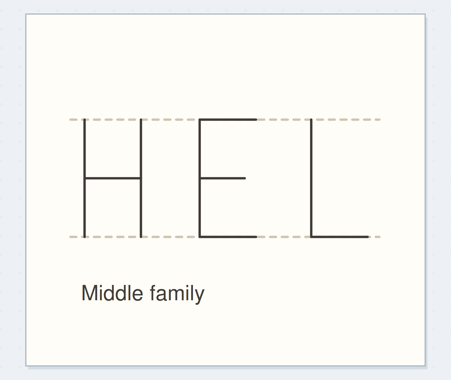
Shared cap height; letter width changes together
The letters share a top and baseline; their narrow widths make a compact family.
Establish a shared height
Draw two pencil guides 12 mm apart and four loose letter boxes below them. Give H, E, and L an initial width of 7 mm; let a plain I occupy much less. The boxes organize practice, but they aren't mandatory equal spaces in a final word. Mark the H crossbar around the middle. Place E's middle arm nearby and shorten it slightly compared with its top arm. Those shared decisions produce a family relationship without pretending the letters have identical outlines.
“Finish with a small reference row and one working label.”
Compare three versions of H
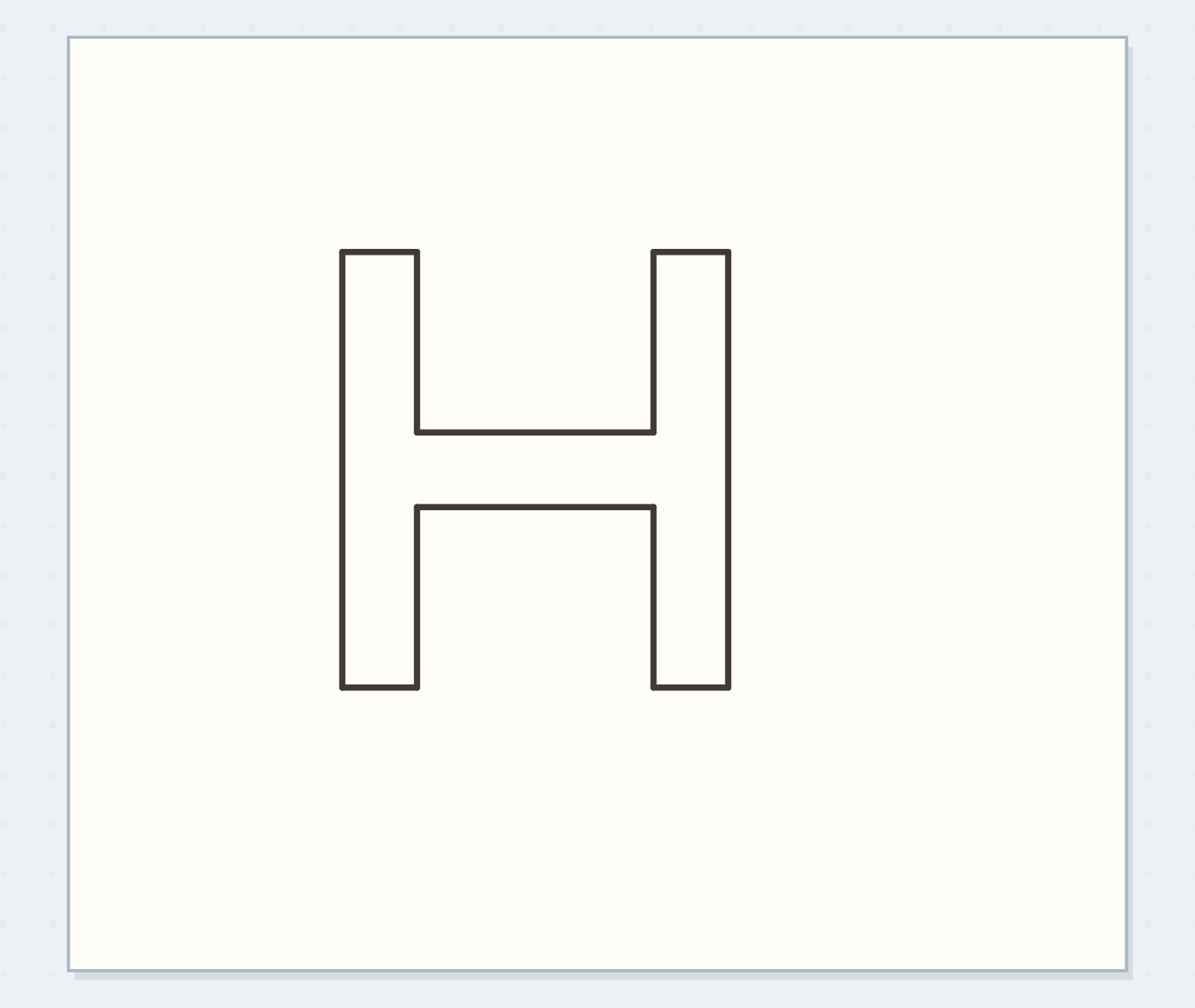
Draw three Hs using the same cap height. Make the first 5 mm wide, the second 7 mm, and the third 9 mm. Keep stem thickness and crossbar height steady. Look at the rectangular opening each one creates rather than asking which H is objectively correct. Choose the middle version for this worked example because it leaves room for a readable label on a narrow page. Copy it once beside E and L. If they feel unrelated, adjust their width before adding any more alphabet members.
Find the inconsistent family
Move the reveal control to inspect this specific change.
Mixed heights
Different heights interrupt the small family.
Letter a small FILE label
Pencil FILE above a box reserved for a clipped note. Adapt F from E by removing the bottom arm; make I narrow; use your existing L and E. Keep all four letters 12 mm high. Begin with roughly 3 mm between visible edges, then adjust by eye so the I doesn't float in an oversized empty slot. Ink each straight segment in one considered movement. The label only needs these four letters; you can extend the alphabet when another real word requires it.
Separate a shape problem from a gap problem
Cover the neighboring letters with scrap paper and inspect the awkward letter alone. If it looks fine alone, spacing may be the problem. If its crossbar is visibly higher than the family's shared position, repair that decision in pencil on a new attempt. Don't thicken the letter to make it feel more substantial: that changes the monoline premise. A long lower arm on L can also steal the following gap. Shortening that arm may help more than shifting the next letter farther away.
Write your letter-family plan
Plan only the letters the real label requires.
Letters needed next:FILE
Feature to repeat:12 mm cap height; middle crossbars
Your words have a place now.
Plan only the letters the real label requires.
- Words on this card
- 13
Change one family feature
Make a second FILE with narrower letters, keeping height and pen unchanged. Then try a lower crossbar on H and E in a separate sample. These are different experiments, so label them separately. For round letters added later, choose whether their outline should feel narrow or broad like your selected H. Expect an O to need visual adjustment rather than fitting its curve into an H-shaped box perfectly. Use a pencil skeleton first so the new letter joins an existing family instead of starting a competing one.
Before inking FILE
Order the preparation before the operation that needs its result.
One workable order
- Choose a cap heightThe chosen cap height sets the skeletons’ common top and bottom.
- Draw the needed skeletonsYou need all the skeletons present to judge the complete word width.
- Check the complete word widthInking commits the spacing chosen in the width check.
- Ink the fitted labelFinish with a small reference row and one working label.
Which check needs to come first?
The example shows one workable order. Plan only the letters the real label requires.
Save four letters you will use
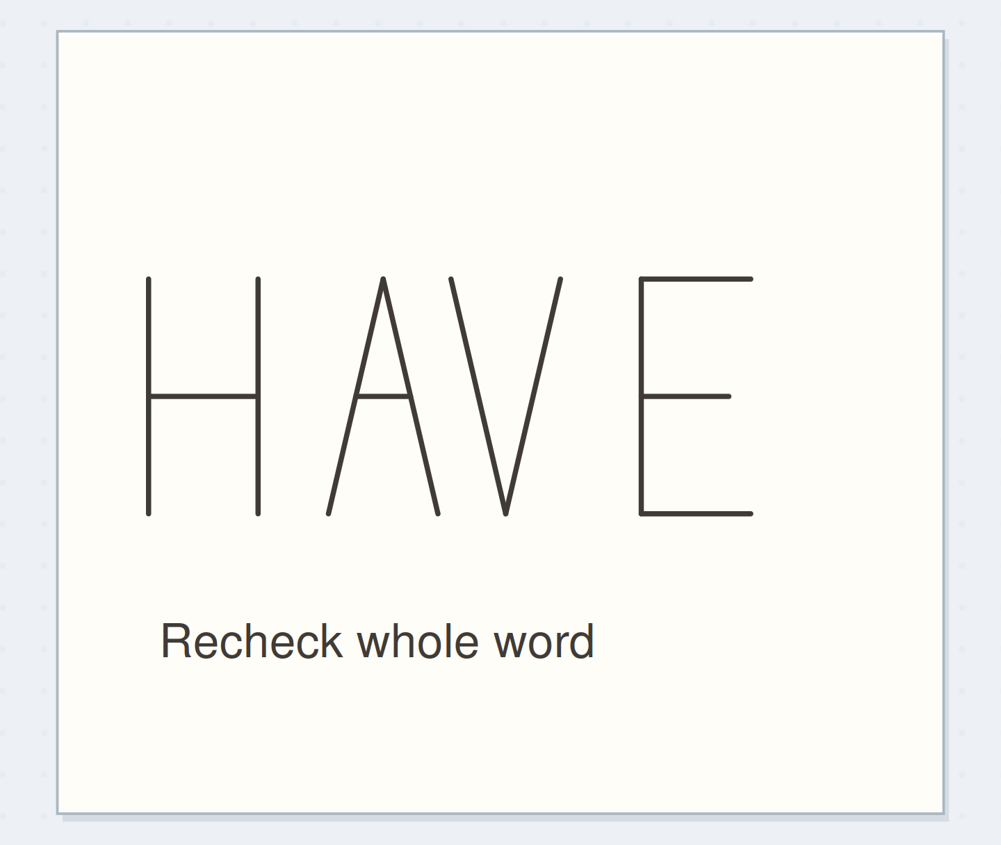
Finish with a small reference row and one working label. Circle the family feature you want to repeat in words: narrow proportions, middle crossbars, or open spacing. Stop before tracing over the row to make every line darker. A few uneven strokes can remain while the alphabet's structure is coherent. Next time you need a heading, borrow the same cap height and proportions, then judge the new word's gaps independently. Rhythm comes from repeated decisions, not from forcing every letter into the same width.
Where this idea began
Want to follow the idea further? These community discussions and maker references are a good place to start.
- Tips on letter/word spacing please?
The search excerpt discusses repeated letter forms, internal spaces, and a consistent written texture.
- 8 Lettering Styles Every Beginner Should Know
Defines monoline lettering by approximately uniform stroke width.