Gather a few things See what you’ll need
- Pencil and eraser
- Ruler
- Practice paper
- Pen
Give each height a job
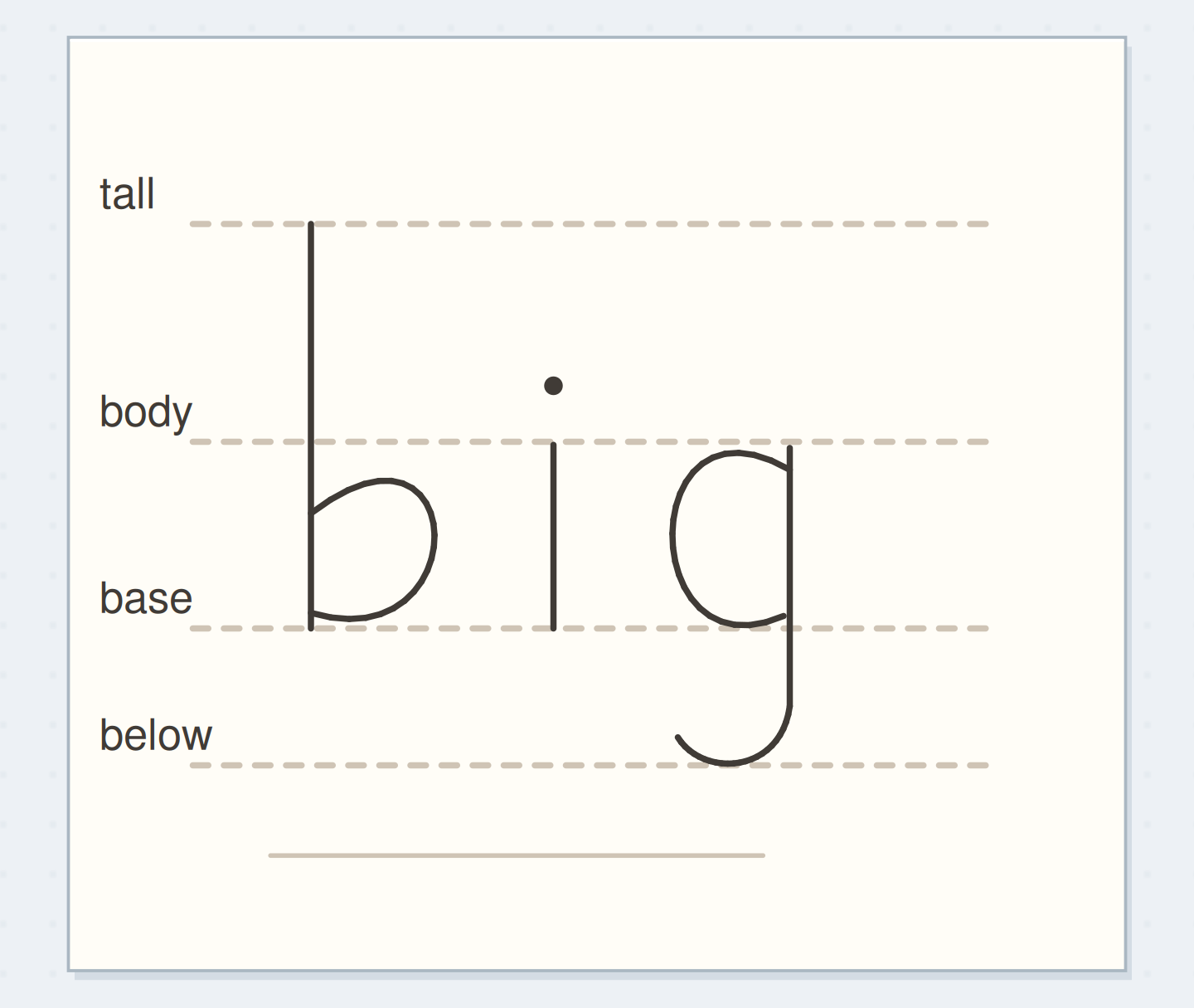
Name four horizontal levels: ascender line, body-height line, baseline, and descender line. The body-height line is often called the x-height line. Lowercase letters such as i sit mainly between it and the baseline; b and h rise above it; g extends below the baseline in many styles. Draw these parts in pencil first if the terms are unfamiliar. Lettering Daily's guideline tutorial explains these roles. The useful idea is that each line answers a different placement question instead of acting as another decorative rule.
Explore four guide levels
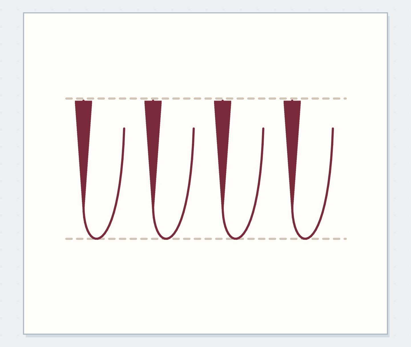
Compare full and compact ascender bands.
Four guide levels separate tall, body, and descending strokes
The b, i, and g isolate tall, body-height, and descending parts from the longer practice word.
Draw a ladder for your own letters
Pencil a baseline across an 80 mm practice strip. Add the body-height line 6 mm above it, the ascender line another 5 mm above that, and the descender line 4 mm below the baseline. Use light marks and a ruler if you have one. Write the numbers in the margin of the scrap, not in the final heading. On dot-grid paper, you can choose whole-grid intervals instead. Keep the relationships visible; exact millimeters matter less than knowing which space each letter is meant to occupy.
“Ink one heading and let it dry before erasing the pale lines.”
Follow bright through the levels
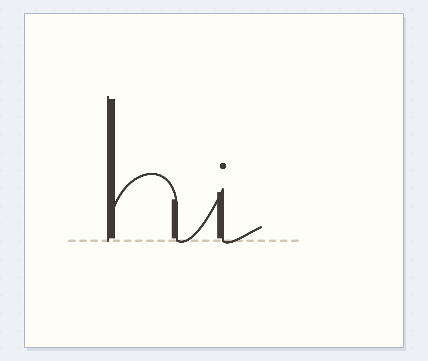
Pencil bright slowly. Let b and h reach the tall line, while the body of r, i, and g stays near the body-height line. Choose a g form you already use and let its descending portion reach into the lower band. Keep t somewhat shorter than b if that matches your style; the tall line is a limit, not a demand that every upward stroke touch it. Add the i dot with clear separation. Look for accidental height changes before correcting small stroke wobbles.
Give the descender room
Move the reveal control to inspect this specific change.
Collision below
The next line meets the descending stroke.
Try a compact second ladder
Draw another baseline and keep its body height at 6 mm, but reduce the upper band to 3 mm. Copy bright using that tighter ascender space. The tall letters should now feel more compact while the main letter bodies remain the same size. Compare the two words above a pair of ordinary writing lines. Choose the first version for a spacious title, or the compact version where the page already contains a taller element. Neither ladder is a quality ranking; each reserves a different amount of vertical space.
Untangle two neighboring lines
If a descending g nearly meets the next line's tall letter, increase the distance between baselines rather than shortening every descender unpredictably. Sketch the fullest letters from both lines at the closest point to verify the gap. If your heading climbs despite a guide, add small starting dots where the baseline meets each letter's beginning. Don't keep drawing more dark horizontal lines over the error. A new light draft with a few anchors will tell you more than a heavily ruled page that hides the letter edges.
Write your guide dimensions
These are informal exercise dimensions, not a named script standard.
Practice word:bright
Guide bands:6 mm body; 5 mm above; 4 mm below
Your words have a place now.
These are informal exercise dimensions, not a named script standard.
- Words on this card
- 14
Add deliberate variation after a stable sample
For a relaxed second heading, allow selected letters to sit a little above the baseline while keeping a recognizable body height. Mark those shifts in pencil before inking. A repeated choice, such as lifting the second short letter, differs from every letter drifting for an unrelated reason. Keep the first stable sample nearby so you can see what changed. If you prefer a steady heading, retain it. Baseline variation is an optional design decision, not a stage you need to reach after learning the ladder.
Before inking bright
Order the preparation before the operation that needs its result.
One workable order
- Mark the guide levelsThe letter draft uses the separate body, tall, base, and descending levels.
- Pencil the word against the levelsThe actual descender position determines the next line’s needed clearance.
- Check the next line clearanceCheck that clearance while the heading is still movable pencil.
- Ink the checked headingInk one heading and let it dry before erasing the pale lines.
Which check needs to come first?
The example shows one workable order. These are informal exercise dimensions, not a named script standard.
Remove only the help you no longer need
Ink one heading and let it dry before erasing the pale lines. Test the eraser on a spare mark from the same pen first. Stop when the letter bodies relate to one another and the space below the descender stays open. Record the four band positions on the practice scrap if you expect to repeat the heading. On a future page, you may need only a baseline and two end marks for body height. Keep whatever guidance saves effort; there is no prize for remembering every distance unaided.
Where this idea began
Want to follow the idea further? These community discussions and maker references are a good place to start.
- Second time trying!
The search excerpt recommends baseline and body-height guides in response to inconsistent letter proportions.
- How To Make Calligraphy Guidelines
Explains baseline, x-height, ascender, and descender guides.