Gather a few things See what you’ll need
- Ordinary pen
- Pencil and eraser
- Scrap paper
- Ruler
Start with a word you can already read
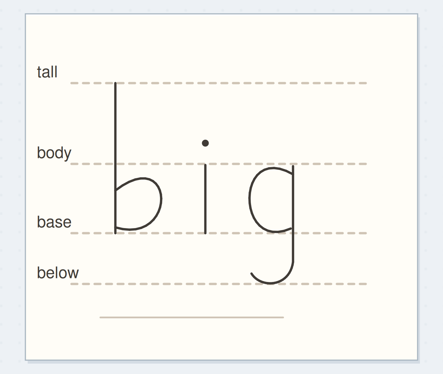
On scrap paper, pencil a baseline and another line 8 mm above it. Add a light mark 16 mm above the baseline for the tall h. Write hi in your usual joined style, slowly enough to notice where you lift the pen. Leave the i dot until later. These dimensions are practice choices, not rules for a named calligraphic script. If your h looks like an n before any extra weight, lengthen its tall stem now. Decoration won't resolve an uncertain letter skeleton.
Follow the downstroke map
Choose a stage of the hi construction.
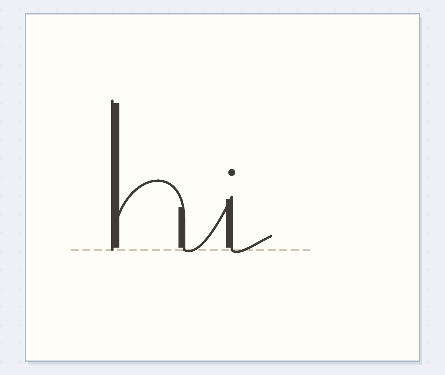
Thin hi skeleton
Read the unweighted hi before changing any stroke. The connector rises and the i dot remain separate marks.
Find the actual downward movements
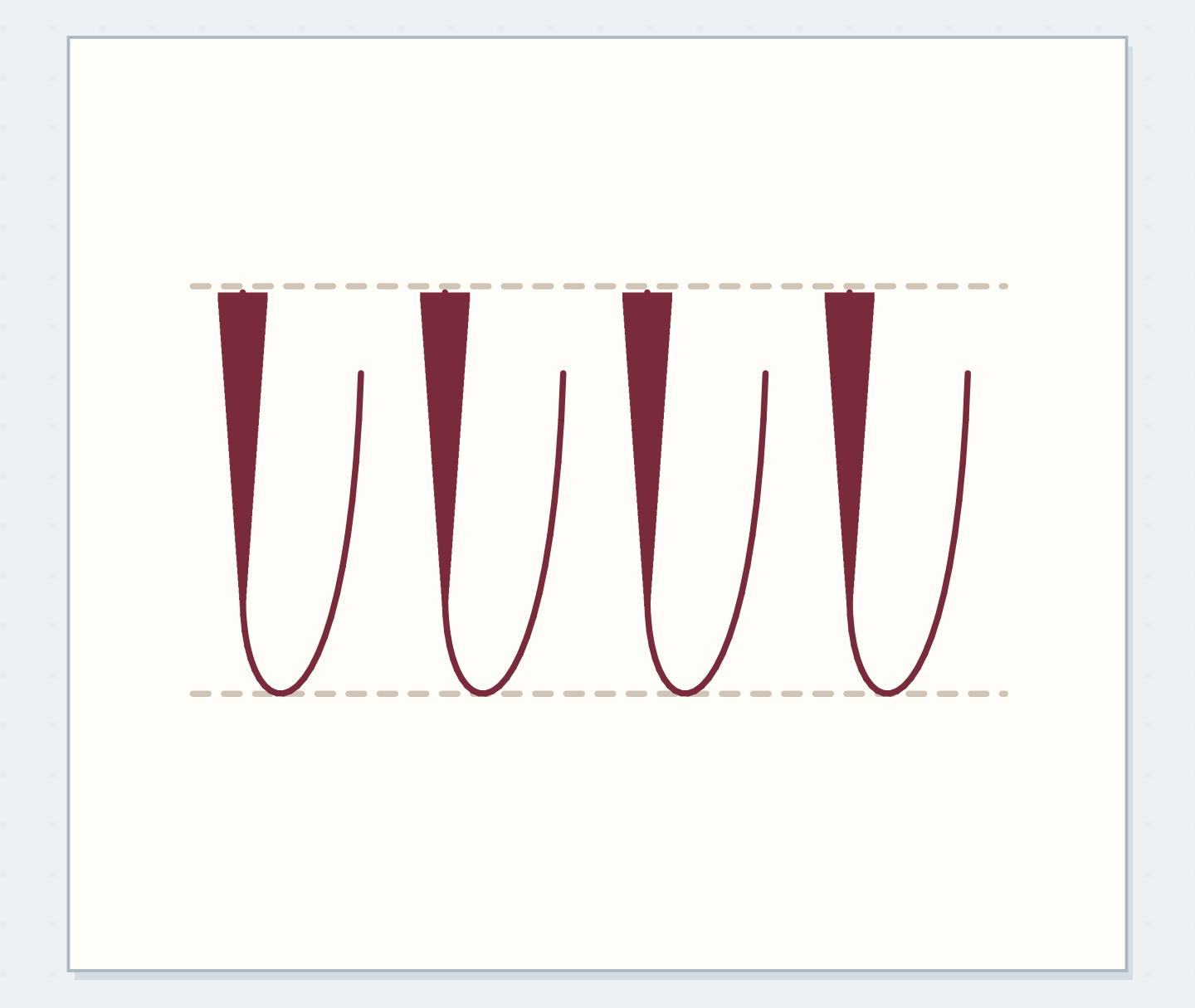
Retrace the word in the air with a capped pen. Where your hand travels toward the baseline, mark a tiny pencil arrow beside that stroke. The tall descent of h, the descent after its shoulder, and the i stem each receive attention. The joining rises stay thin. A curved stroke may contain both directions, so don't classify an entire loop as thick. Lettering Daily's faux-calligraphy tutorial supports this thin-upstroke, thick-downstroke distinction; the arrows here are a temporary planning aid for this particular word.
“Stop when the word reads immediately, its thin joins remain open, and its three main downstrokes feel related.”
Make room before making ink
Choose an added width of roughly 1 mm. Pencil the second edge beside each marked descent, joining it smoothly into the original stroke at its top and bottom. Place the strip on whichever side preserves the letter's inside space and neighboring gap. That can mean changing sides between letters. Look especially inside the h shoulder: its open area should still look deliberate. If it becomes a narrow slit, reduce the added width across the word instead of squeezing just that one opening.
See how weight changes the opening
Move the reveal control to inspect this specific change.
Crowded h
Wide strips shrink the h opening.
Turn the map into a finished hi
Ink the thin skeleton first, following your pencil drawing rather than repeatedly scratching along it. Add the outer edges of the three planned strips. Fill each strip with short, controlled marks, staying inside its outline. Complete the i dot as a small separate mark with a visible gap below it. Let the ink dry before erasing guides, testing dryness on the scrap margin rather than rubbing the heading. Compare the three thick strokes together; small differences are fine, but one should not dominate the whole word.
Fix weight without closing a loop
A thick stroke that looks slightly narrower can receive a small addition along its outside edge. A stroke already too wide is harder to shrink, so don't enlarge every other stroke automatically. Leave the first attempt as a useful specimen and redraw the word with more spacing. If a connector has become thick, preserve its current edge and simplify the adjacent loop next time. Once the pen begins scraping or the paper surface lifts, stop filling that area. An uneven patch is less disruptive than a torn letter.
Write your downstroke plan
Write the specification, then draw it on paper; this card does not render handwriting.
Word to letter:hi
Body height and added width:8 mm body; about 1 mm added width
Your words have a place now.
Write the specification, then draw it on paper; this card does not render handwriting.
- Words on this card
- 17
Give one heading the treatment
Try the same process with “this week,” penciled at the size you will actually use. Map descents letter by letter; don't copy the three-arrow arrangement from hi. Place the phrase above two ordinary handwritten lines so you can judge its job as a heading. Leave enough clearance for tall stems and descending letters in neighboring lines. If the phrase needs reducing to fit, reduce its added weight as well. A 1 mm strip can be modest on a large word and overwhelming on a small one.
Before filling the hi
Order the preparation before the operation that needs its result.
One workable order
- Identify the descending movementsThe second edge belongs beside identified descents, so map those movements before reserving width.
- Reserve added width in pencilFilling uses the pencil strips whose width and openings have already been checked.
- Fill the planned stripsErasing must wait until the filled ink is dry enough for the tested eraser.
- Erase dry-ink guidesStop when the word reads immediately, its thin joins remain open, and its three main downstrokes feel related.
Which check needs to come first?
The example shows one workable order. Write the specification, then draw it on paper; this card does not render handwriting.
Keep the useful reference
Stop when the word reads immediately, its thin joins remain open, and its three main downstrokes feel related. You don't need every filled strip to be mechanically identical. Keep one successful hi beside a note such as “8 mm body, narrow added strips.” That gives you a repeatable starting point next time without demanding an entire alphabet sheet. For the next attempt, change one thing only: the added width, the body height, or the spacing. A small comparison tells you more than a page of increasingly crowded corrections.
Where this idea began
Want to follow the idea further? These community discussions and maker references are a good place to start.
- Can anyone give me suggestions on how to improve my faux calligraphy?
The search excerpt shows a beginner asking about faux-calligraphy consistency and replies discussing guides and thick descents.
- How To Do Calligraphy With A Regular Pen
Supports adding weight to descending strokes while retaining thin rising joins.