Gather a few things See what you’ll need
- Pencil and eraser
- Scrap paper strips
- Pen
- Ruler
Look between the marks
Draw a pair of upright Hs about 12 mm high, leaving a 3 mm gap between their nearest stems. Beside them, draw A and V with the same nearest-edge gap. The wedge-shaped space between the diagonals will differ from the upright channel between Hs. Neither sample needs a decorative outline. Lightly shade only the gaps in pencil to see their shapes. Community calligraphy discussions repeatedly ask about this distinction, and block-lettering tutorials describe spacing as an optical judgment rather than a series of equal measurements.
Move one pair at a time
Watch AV tighten while the letters stay the same size.
Even measured starts leave a wide diagonal gap
The same starting gaps leave conspicuous white space around the diagonals.
Make spacing reversible
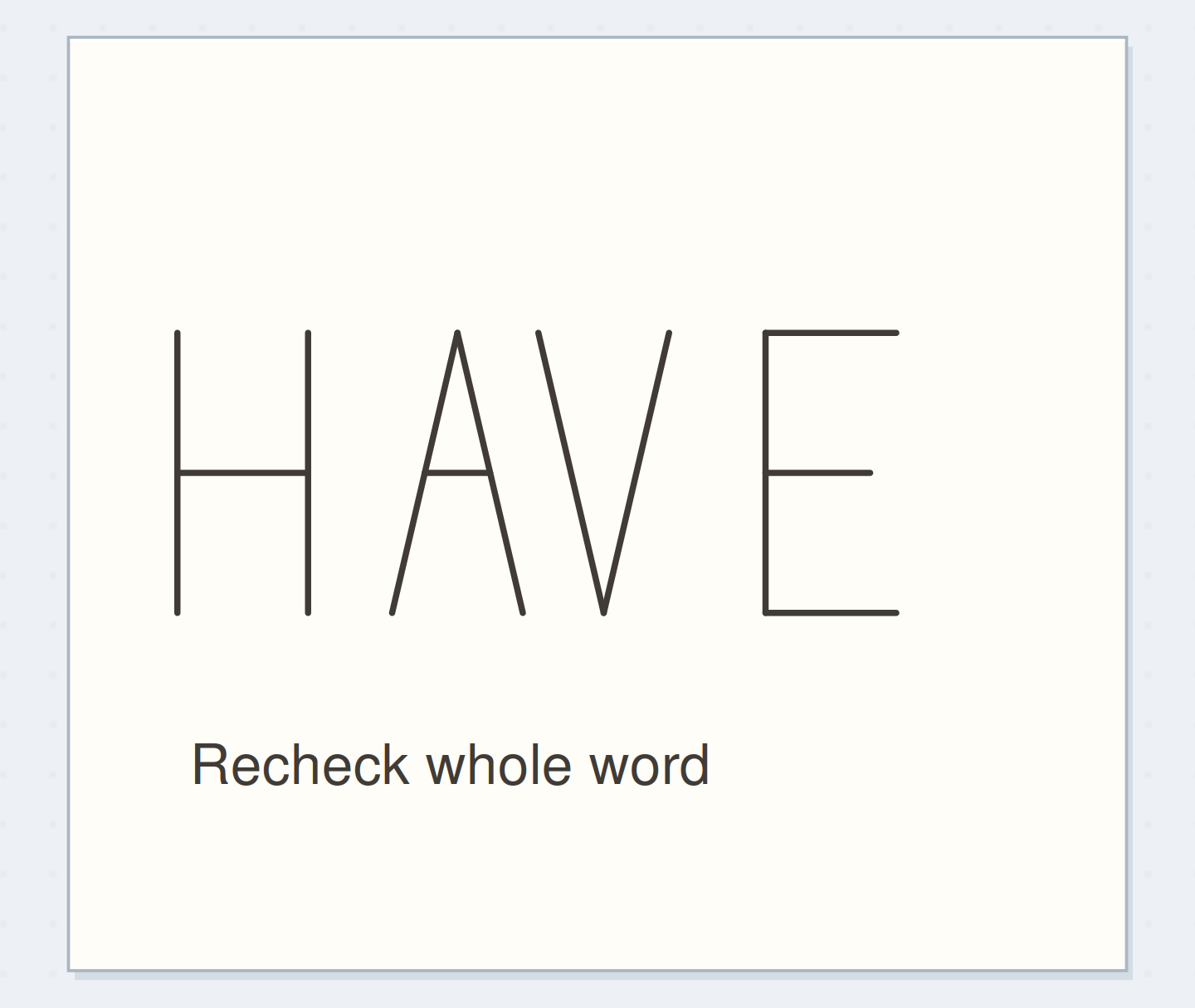
Write H, A, V, and E on separate scraps with plenty of paper around each letter. Use the same height and stroke weight. Overlap the paper margins as you arrange HAVE along a penciled baseline; only the visible letter positions matter. You can also redraw the word lightly several times if cutting scraps feels like more work. Keep the baseline fixed during these trials. Changing vertical alignment at the same time makes it harder to see whether a spacing adjustment helped.
“Keep the successful HAVE with a note such as “AV closer; room after H.” Don't turn its millimeter distances into universal spacing rules for another style.”
Adjust the most conspicuous hole
Start with generous gaps and look for the largest apparent interruption. Move the V toward the A in small amounts, watching the triangular white area shrink. Then inspect HA and VE without assuming they should share the same movement. Avoid touching strokes unless joined lettering is your deliberate aim. The goal here is a readable word with an even sense of pace. Keep checking HAVE as a whole; an individually beautiful AV pair can still look too tight beside the rest of the letters.
Compare the whole word
Move the reveal control to inspect this specific change.
Loose diagonal gap
The diagonal gap interrupts the word.
Fit HAVE in a real heading slot
Pencil a 55 mm wide heading area, then assemble HAVE at 12 mm high within it. Leave visible space at both ends instead of using the full width immediately. After adjusting the pairs, find the midpoint of the complete word and compare it with the heading area's midpoint. Shift the word as a group if needed. Only then copy its positions onto the page. This order prevents the last letter from being squeezed simply because the first three were committed too early.
Repair the draft without stretching a letter
If the word is too wide, first check for unusually loose gaps. If all the gaps are already comfortable, redraw the whole word a little smaller or choose a narrower letter family. Compressing only the final E gives it a different personality. If the word is too short, leave wider outer margins rather than automatically spreading every letter apart. An inked word with one awkward gap can remain readable; use the next heading to test the correction instead of adding an ornament into the hole.
Write your spacing observation
The field records an observation rather than a universal spacing formula.
Heading word:HAVE
Pair to inspect:AV first, then HA and VE
Your words have a place now.
The field records an observation rather than a universal spacing formula.
- Words on this card
- 12
Check the intended reading distance
Hold the page where you normally read your journal. Look away briefly, then return and say the word once. Notice which pair interrupts that first reading. A close inspection may reveal tiny irregularities that disappear at normal distance, while a large gap remains obvious. Turn the page upside down for a secondary shape check if useful, then return it upright before deciding. Familiar letter recognition matters too; the goal is a usable word, not merely a row of evenly distributed dark shapes.
Before fixing the letter positions
Order the preparation before the operation that needs its result.
One workable order
- Draft all lettersPair spacing can only be compared once both neighboring letter shapes exist.
- Compare and move letter pairsA locally improved pair still needs checking in the complete word.
- Check the whole word in its slotInk preserves the selected whole-word positions.
- Ink the chosen positionsKeep the successful HAVE with a note such as “AV closer; room after H.” Don't turn its millimeter distances into universal spacing rules for another style.
Which check needs to come first?
The example shows one workable order. The field records an observation rather than a universal spacing formula.
Record an observation, not a formula
Keep the successful HAVE with a note such as “AV closer; room after H.” Don't turn its millimeter distances into universal spacing rules for another style. Wider strokes, narrower letters, and a different word all change the empty shapes. Stop when no single pair attracts attention before the heading itself. For a next practice, choose a word containing one round letter and two straight stems. Apply the same compare-and-adjust process, using the inside openings of the letters as an additional visual reference rather than a fixed measuring unit.
Where this idea began
Want to follow the idea further? These community discussions and maker references are a good place to start.
- Help with spacing
The search excerpt discusses judging white areas between differently shaped letters.
- How to Draw Block Letters: A Beginner’s Guide to Sans Serif Lettering
Supports skeleton-first block construction and optical rather than purely measured spacing.