Gather a few things See what you’ll need
- Pen
- Pencil and eraser
- Scrap paper
- Journal
Decide what the reader should find first
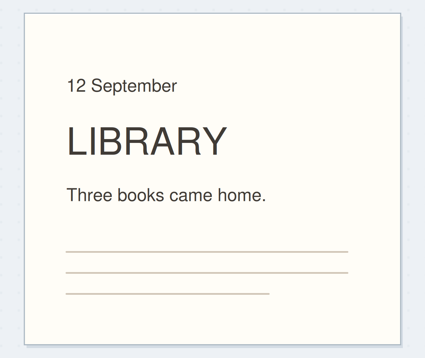
Write the three pieces of information in plain handwriting on scrap: “12 September,” “LIBRARY,” and “Three books came home.” Say which one identifies the entry. In this example LIBRARY is the title, the date helps locate it, and the sentence adds a detail. That decision comes before choosing lettering styles. The Postman's Knock introduces layout planning as part of lettering composition, while journal discussions show how scale and placement can resolve an uncertain page opening. Our three-line arrangement is an original application of that broader idea.
Assign the three text roles
Follow date, title, detail, and then ordinary writing.
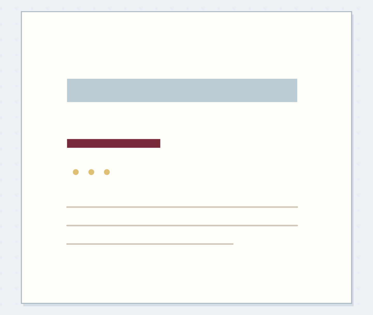
The three information roles begin at similar sizes
The three text lines are present, but their similar size gives the title little emphasis.
Make a clear but manageable size difference
Try the date at your normal small handwriting size, the title around 10 mm high, and the descriptive line around 4 mm high. These are convenient test sizes, not a typographic law. Keep the title's letters simple enough to draw consistently with the same pen. If your normal writing is much larger, scale the whole arrangement to suit it. An extremely tiny date won't serve its locating job merely because it makes the title appear grander. Every line still needs to be readable.
“Look away and return to the page.”
Give the group one visible edge
Pencil a shared left margin for the three lines. Place the date first, leave about 3 mm of clear paper, add the title, then leave about 5 mm before the descriptive line. The larger gap below the title separates its heavier shape from the sentence. Compare this with a centered version on scrap if you prefer symmetry. Choose one alignment for this group. Combining a left-aligned date, a nearly centered title, and an indented sentence can work, but it adds decisions before the basic hierarchy is established.
Choose a clear entry point
Move the reveal control to inspect this specific change.
Competing support text
Supporting information is visually larger than the title.
Make the library opening
Reserve a 90 mm wide area at the top of the entry. Pencil LIBRARY at the chosen height and check its full width before inking. Place the date and sentence using the same left edge. Below the group, leave a little more space than the gap within it before starting ordinary journal writing. Read the page once from top to bottom. The title should identify the entry, while the nearby date and detail feel attached to it. No surrounding box is needed to show that relationship.
Reduce competition between the lines
If the date attracts attention first because it is very dark, redraw the draft with smaller date letters or less weight. If the descriptive sentence is nearly as large as the title, reduce it before adding decoration to the title. If LIBRARY doesn't fit, shorten the title to BOOKS or redraw the whole word slightly smaller. Don't squeeze only its last letters. For an already inked group, you can strengthen hierarchy by leaving more space before the body text and keeping subsequent headings quieter.
Write your three-line opening
These are editable words for your hand-lettered layout, not a font preview.
Date:12 September
Title:LIBRARY
One detail:Three books came home.
Your words have a place now.
These are editable words for your hand-lettered layout, not a font preview.
- Words on this card
- 11
Carry the roles into another entry
Try “18 September,” “REPAIRED,” and “The loose chair leg” using the same roles. The title has a different width, but the shared left edge still works. A longer description may become two lines at the same small size rather than one crowded line. Keep the distance between those two description lines smaller than the gap before the main body so they remain one unit. This is where a small lettering system earns its place: it can accept real wording without demanding a decorative shape of a fixed size.
Before inking the opening
Order the preparation before the operation that needs its result.
One workable order
- Assign each line a roleThe title’s assigned role determines the size used in its draft.
- Draft the title at its chosen sizeThe drafted title must exist before its complete group width can be checked.
- Check complete group widthInk the group after its words fit the reserved space.
- Ink the fitted groupLook away and return to the page.
Which check needs to come first?
The example shows one workable order. These are editable words for your hand-lettered layout, not a font preview.
Check the hierarchy with a quick glance
Look away and return to the page. Name the first line you notice, then the information you find next. Stop when that order matches the jobs you assigned and no line becomes hard to read. Save the three approximate sizes in a tiny reference note if useful. You don't need a different font for every level; a plain pen can provide enough variation through scale and spacing. On a later page, change the title treatment only after checking that the smaller supporting lines still belong to the same group.
Where this idea began
Want to follow the idea further? These community discussions and maker references are a good place to start.
- First cover page. Not sure what to add…
The search excerpt discusses title and calendar scale, penciled layout, and spacing in a journal page opening.
- Calligraphy and Lettering Layout Tips
The accessible introduction frames layout planning as part of lettering composition; the three-line library exercise is original.