Gather a few things See what you’ll need
- Three existing colors
- Paper scraps
- Pencil and ruler
- A retained visual reference
- Usual writing pen
Borrow a color relationship from something nearby
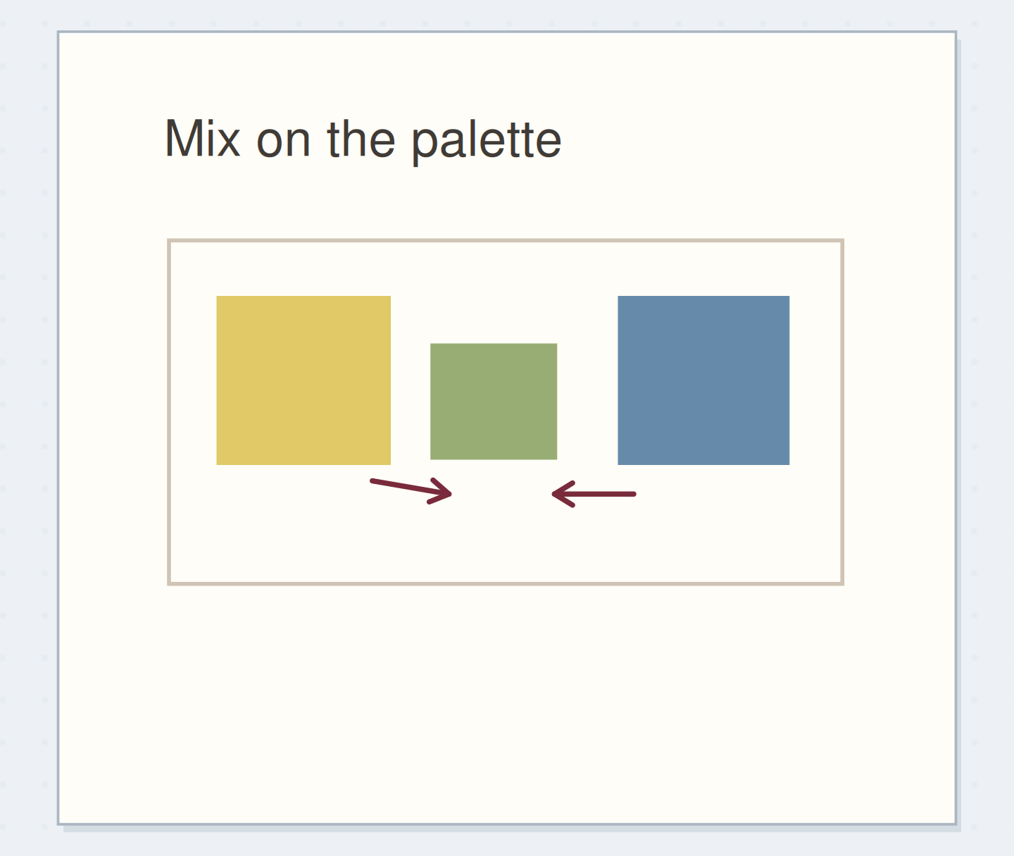
Choose an existing scrap, ticket, photograph, or familiar object with a color combination you enjoy. Select three approximate colors from your pencils or markers; exact matching isn't necessary. Journal palette discussions show readers looking for a useful starting point among their existing materials, while Tombow's palette tutorial begins with inspiration and then tests actual swatches. Keep the chosen reference nearby, but don't try to reproduce every color in it. The three-color limit is an editorial constraint for this exercise, helping you make a usable page recipe with a small set of decisions.
Assign the colors different jobs
Swap roles, then change area while holding the colors fixed.
Blue gets the broad area; rust is smaller; ochre repeats in tiny marks
Blue has the broad role, rust the smaller mark, and ochre the tiny repeated detail.
Give each accent a different amount of work
For the example, use muted blue for the broadest accent, rust for a smaller heading detail, and ochre for tiny repeated marks. Write those jobs beside the swatches. Your ordinary dark writing is a separate practical tool, not a fourth decorative role you must somehow exclude. Think in areas: a blue patch 40 mm wide occupies far more visual space than three ochre dots. Equal-size swatches are useful for identifying colors, but they don't predict the balance of an arrangement where the colors have different jobs.
“Stop after selecting one miniature and using its three roles in an entry.”
Swatch the way you intend to draw
If the blue accent will be a light pencil layer, make its sample with light pencil rather than a dense block. If a marker will be diluted on a palette, sample that diluted application on suitable paper. Tombow specifically recommends matching the swatch method to the final technique because adding water can reveal a different appearance. Let wet samples dry before choosing. Keep color names or tool descriptions close to each swatch. A palette that looks good only under an application you won't use is less helpful than a modest combination you can reproduce easily.
Move beyond equal squares
Move the reveal control to inspect this specific change.
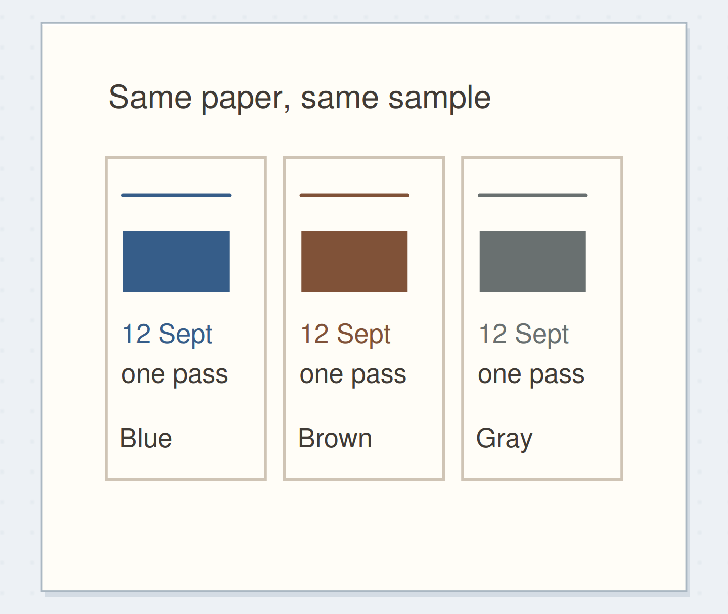
Equal swatches only
Equal swatches identify hues without showing their page roles.
Arrange a small page recipe
Draw three page thumbnails, each 30 mm wide and 45 mm high. In the first, make a broad blue heading band, a short rust line, and three small ochre marks. In the second, swap blue and rust while leaving the shapes unchanged. In the third, keep the original roles but halve the broad band's area. Add a few gray pencil lines to stand for ordinary writing. Compare the thumbnails at once. For this example, choose the third if it keeps the color present while leaving the entry's writing area more open.
Use the recipe on a real entry
Scale the chosen arrangement to the actual page without enlarging every accent mechanically. A small group of dots may remain small while the heading band gets longer. Put the palette reference beside the notebook and repeat the assigned jobs consistently across the entry. If a saved ticket introduces another hue, let it remain part of the ticket instead of automatically adding that hue to every new detail. The recipe organizes your own marks; it doesn't require the entire world recorded on the page to obey a strict color count.
Write your color roles
Your usual writing pen remains a practical separate tool.
Broad accent:Muted blue heading band
Smaller accent:Rust date line
Tiny repeated detail:Ochre dots
Your words have a place now.
Your usual writing pen remains a practical separate tool.
- Words on this card
- 16
Quiet a color by changing its role
If rust looks too dominant, reduce its area or move it to a smaller detail before replacing the whole palette. If ochre disappears beside your writing, give it a slightly larger mark or use it where it doesn't need to communicate text. Readability questions can be explored separately in the existing color-value guide. This exercise asks about allocation and repetition, so avoid turning every adjustment into a search for maximum contrast. You can keep an appealing color simply as a small accent when it doesn't work well as a broad field.
Before using the palette
Order the preparation before the operation that needs its result.
One workable order
- Identify three available colorsThe swatches use colors selected from the available supplies.
- Swatch the intended applicationsThe role-based thumbnails should use the tested application, not an imagined swatch color.
- Compare role-based thumbnailsThe real entry follows the allocation chosen from the thumbnail comparison.
- Use the selected allocationStop after selecting one miniature and using its three roles in an entry.
Which check needs to come first?
The example shows one workable order. Your usual writing pen remains a practical separate tool.
Name a recipe you can recognize
Stop after selecting one miniature and using its three roles in an entry. Give it a practical name such as “blue band, rust date, ochre details.” Save the actual swatches with that note; a poetic palette name alone won't tell you which pen to pick up next month. When revisiting the recipe, change one role or area and compare it with the original. You don't need a new palette for every page. A small familiar set can accept different subjects when its colors have flexible but recognizable jobs.
Where this idea began
Want to follow the idea further? These community discussions and maker references are a good place to start.
- color palatte
The search excerpt suggests choosing journal colors from existing paper, tape, or another reference.
- Create Custom Color Palettes Using Dual Brush Pens
Recommends choosing inspiration and swatching with the same application method intended for the final work.