Gather a few things See what you’ll need
- Pencil and eraser
- Scrap paper strips
- Pen
- Ruler
Choose an exercise 4 things to try as you read
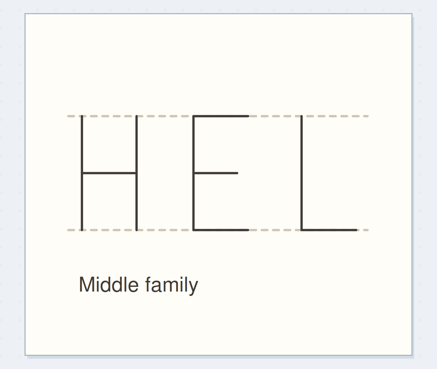
Look between the marks
Draw two Hs about 12 mm high with 3 mm between their nearest stems. Draw AV beside them with the same nearest-edge gap. Shade just the gaps lightly: diagonal wedges differ from upright channels. Community calligraphy questions and block-lettering tutorials discuss this optical judgment. The ruler supplies a starting distance; the shapes around the letters determine how that distance appears.
Compare the optionsMove one pair at a time
Move one pair at a time
Watch AV tighten while the letters stay the same size.
Read the words in this example
- Equal start gaps
Even measured starts leave a wide diagonal gap
The same starting gaps leave conspicuous white space around the diagonals.
ONE WORKED EXAMPLE
The last E needs room too
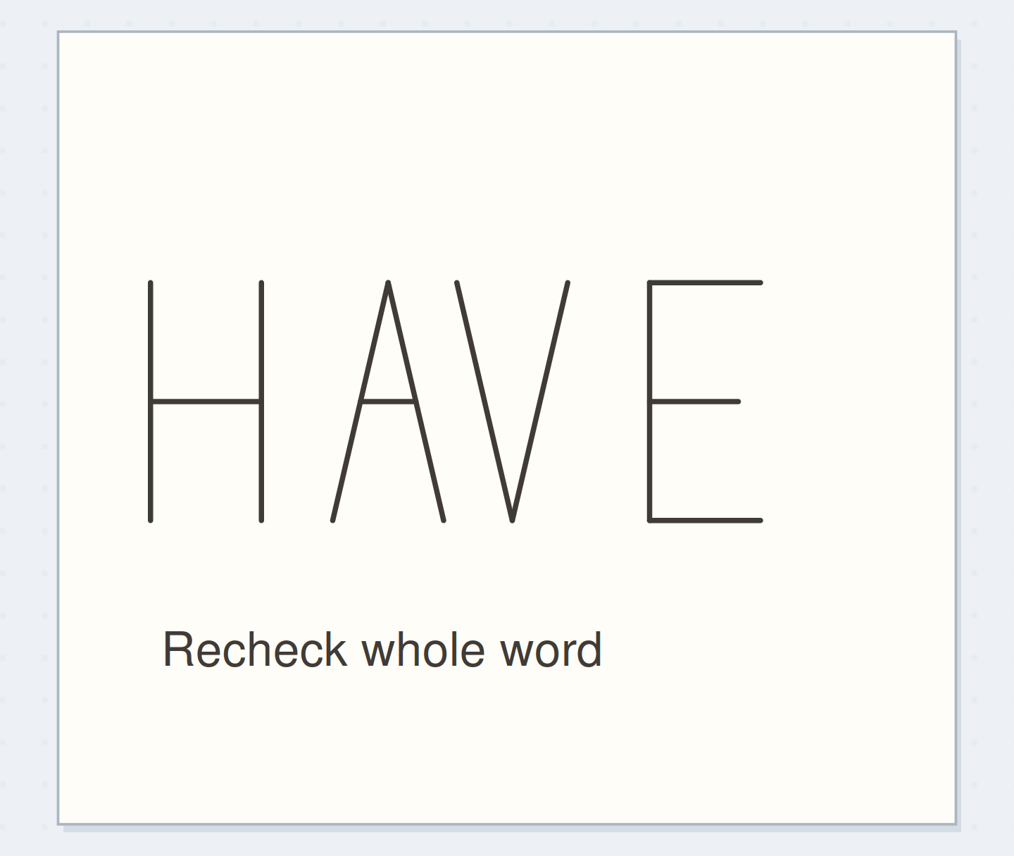
You have arranged HAVE on scraps for a 55 mm heading area. The pairs read comfortably, but the full word still extends beyond the right edge of the slot.
Before
The first three letters fit, tempting you to make only the final E much narrower while leaving the others unchanged.
After
You keep the comfortable relative gaps and try a slightly narrower drawing of the whole word at the planned 12 mm height. Before tracing, you check the loose arrangement inside the 55 mm slot, leaving outer margins and keeping E in proportion with the other letters.
What changed—and what to check
The space problem belongs to the whole word. Resizing the arrangement preserves its rhythm better than distorting the final letter alone.
Try this check. Look away, then read HAVE once; check both outer margins before tracing any letter into its final position.
Make spacing reversible
Write H, A, V, and E on separate scraps with generous margins, using matching height and stroke weight. Overlap paper margins to arrange HAVE along a penciled baseline. Only visible letter positions matter. Alternatively, redraw several light trials if cutting adds work. Keep the baseline fixed throughout so vertical changes do not confuse your judgment of horizontal spacing.
“The ruler supplies a starting distance; the shapes around the letters determine how that distance appears.”
Adjust the most conspicuous hole
Start with generous gaps and find the white space that interrupts HAVE most. Move V toward A in small steps, keeping the baseline fixed. Then inspect HA and VE rather than assuming they need the same adjustment.
Look at the whole word after each move. A compact AV can make the space after H feel larger by comparison. Keep strokes apart: the aim here is an unjoined heading with an even rhythm, not identical measured gaps.
See the differenceCompare the whole word
Compare the whole word
Move the reveal control to inspect this specific change.
Read the words in this example
Loose diagonal gap
- Equal start gaps
Loose diagonal gap
The diagonal gap interrupts the word.
Fit HAVE in a real heading slot
Mark a 55 mm-wide heading area and arrange HAVE at 12 mm high inside it, preserving space at both ends. After adjusting pairs, compare the full word’s midpoint with the area’s midpoint and shift it as a group. Copy positions only after the word fits. That sequence leaves the last E room instead of squeezing it around three letters already inked.
GO A LITTLE FURTHERRepair the draft without stretching a letter
Repair the draft without stretching a letter
If the word runs beyond its heading slot, first reduce gaps that look unusually loose. When the spacing already reads well, redraw the whole word smaller or use narrower proportions. Squeezing only the final E makes one letter pay for a decision about the whole word.
A short word can keep wider outer margins. If a readable inked gap bothers you, note it for the next trial instead of adding ornament merely to fill the hole.
Write your versionWrite your spacing observation
Write your spacing observation
The field records an observation rather than a universal spacing formula.
Heading word:HAVE
Pair to inspect:AV first, then HA and VE
Your words have a place now.
The field records an observation rather than a universal spacing formula.
- Words on this card
- 12
Check the intended reading distance
View the page at your usual reading distance. Look away, then return and say the word once, noticing any pair that interrupts. Tiny close-up irregularities may disappear while a large gap remains. An upside-down view can provide a second shape check, but return upright before deciding: recognizing the letters comfortably remains part of successful spacing.
Try a what-ifThe word fits, but it sits off-center
The word fits, but it sits off-center
Preserve the pair spacing you have already chosen.
HAVE fits inside its heading area and the inner gaps read evenly. There is much more blank space to the left of the whole word than to the right.
Compare the three choices
Which adjustment addresses this remaining issue?
- Open the HA gap until the left side feels fuller.
That changes an inner pair that already works. The unequal outer margins concern the placement of the whole word.
- Enlarge H while leaving AVE in place.
That changes one letter’s proportions and its neighboring gap. You can adjust placement without redrawing a letter.
- Shift the complete loose word toward the larger margin.
Moving the group left balances the outer space while preserving the selected gaps. Check the full word again before copying it.
Adjust a word’s position as a group when its internal spacing already works.
What would you try?
Choose an option to see what it would do. You can explore all three.
GO A LITTLE FURTHERKeep the spacing decision beside the word
Keep the spacing decision beside the word
Save HAVE with a short observation such as “AV closer; leave room after H.” Do not turn its millimeter gaps into a rule for a different word or heavier letters.
On your next heading, move one troublesome pair on scraps before copying the whole arrangement. Stop adjusting when you read the word before noticing a particular gap; the saved example is a reminder of how you decided, not a template every heading must match.
Something for a future page?
The Washi Tape ShopAffiliate links: we may earn a commission if you buy through these links.
Where this idea began
The method references explain the underlying ideas. Community links show the questions and experiences that helped shape this guide; they are not a popularity ranking. The worked examples here are our own.
- Background mention — search excerpt onlyHelp with spacing
This link provides background context. The full discussion was not reviewed, so it is not evidence that this exact method is popular or effective.
- Method referenceHow to Draw Block Letters: A Beginner’s Guide to Sans Serif Lettering
Supports skeleton-first block construction and optical rather than purely measured spacing.