Gather a few things See what you’ll need
- One ordinary pen
- Pencil and eraser
- Practice paper
- Ruler
Choose an exercise 4 things to try as you read
Choose relatives before an alphabet
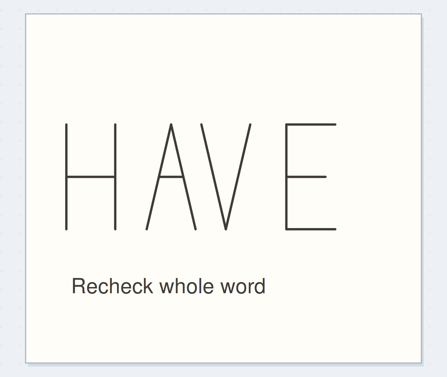
Start with straight-sided H, E, L, and I. H establishes stems and a crossbar; E adds unequal horizontal arms; L removes most of that structure; I is narrow. Use one ordinary pen and leave the sample unshaded. Lettering Daily describes monoline by its uniform stroke width. Holding that weight steady lets you judge whether the proportions belong together.
Compare the optionsCompare a letter family
Compare a letter family
Change letter width while holding height steady.
Read the words in this example
- Narrow family
Shared cap height; letter width changes together
The letters share a top and baseline; their narrow widths make a compact family.
ONE WORKED EXAMPLE
The I that looks stranded
You have penciled FILE at 12 mm high using one pen width and related F, L, and E shapes. The narrow I seems detached from the rest of the word.
Before
Equal boxes gave every letter the same allotted width, leaving much larger visible spaces on either side of the narrow I.
After
The new FILE keeps the 12 mm height and the same letter shapes. You start with roughly 3 mm between visible edges, then adjust the two gaps around I by eye until it belongs to the word.
What changed—and what to check
The adjustment changes spacing rather than stroke weight or letter design, so the family stays consistent while the word becomes easier to read.
Try this check. Cover I’s neighbors, then uncover them: check whether the awkwardness appears in the shape itself or only in the surrounding gaps.
Establish a shared height
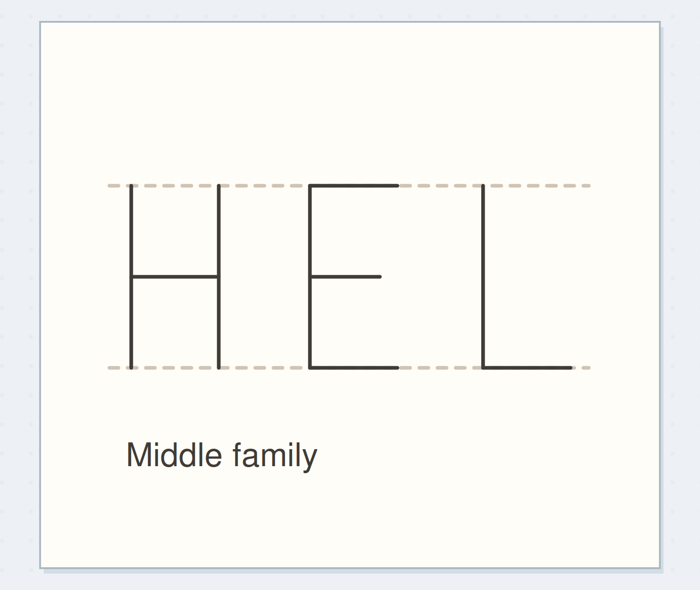
Draw pencil guides 12 mm apart. Try H, E, and L in loose boxes about 7 mm wide, with a much narrower box for a plain I. Place H’s crossbar near the middle and E’s shorter middle arm nearby. The guides help their structures agree; they do not mean that every letter needs the same width or the same space around it.
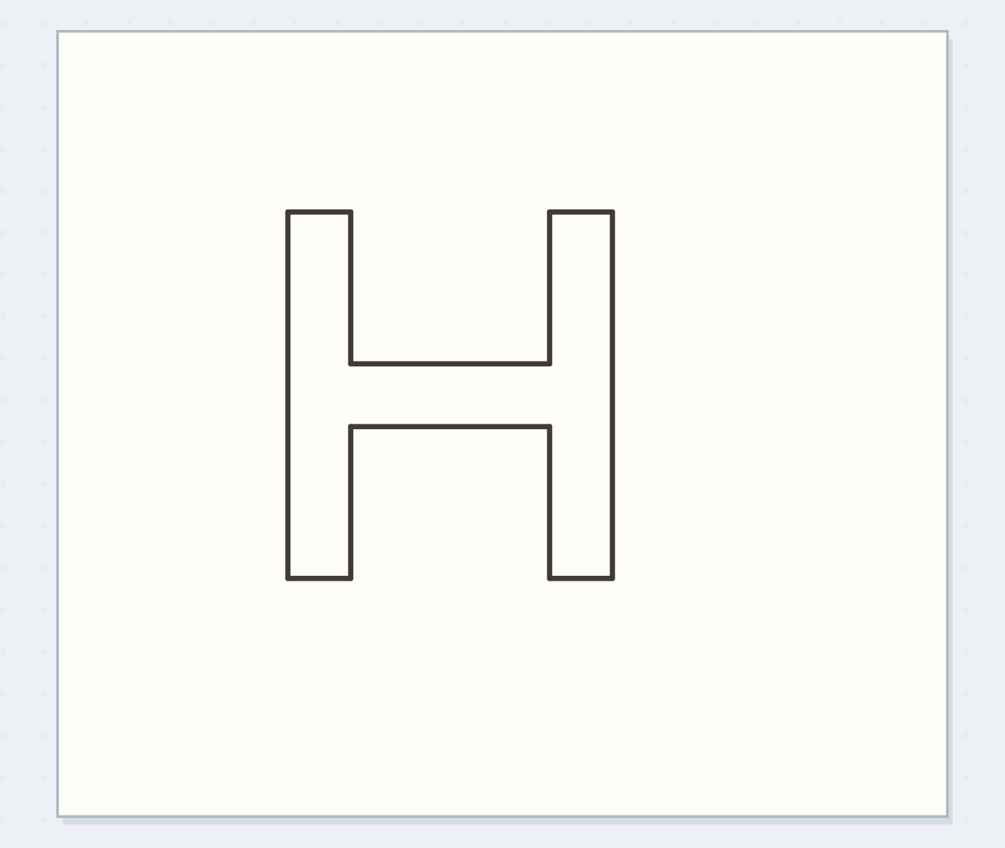
Compare three versions of H
Draw three Hs at the same height, with widths of 5 mm, 7 mm, and 9 mm. Keep stroke thickness and crossbar height fixed and compare their interior rectangles. Choose the middle version for this narrow-page example. Copy it beside E and L. If the family feels inconsistent, adjust those widths before adding more letters; no H proportion is universally correct.
See the differenceFind the inconsistent family
Find the inconsistent family
Move the reveal control to inspect this specific change.
Read the words in this example
Mixed heights
There are no written words in this view. The explanation below describes what changes.
Mixed heights
Different heights interrupt the small family.
Letter a small FILE label
Pencil FILE above a clipped-note box. Adapt F from E by dropping the bottom arm, keep I narrow, and use your L and E at the shared 12 mm height. Start with roughly 3 mm between visible edges, adjusting by eye so I does not float. Ink straight segments in considered movements. Add alphabet members when another real label needs them.
Once the letter shapes agree, compare the spaces between the actual letter pairs.
Separate a shape problem from a gap problem
Cover the neighboring letters and inspect the awkward letter alone. If its shape reads clearly, uncover the word and compare the spaces on either side. A long L arm may be using most of one gap; shortening it in a fresh pencil draft can help more than moving the next letter. Avoid retracing a correction in ink, which changes the uniform stroke weight.
Write your versionWrite your letter-family plan
Write your letter-family plan
Plan only the letters the real label requires.
Letters needed next:FILE
Feature to repeat:12 mm cap height; middle crossbars
Your words have a place now.
Plan only the letters the real label requires.
- Words on this card
- 13
GO A LITTLE FURTHERChange one family feature
Change one family feature
Try a narrower FILE while keeping pen and height unchanged. Test lower H and E crossbars separately and label the samples. When adding round letters, choose narrow or broad proportions related to the selected H. Expect O to need optical adjustment instead of fitting an H-shaped box exactly. A pencil skeleton lets you bring the curve into the existing family.
Try a what-ifWhich next draft preserves the monoline plan?
Which next draft preserves the monoline plan?
A repaired letter can have the right shape but the wrong weight.
You corrected one penciled E by retracing it several times in ink. Its shape now reads clearly, but its stroke is heavier than the F, I, and L in the label.
Compare the three choices
Which next draft preserves the monoline plan?
- Redraw E once at the shared pen weight
Carry the corrected shape into a fresh draft so its structure improves without keeping the accumulated ink.
- Retrace every other letter to match the heavier E
That can create a heavier set, but abandons the light single-weight plan and may introduce further unevenness.
- Move E farther from L
Spacing may affect the word’s rhythm, but does not change the thick corrected stroke.
Transfer a corrected shape into a fresh draft when in-place repair changes the stroke weight.
What would you try?
Choose an option to see what it would do. You can explore all three.
GO A LITTLE FURTHERSave four letters you will use
Save four letters you will use
Save the FILE label and one reference row with its height, typical width, and crossbar position. On the next real label, borrow those proportions but pencil the new word’s gaps afresh. Before inking, read the word from your usual distance. Change the one shape or gap that interrupts it; leave small variations that do not affect reading.
Something for a future page?
The Washi Tape ShopAffiliate links: we may earn a commission if you buy through these links.
Where this idea began
The method references explain the underlying ideas. Community links show the questions and experiences that helped shape this guide; they are not a popularity ranking. The worked examples here are our own.
- Background mention — search excerpt onlyTips on letter/word spacing please?
This link provides background context. The full discussion was not reviewed, so it is not evidence that this exact method is popular or effective.
- Method reference8 Lettering Styles Every Beginner Should Know
Defines monoline lettering by approximately uniform stroke width.