Gather a few things See what you’ll need
- Pen
- Pencil and eraser
- Ruler
- Practice paper
Draw a letter with usable interior space
Pencil an E with bands about 6 mm thick, a 30 mm cap height, and a middle arm slightly shorter than its upper and lower arms. Establish its perimeter before adding anything inside. If you're unsure how the bands join, use the skeleton method from the outlined-letter guide. Tuts+'s lettering tutorial demonstrates adding style to established letterforms; the important dependency here is that the letter must already read before you decorate it. Keep a plain copy nearby as a reference for how much clarity the pattern preserves or removes.
Compare fills inside one E
Switch between sparse stripes, dots, and dense stripes.
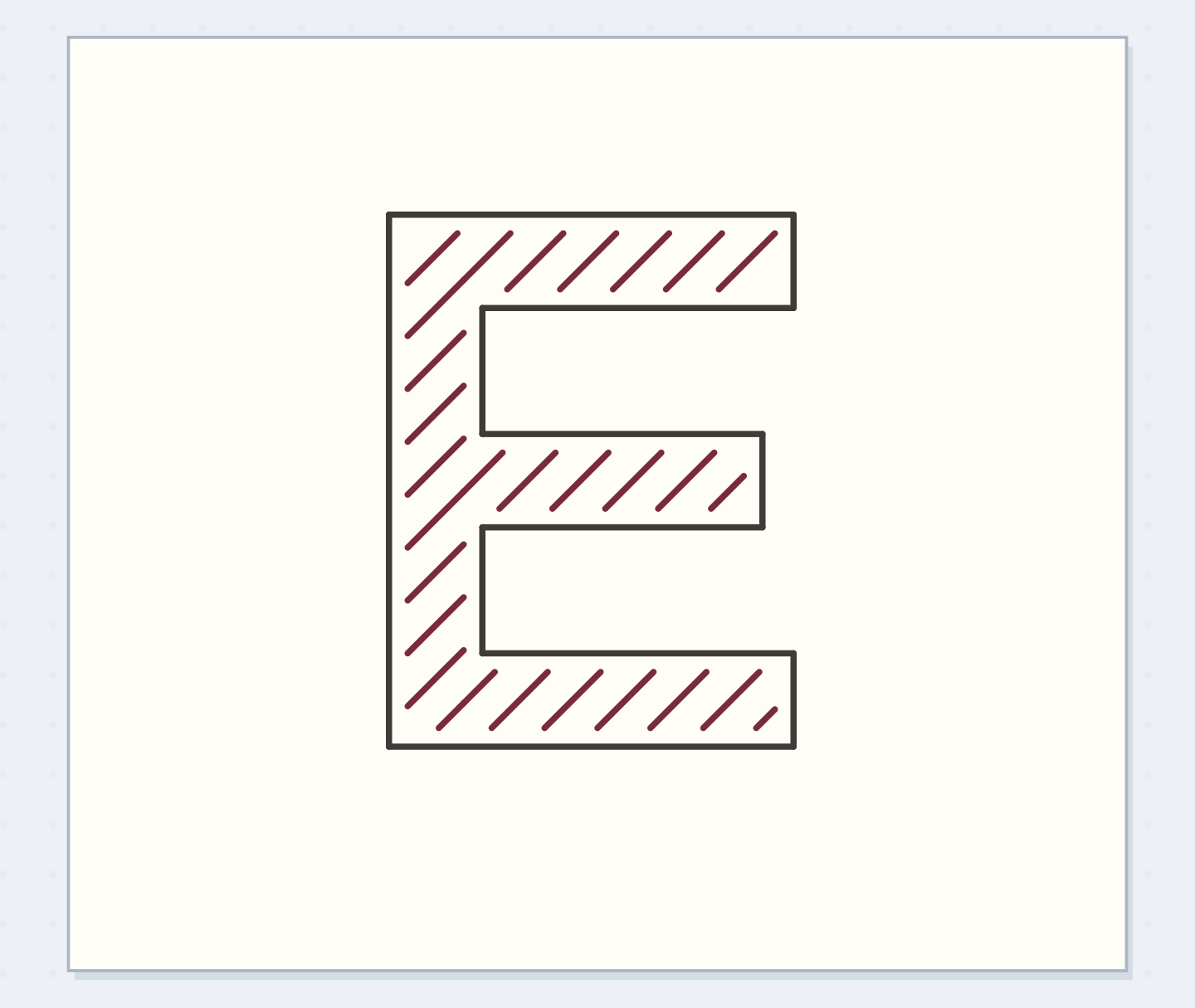
Sparse diagonal marks leave a quiet edge strip
Sparse diagonals stay within the E and leave a quiet paper strip beside its outline.
Reserve a quiet strip inside the outline
Pencil a light guide roughly 1 mm inside the letter's perimeter. This marks where the fill should stop, leaving a small paper gap between pattern and outline. It is a practice choice suited to this letter size, not a required border width. In narrow parts of the E, the usable patterned area will become smaller than the full band. Notice that before choosing a motif. If almost no interior remains, enlarge the letter or simplify the fill instead of squeezing detailed marks into a space that cannot show them clearly.
“Look away and read the label on returning.”
Keep the pattern direction consistent
Draw short diagonal lines at a single angle, spaced about 3 mm apart, inside the usable area. Stop each line before the reserved edge strip. At a corner or junction, imagine the stripes continuing through the shape even though the actual marks end at its boundary. That alignment makes the fill feel like one pattern clipped by a letter. Don't outline every stripe. The letter already has an outer structure, and adding heavy edges to each interior mark can make the fill compete with the perimeter that holds it together.
Protect the letter structure
Move the reveal control to inspect this specific change.
Dense interior
Closely packed marks attract attention before the E.
Make dots and a dense version
On a second penciled E, place small dots in loose rows with similar gaps, again keeping the inner edge strip clear. On a third, draw stripes much closer together so you can see what density changes. Compare all three at normal reading distance. Community lettering critiques include examples where repeated stripes obscure letter structure; this comparison turns that concern into a small controlled test. The densest E isn't automatically wrong, but if its interior becomes one dark mass, it no longer shows the distinct pattern you set out to practice.
Use one fill in a short HE label
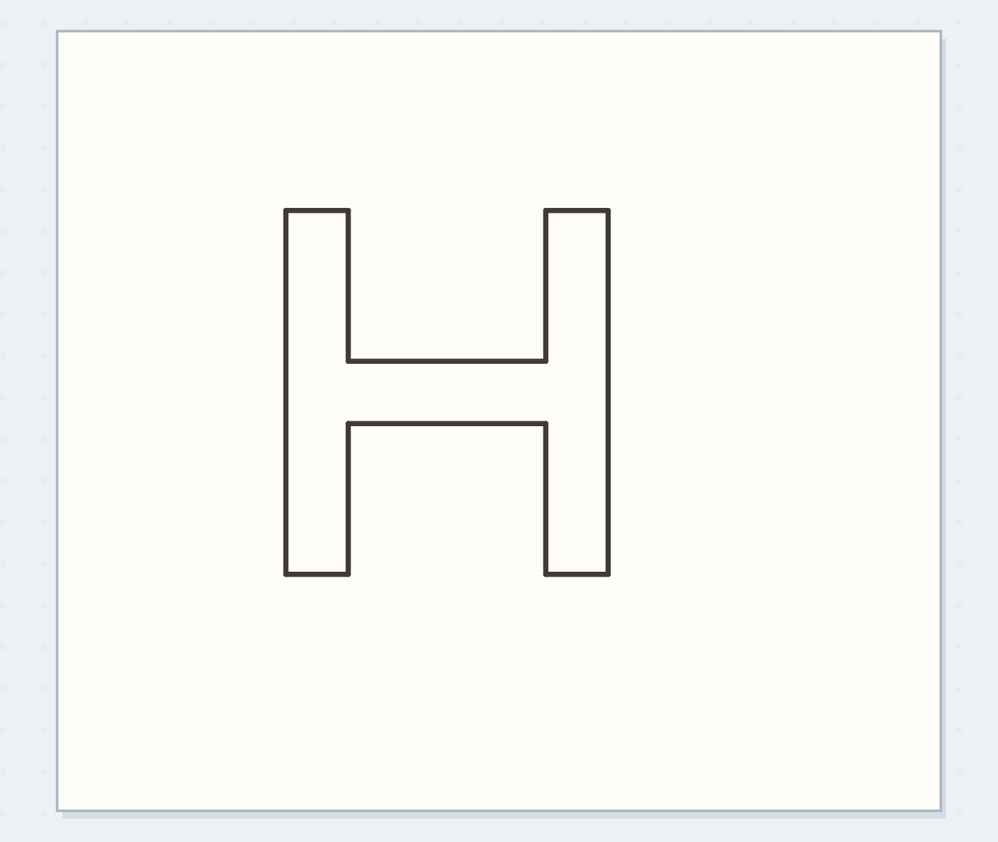
Pencil HE with the same band width and cap height, leaving a clear inter-letter gap. Choose the sparse stripes for this worked example and continue their angle across both letters. Plan the H's crossbar and inside openings before inking the outlines. Add the fill after the outlines have dried, keeping the edge strip visible. Put the pair beside a small caption or practice note so you can judge the patterned letters next to ordinary writing. If the fill dominates everything around it, reduce its density in the next version.
Write your fill specification
Reduce the number of marks when lettering gets smaller.
Letter or short label:HE
Fill specification:Sparse diagonal stripes; 1 mm quiet edge strip
Your words have a place now.
Reduce the number of marks when lettering gets smaller.
- Words on this card
- 15
Remove complexity before adding contrast
If the stripes merge visually, try fewer marks in a fresh sample before reaching for a darker outline. If dots crowd a corner, omit one rather than forcing a complete grid into every arm. A pattern can suggest continuation without occupying every available spot. For a pen mark that crosses the letter edge, leave the practice sample and redraw; repeated corrections may thicken that local perimeter conspicuously. If you reduce the final label to half the height, use fewer interior marks. Your physical pen line stays the same width unless you deliberately change tools.
Before adding the letter fill
Order the preparation before the operation that needs its result.
One workable order
- Construct readable letter outlinesThe inner quiet strip follows the established letter perimeter.
- Reserve the inner edge stripThe remaining interior area determines which pattern spacing can fit.
- Plan the fill direction and spacingInk the pattern after its spacing has been checked inside that area.
- Ink the fitted interior marksLook away and read the label on returning.
Which check needs to come first?
The example shows one workable order. Reduce the number of marks when lettering gets smaller.
Check the word before admiring the fill
Look away and read the label on returning. Stop when you recognize its letters immediately and can still distinguish the chosen pattern on a closer look. Keep the plain reference letter beside the selected fill as a reminder of the shape underneath. Note the approximate band width and pattern spacing if you want to repeat it. For a later heading, change only the fill or only the letter proportions at first. That makes your next experiment a clear comparison instead of a new combination whose readability is difficult to diagnose.
Where this idea began
Want to follow the idea further? These community discussions and maker references are a good place to start.
- Just experimenting with different letters
The search excerpt discusses stripes that compete with letter structure and the need for readable outlines.
- Hand Lettering: How to Stylize Your Letters
Demonstrates style treatments applied to established letterforms; the E fill-density test is original.