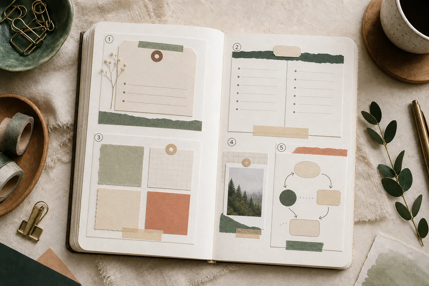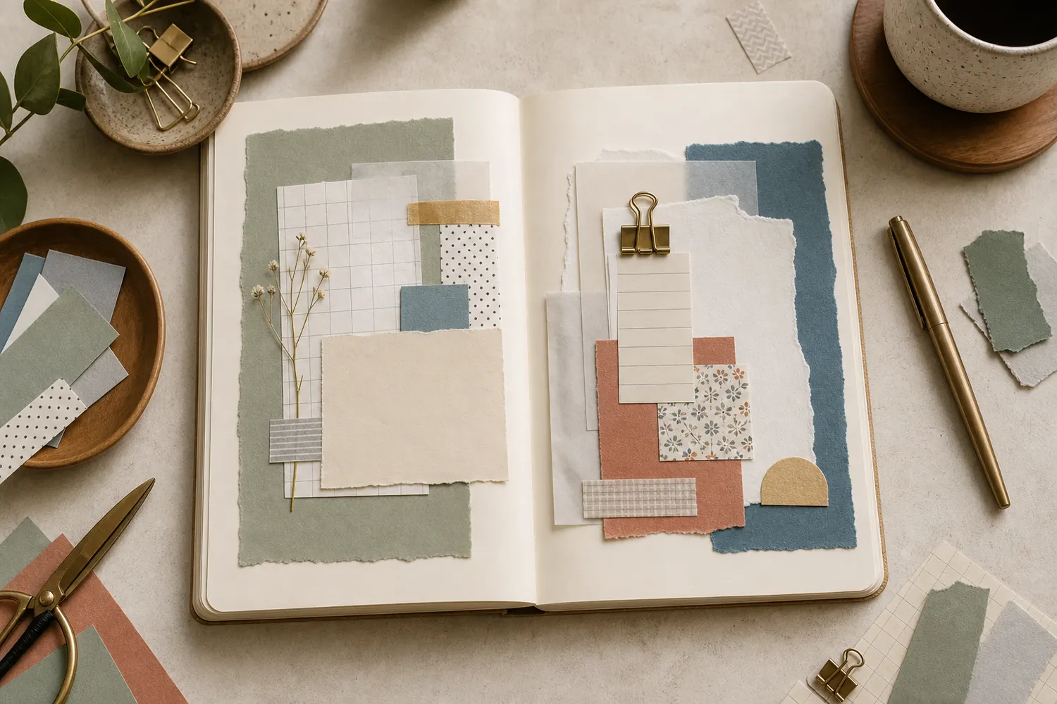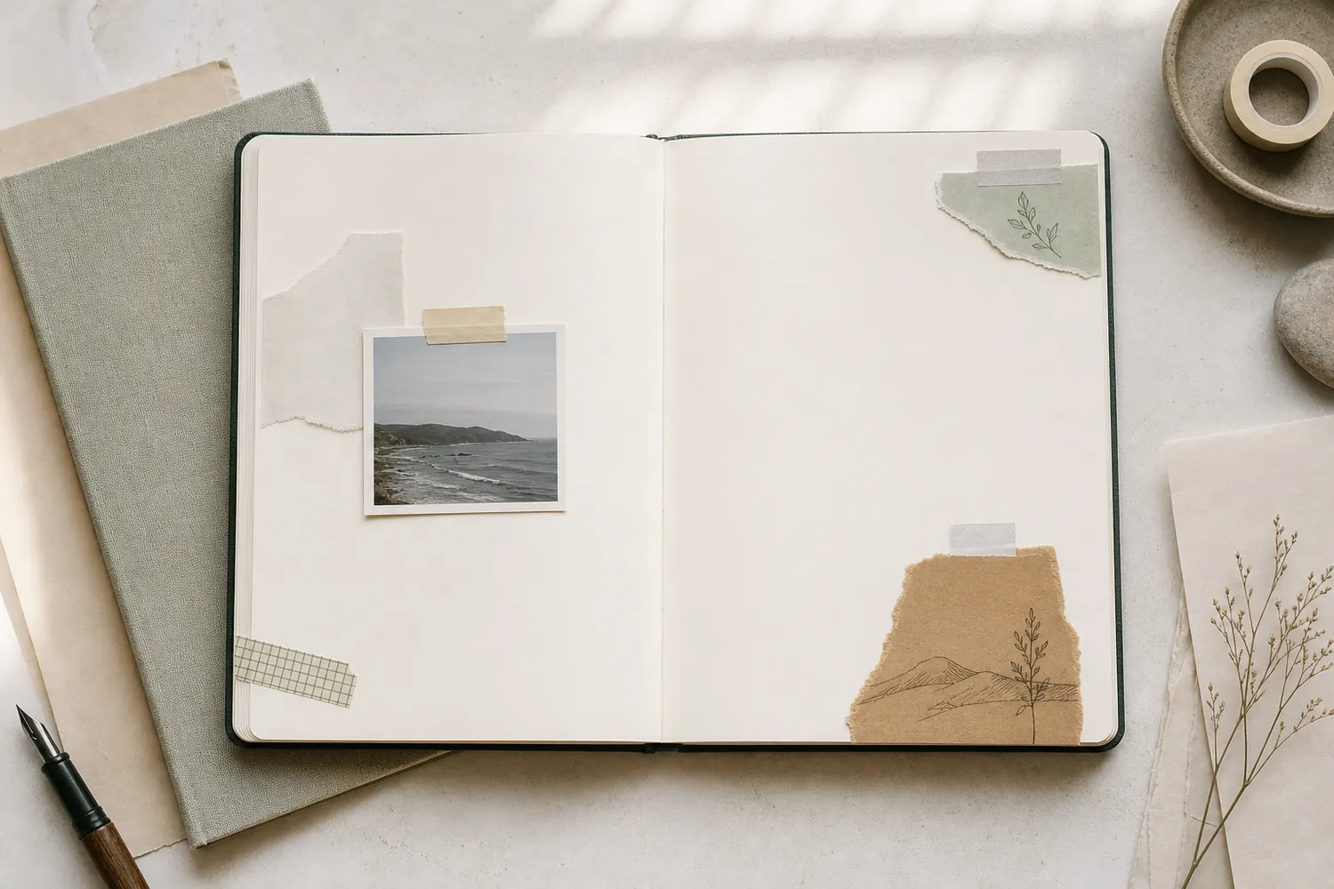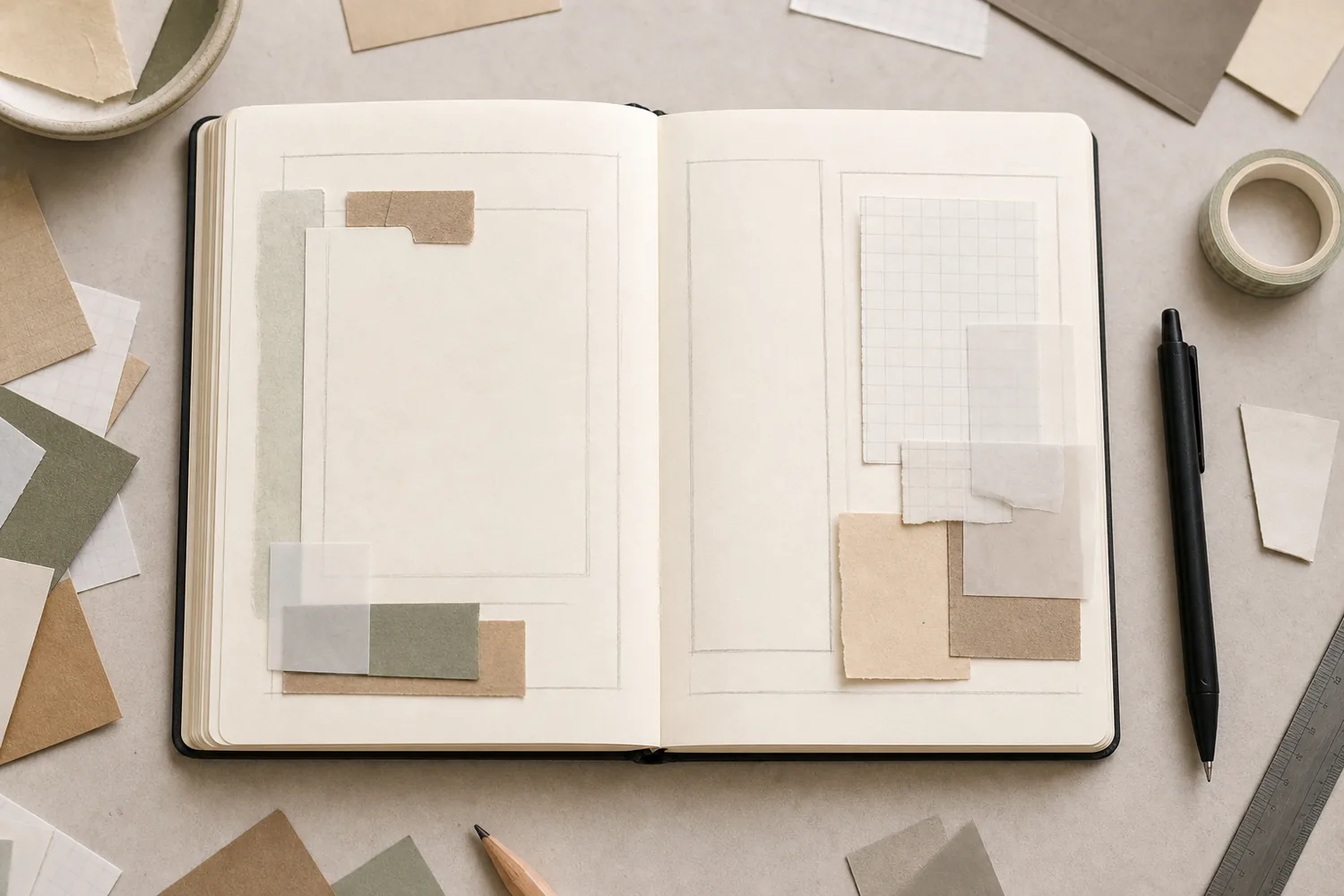
Gather a few things See what you’ll need
- Journal and a few loose paper pieces
- One photo or main scrap
- Plain paper for a writing space
- Pencil and adhesive
- Optional: phone for a placement photo
Choose an exercise 4 things to try as you read
Decide what this page is really about
Name the page in an ordinary sentence: “The walk after dinner,” or “What came home from the market.” Use that sentence to decide which scraps belong. A beautiful label can wait if it tells a different story.
Place the piece you want to notice first loosely on the spread. Space around a photograph or a plain mat may make it stand out without enlarging it or adding more decoration.
Write your versionGive the loose scraps a reason to stay
Give the loose scraps a reason to stay
Name the page subject, then explain one scrap’s connection to it.
The walk after dinner.
The map corner shows the turn where we found the garden.
Your words have a place now.
The filled card is a sample. Replace any part with your own words; leave a field empty if it does not help.
- Words on this card
- 15
ONE WORKED EXAMPLE
The card that passed the handwriting test
You are arranging a market photograph, a receipt copy, and a few patterned scraps. Your entry includes one long sentence about carrying flowers home on the bus.
Before
The remaining writing space is a narrow strip that fits several short lines but forces the flower sentence into much smaller handwriting.
After
A blank writing card is widened until the longest sample line fits at your usual size. The receipt moves beside the market photo, and one patterned scrap is left out. You photograph the loose arrangement before attaching background layers first.
What changed—and what to check
The actual handwriting sets a useful constraint before glue fixes the composition. Removing one optional piece preserves the story without shrinking its letters.
Try this check. Lay the longest sample sentence on the reserved card and check the full hand movement before lifting any pieces to glue.
Something for a future page?
The Washi Tape ShopAffiliate links: we may earn a commission if you buy through these links.
Check the writing space with actual handwriting
Put a blank card or scrap beside the main piece. Write the longest line you expect to use on a spare bit of paper and see whether it fits. If your normal handwriting needs a wider space, give it one now. A page that's only readable in tiny letters isn't finished just because the collage fits.
For a simple spread, try the main image on the left page and the writing card on the right. Or put both on one page and leave the facing page for later. Keep important words and faces clear of the center fold, where the binding can hide them when the book isn't pressed flat.
See the differenceLet the sample sentence set the card width
Let the sample sentence set the card width
Switch the writing card from a narrow leftover strip to its own page area.
Read the words in this example
Leftover strip
- photo
- scrap
Leftover strip
The narrow strip invites awkward line breaks or smaller handwriting. Its paper area does not guarantee that the longest real line will fit comfortably.
GO A LITTLE FURTHERSee what happens when you leave one area alone
See what happens when you leave one area alone
Choose a bit of the page to keep quiet: an open corner, a pale margin, or a gap between the image and the writing. It doesn't have to be white. It just needs less going on than the parts you want to read.
Look away from the spread and back again. Where do you look first, and where do you go next? If your eye lands on an unrelated bright sticker, move or remove it. If the two pages feel disconnected, repeat one small color or align an edge across the spread. You don't have to fill the center fold to make the pages belong together.
Save the loose version before lifting everything
Take a quick reference photo before lifting the loose pieces. If you would rather avoid a phone, mark hidden corners lightly in pencil or lift the layers in a small, ordered stack. The reminder only needs to preserve positions and overlaps.
Attach background pieces first, then work toward the front. Before pressing anything beside a pocket or flap, use it once with the actual insert. Its movement may need more room than the still arrangement suggests.
Put the steps in orderKeep the loose arrangement while you attach it
Keep the loose arrangement while you attach it
Reorder these steps so lifting the layers does not erase your placement plan.
One workable order
- Check the writing card and any moving openingsKeep the actual entry and usable openings in the plan before recording it.
- Take a placement photo or mark hidden cornersA record made before lifting the pieces preserves their arrangement.
- Lift the pieces into an ordered stackLift after recording so the useful relationships are not lost.
- Attach from the background toward the frontAttaching the background first avoids needing to slide it beneath fixed foreground pieces.
Which check needs to come first?
The example shows one workable order. The placement record is a reminder; small adjustments are allowed when the real page needs them.
Let the words tell you whether it’s enough
Write the entry in the reserved space and read it once. Can you find the beginning, and is the photograph near the sentence that explains it? Cover one loud accent if the page feels busy before deciding to add anything.
Keep your reference photo until the writing and moving parts are finished. If an overlap has shifted, it gives you a way to identify the piece that stole space rather than redesigning the whole spread.
Where this idea began
This guide adapts expert practices from visual journaling, sketchnoting, scrapbook layout design, art journaling prompts, and double-page scrapbook composition into a beginner-friendly pre-glue routine.
Want to explore the techniques a little further? Here are the maker tutorials and references behind this guide.
- Maker exampleJanna Werner at Shimelle: Layering with a Photo
Janna Werner’s photo-layering process supplies a named arrangement-before-gluing example.
- Creative contextDaisy Yellow Art: Art Journaling 101
Tammy Garcia’s introductory art-journaling guidance informs small, manageable creative starts.
- Creative contextDaisy Yellow Art: Art Journaling: Art Without Rules
Tammy Garcia’s flexible approach to art journaling informs permission to adapt a page.
- Method referenceRohdesign: What are Sketchnotes?
Mike Rohde’s sketchnote explanation supplies the broad combination of words and simple drawings.
- Method referenceUX Mastery: Sketchnoting 101
A sketchnoting introduction supplies broad visual-note structure, not the guide’s exact symbols.
- Design principleGet It Scrapped: Scrapbooking Ideas & Layout Design
A broad scrapbook-layout reference; each guide’s exact arrangement is an editorial adaptation.
- Design principleGet It Scrapped: Grounding Visual Design for Scrapbook Pages
Grounding visual elements informs the use of a strip or shared edge under a cluster.
- Design principleMosaic Moments: 8 Principles of Scrapbook Page Design
Eight scrapbook design principles inform the guide’s pre-glue arrangement routine.
- Creative contextMindful Art Studio: How to Start an Art Journal
An introductory art-journaling reference for starting with available materials; no wellbeing outcome is established.
- Design principleShimelle: Scrapbooking Double Page Layouts
Double-page scrapbook examples inform continuity and relationships across a spread.
- Design principleUniversity of Wisconsin: Graphic Design, Layout and Composition
General layout and composition guidance is adapted to a notebook page.
- Design principleMcGill University: Visual Hierarchy
Digital visual-hierarchy guidance supplies an analogy for making a notebook’s main content easy to find.