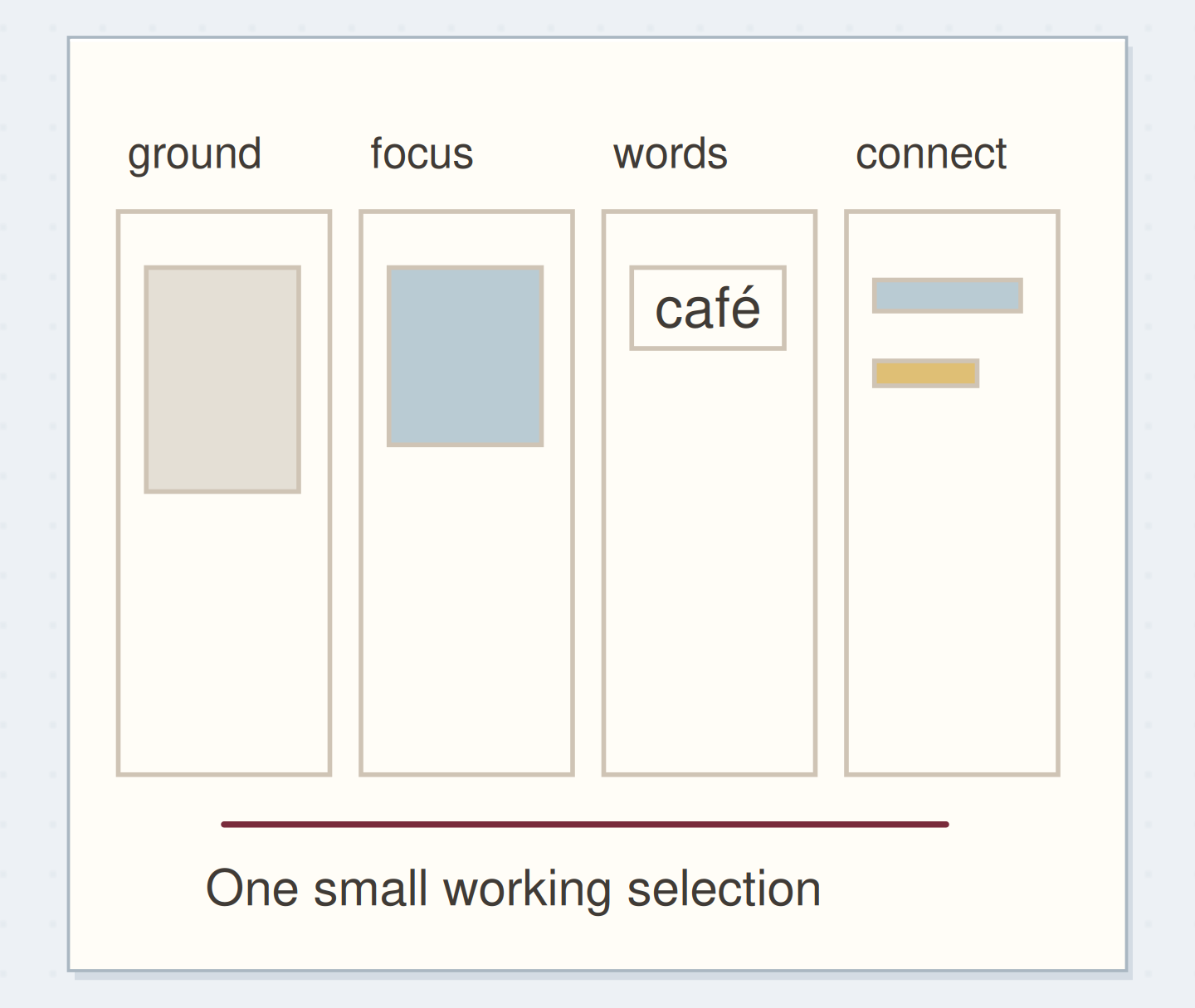
Gather a few things See what you’ll need
- Five to eight paper scraps in one color family
- A plain 10 × 15 cm base
- Scissors
- Glue stick
- A pencil
- Optional phone camera
Choose a color family with enough range
Gather five to eight scraps that feel related: pale blue, middle blue, and one dark blue are enough. Printed or textured papers can join the set if their main impression still belongs to that family. Put aside an especially bright contrasting scrap for this exercise; it changes the question you are trying to answer.
Choose a 10 × 15 cm plain base. The base may remain visible as the lightest part of the composition, so include it in your choices rather than treating it as neutral by default. Avoid spending the session searching for a perfect shade; a small selection makes differences easier to compare.
Sort by lightness instead of the printed subject
Lay the scraps in three loose groups: light, middle, and dark. Compare neighboring pieces directly. A blue scrap with large cream lettering may read lighter overall than a solid blue paper of similar ink color. Look at the area you will actually cut, not only the source sheet's most obvious image.
If the groups are hard to judge, squint slightly or take an optional grayscale photograph of the arrangement. The photograph can make some differences easier to see, but it isn't a grading tool. Keep your normal view as the final check because the journal will usually be read in color.
Build a One-Color Collage With Light, Middle, and Dark
Compare three related paper values and then reduce a dark area that overwhelms the panel.
Select light, middle, and dark papers from one color family.
Select one color family with three clearly different values. Use the article measurements for the physical version; the drawing is a schematic.
“The panel is finished when you can point to its light ground, middle shape, and dark accent.”
Give each value a different amount of space
Start with the light paper covering the largest area, the middle value forming a smaller block, and the dark value making one small accent. These are starting roles for this example, not a fixed ratio for every composition. Cut broad shapes before trimming tiny details.
Place the pieces loose and leave some of the base visible. If every piece is the same size, the eye may give them equal attention even when their values differ. Change the area of a shape before adding another color. You are testing how lightness and proportion work together within one family.
Order the steps: sort three values first
Check the physical dependencies in this monochrome example. Reorder the actions before trying the paper version.
One workable order
- Sort three valuesSorting identifies a real light, middle, and dark range.
- Arrange shapes looseLoose shapes can be changed without tearing the paper.
- Adjust the dark areaAdjusting the dark area tests its visual weight before attachment.
- Glue and add wordsGlue preserves the chosen relationship and leaves the caption area clear.
Which check needs to come first?
The example shows one workable order. Glue preserves the chosen relationship and leaves the caption area clear.
Make a small study of window light
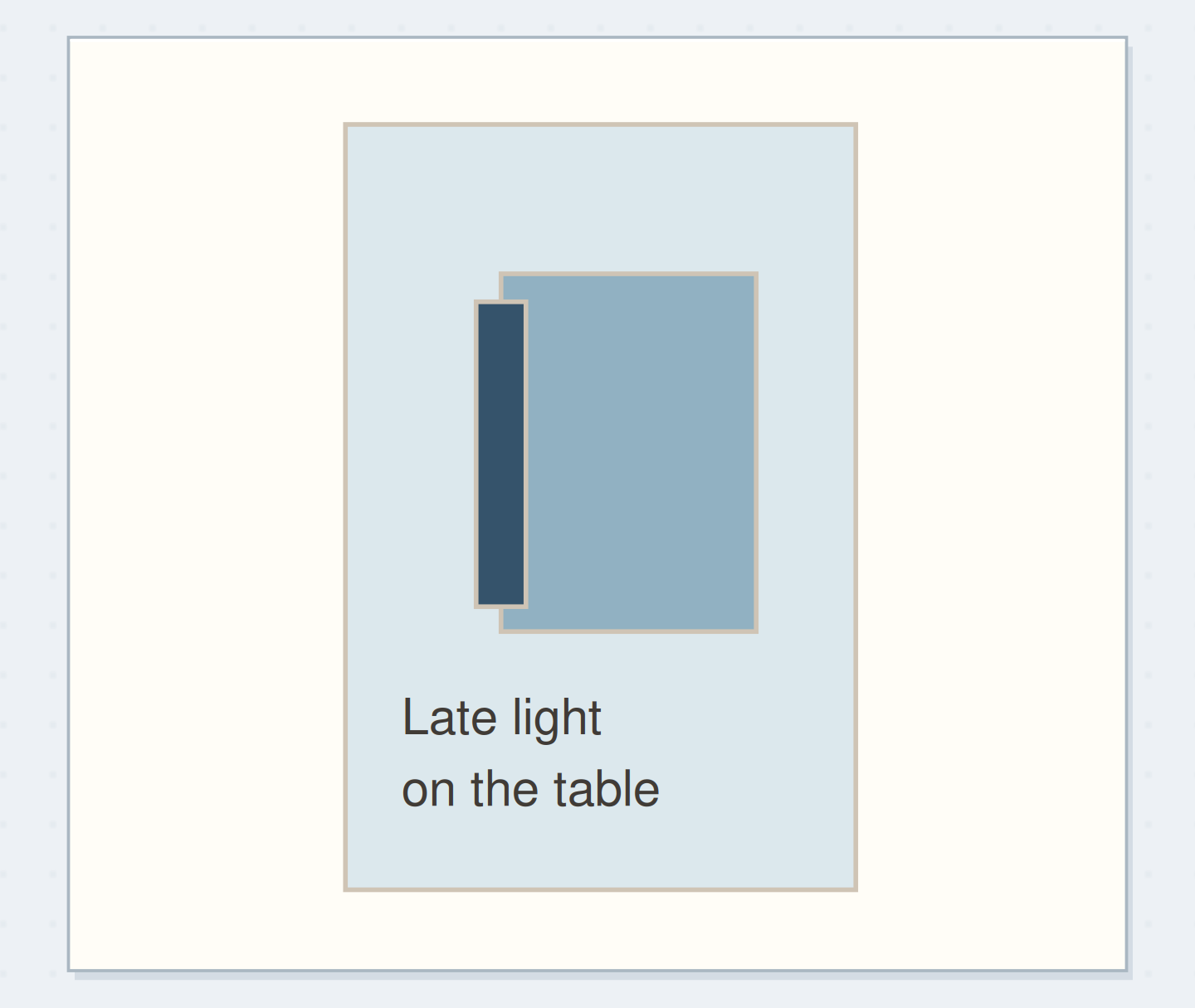
For the 10 × 15 cm panel, use a pale blue ground with a middle-blue rectangle about 5 × 7 cm placed slightly right of center. Add a dark blue strip about 1 × 6 cm along one side of that rectangle. Leave a clear pale area below for the words “Late light on the table.”
Slide the dark strip a little closer to and farther from the rectangle. Choose the position that suggests a shadow without turning into a heavy border around everything. Glue the broad ground, then the middle shape, then the small dark accent. Let the adhesive dry before writing the caption on the pale area.
Plan color family
Name the color family and write the observation that belongs beneath your value study.
Color family:Blue: pale, middle, and dark.
Observation below the study:Late light on the table.
Your words have a place now.
Name the color family and write the observation that belongs beneath your value study.
- Words on this card
- 16
Change the value relationship before adding detail
If the shapes merge together, place the two papers side by side on a plain surface. If their lightness is almost identical, replace one with a clearly lighter or darker piece. A tiny outline may separate edges, but it won't make a large indistinct arrangement suddenly have a strong light-dark structure.
If the dark paper dominates, reduce its size or move it away from the caption. If the page feels empty, try enlarging the middle-value shape while keeping the dark accent small. These changes preserve the restricted palette and answer a specific problem; adding many little scraps can hide the problem without resolving it.
Compare the dark accent sizes
At reading distance, point to the light ground, middle shape, and dark accent; check that the caption stays readable.
Assign areas
The broad dark strip claims more of the small panel.
Let texture join after the values are readable
Replace one plain piece with a printed scrap of similar overall value and compare the result. Small text can add texture without becoming the subject, but a large readable headline will draw attention for its meaning as well as its tone. Decide whether that new reading belongs in the entry.
You can repeat the study in brown, green, or gray using the same broad arrangement. Each paper family will behave differently, and that is useful information. Keep the first panel nearby while making the second so you can compare one relationship at a time rather than trying to remember the exact balance.
Finish with one clear relationship you can name
The panel is finished when you can point to its light ground, middle shape, and dark accent. Read the caption at normal distance and check that the small dark area supports the composition without swallowing the words. The labels describe the papers' jobs, not a ranking of good and bad colors.
Use the study beside a real observation or keep it as one sample page with a short note about what changed. Stop before filling every pale area. The useful result is a small composition whose contrast you understand and can vary deliberately the next time a one-color pile starts looking muddy.
Where this idea began
Want to follow the idea further? These community discussions and maker references are a good place to start.
- Ten mostly monochrome paper collages
The maker presents a series made by returning to old books and images within restrained palettes.
- Monochromatic abstract collage process
The maker explains painting papers and reconstructing them into a monochromatic collage.