Gather a few things See what you’ll need
- A journal page
- Plain paper scraps
- A pen
- Your photo or keepsake
- Scissors
- Glue
Choose an exercise 4 things to try as you read
Start with what you’d like to remember later
Write a rough version of the memory on scrap paper. Include the sentence you care about, then add whatever a future reader would need to understand it: the place, the people, or why it made you laugh. If the reader is only you, that context still helps.
Give the longest thought its paper first. A date can wait for a small label; a story needs several lines at your ordinary handwriting size, with margins. If the rough version includes a name or date you are unsure about, keep that uncertainty visible while deciding the card’s size. A polished layout need not make the facts more certain.
Write your versionKeep the sentence and the clue that explains it
Keep the sentence and the clue that explains it
Edit the remembered sentence, then supply the context a later reader would need.
We can take the long way.
After Saturday lunch, by the bus stop.
For once neither of us was watching the time.
Your words have a place now.
The filled card is a sample. Replace any part with your own words; leave a field empty if it does not help.
- Words on this card
- 22
ONE WORKED EXAMPLE
The lunch photo needs the longer sentence
You have a lunch photo, a short place label and a memory of a conversation. The story is longer than the decorative card you first picked.
Before
The date has a large banner while the conversation is squeezed into tiny writing beneath the photograph. The visual space does not match what matters.
After
A larger plain story card sits beside the photo with one edge aligned. The date and café name share a small heading. The sentence about the conversation keeps its normal handwriting size, while an extra decorative label is left off.
What changed—and what to check
Choosing the story area first gives the longer thought its real space. Nearby labels support the connection instead of competing with it.
Try this check. Read the page without the rough draft and check that the conversation still has enough context to make sense.
Something for a future page?
The Washi Tape ShopAffiliate links: we may earn a commission if you buy through these links.
Put the longer thought beside the thing it belongs to
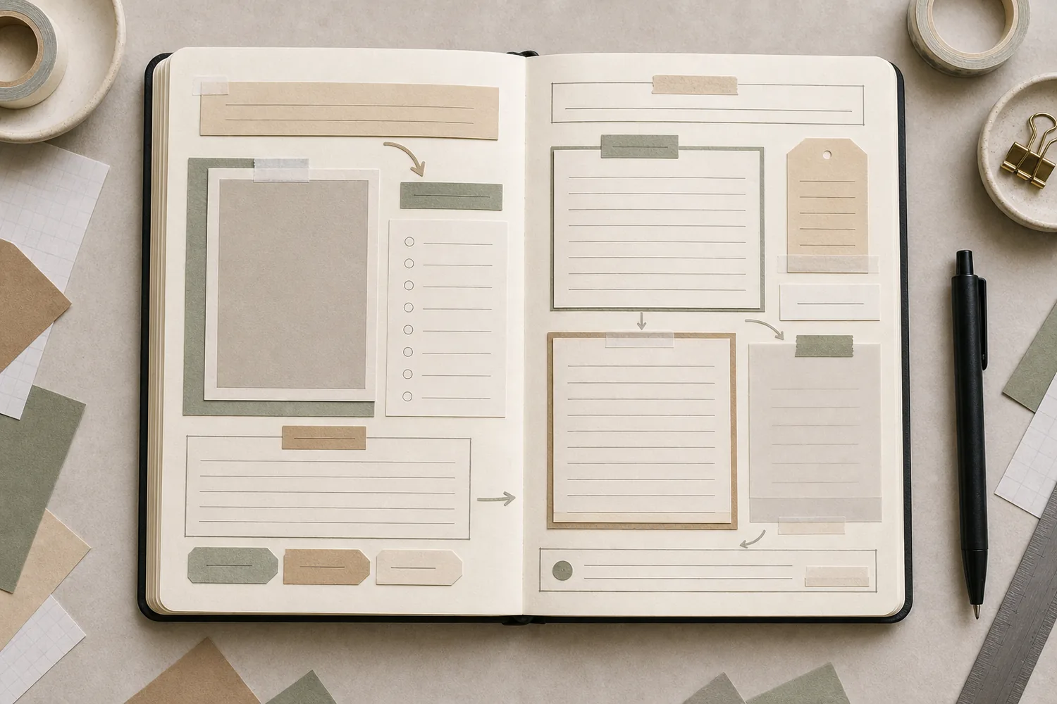
Lay the blank story card near the photograph or keepsake. Try aligning one edge with the photo, or leave a consistent small gap between them. Close placement helps you understand that these two pieces describe the same moment.
If you have several images, give each a brief caption nearby and save the longer story for one shared area. Otherwise, a reader may have to guess which sentence belongs to which picture. You can keep this very simple: three photos, three short captions, and a small paragraph underneath.
See the differenceGive each photograph its own nearby caption
Give each photograph its own nearby caption
Switch the captions from a shared distant block to their images.
Read the words in this example
Distant captions
- photo A
- photo B
- captions
Distant captions
A shared paragraph can work for an overall story, but these individual captions are far from both pictures. Their placement leaves the association to be inferred.
Let the heading introduce the page
Choose a date, a place name, or a short phrase as the heading. It can be slightly larger, darker, or more isolated than the supporting words. You don’t have to combine all three treatments, and you don’t need fancy lettering.
Try the heading above the photo or beside the writing card. If it takes over, shorten it or make it a little quieter. For a page about a small moment, “Saturday lunch” may tell you more than a large decorative quotation that could belong to any day.
Try a what-ifThe ticket date is not the visit date
The ticket date is not the visit date
Check what the borrowed label actually identifies.
A museum ticket says “Exhibition: May–August.” You visited in June but cannot remember which day, and want to label the photo honestly.
Compare the three choices
Which label fits the information available?
- Print the full exhibition range as the only date beside the photo
The range can identify the show, but alone it leaves the reader unsure when your particular visit happened.
- Write “Visited in June; day uncertain” and keep the exhibition range separate if useful
This distinguishes your visit from the event’s run. A later checked date can be added without pretending you know it now.
- Use the exhibition’s first day as the photo date
That date identifies the opening, not this visit. It would add a precision the memory does not support.
A printed date may describe the object or event rather than your own moment.
What would you try?
Choose an option to see what it would do. You can explore all three.
GO A LITTLE FURTHERGive small labels useful things to say
Give small labels useful things to say
A label can identify a street, a recipe, or a date that the story actually uses. Keep these small pieces similar enough to read as supporting information. Check a printed keepsake before borrowing its date: a ticket’s exhibition range may be different from the day you visited. Add your known date or label an approximate one.
Place a label beside the object it explains. Add an arrow only if the connection would otherwise be unclear. A bracket around two related notes can help, too. If every gap has an arrow or a box, try removing a few and see whether the meaning is already obvious from the placement.
Let the story get longer without shrinking the letters
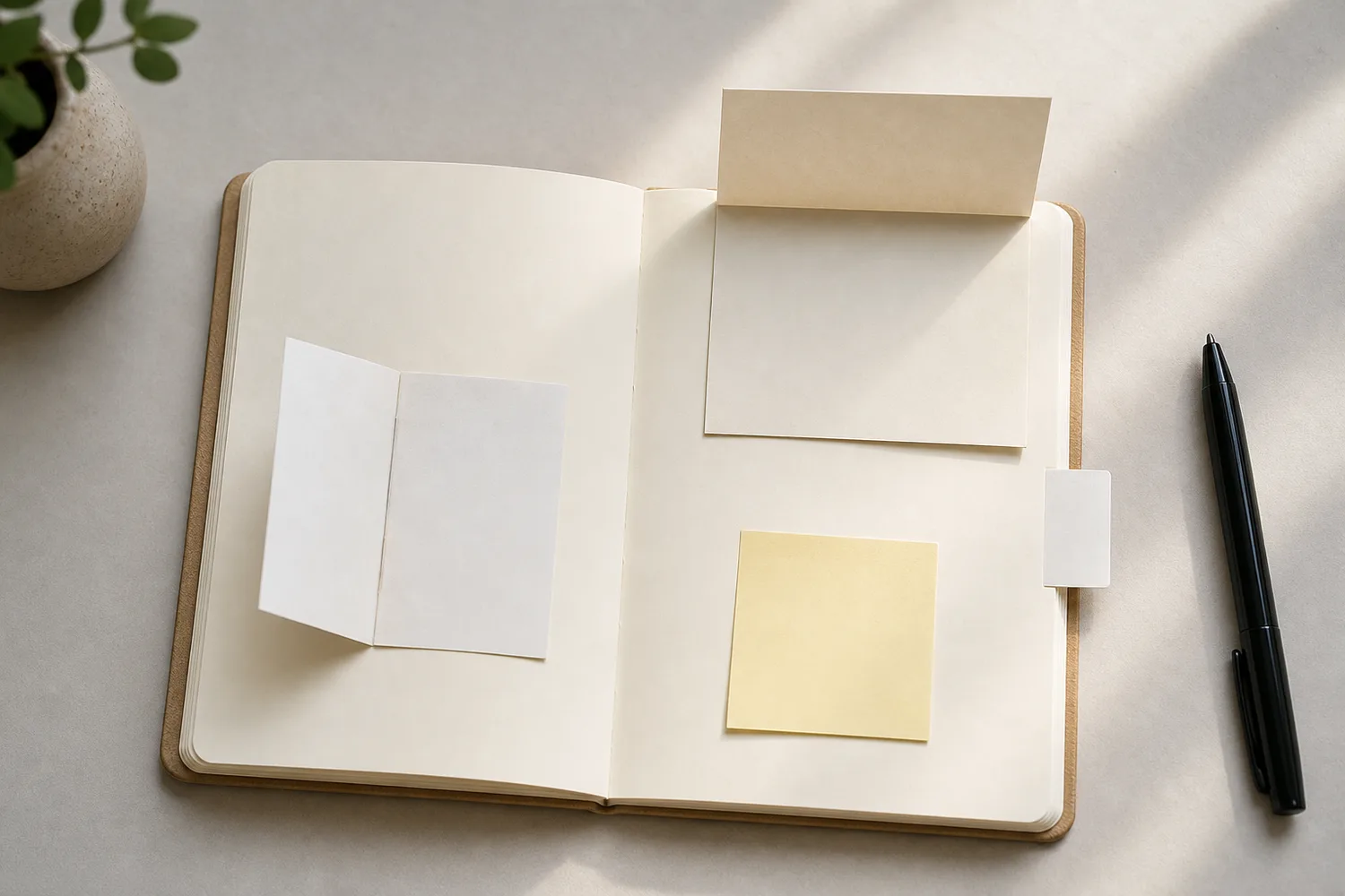
Sometimes writing brings back another detail. If it needs room, move the extra paragraph to the reverse of a card, a tip-in, or a folded note. Leave a visible cue so you know there’s more to read. Choose a structure you can open comfortably in this journal.
If the page is already glued and the words are crowded, write the important part again on a fresh plain card. Keep a short caption visible and put the longer version inside a pocket or under a flap. You can also use the next page. A memory doesn’t become less complete because it takes two places to tell it.
Try the exampleGive the extra paragraph somewhere to open
Give the extra paragraph somewhere to open
Change the hinge edge and opening angle to reveal the longer note beneath.
Read the words in this example
- Fold projection
- Your words
- Wine = fixed hinge
- Side profile
- 65° from closed
Left hinge stays fixed; the flap lifts 65° from closed.
Lifting the flap can reveal the longer story beneath its closed footprint. Gold is the moving flap and wine is its attached edge. The side profile shows the lift angle; the upper view is an oblique geometric projection. These are rigid-paper schematics, not predictions of bending, clearance, or collisions. Try the motion: short caption. This projection models a one-edge paper flap, not the fit of your real notebook. Keep a visible opening cue and test finger room near the binding.
- Lift angle
- 65°
- Fixed hinge
- Left edge
- Model
- Oblique projection + side profile
Read the words before adding the final decoration
Fill in your reserved areas, then read the page as though you’ve just opened it months later. Can you find the date? Do the captions clearly belong to their pictures? Does the longer note have enough context to make sense?
If one label repeats what you can already see, leave it out. If you keep jumping between competing headings, choose the one that best introduces the memory and make the others smaller. Your ordinary handwriting can do all of this; consistent spacing often helps more than another lettering style.
Put the rough draft beside the page and check that the sentence you meant to keep survived the layout. Add a missing name or route to the longer note before adding decoration. When the words and their connections are clear, the page is ready to leave—even if some labels never found a job.
Where this idea began
These references informed the tutorial logic, especially how handwriting, grouping, proximity, and hierarchy can make words part of the page structure.
Want to explore the techniques a little further? Here are the maker tutorials and references behind this guide.
- Creative contextAli Edwards: What Stories Will You Tell?
Ali Edwards’s story prompts inform choosing words that carry the memory.
- Method referenceRohdesign: What Are Sketchnotes?
Mike Rohde’s sketchnote explanation supplies the broad combination of words and simple drawings.
- Method referenceUX Mastery: Sketchnoting 101
A sketchnoting introduction supplies broad visual-note structure, not the guide’s exact symbols.
- Design principleNielsen Norman Group: Visual Hierarchy in UX
Visual hierarchy supplies a background principle for clear focal content and supporting details.
- Design principleNielsen Norman Group: Proximity Principle in Visual Design
Proximity supplies the principle of grouping related content with smaller gaps.
- Design principleGet It Scrapped: Scrapbook Layout Design
A broad scrapbook-layout reference; each guide’s exact arrangement is an editorial adaptation.
- Design principleU.S. Web Design System: Typography
Digital typography guidance supplies a hierarchy analogy; notebook dimensions are editorial adaptations.
- Design principleWesleyan University: Print Typography
Print typography guidance informs readable type hierarchy and spacing.