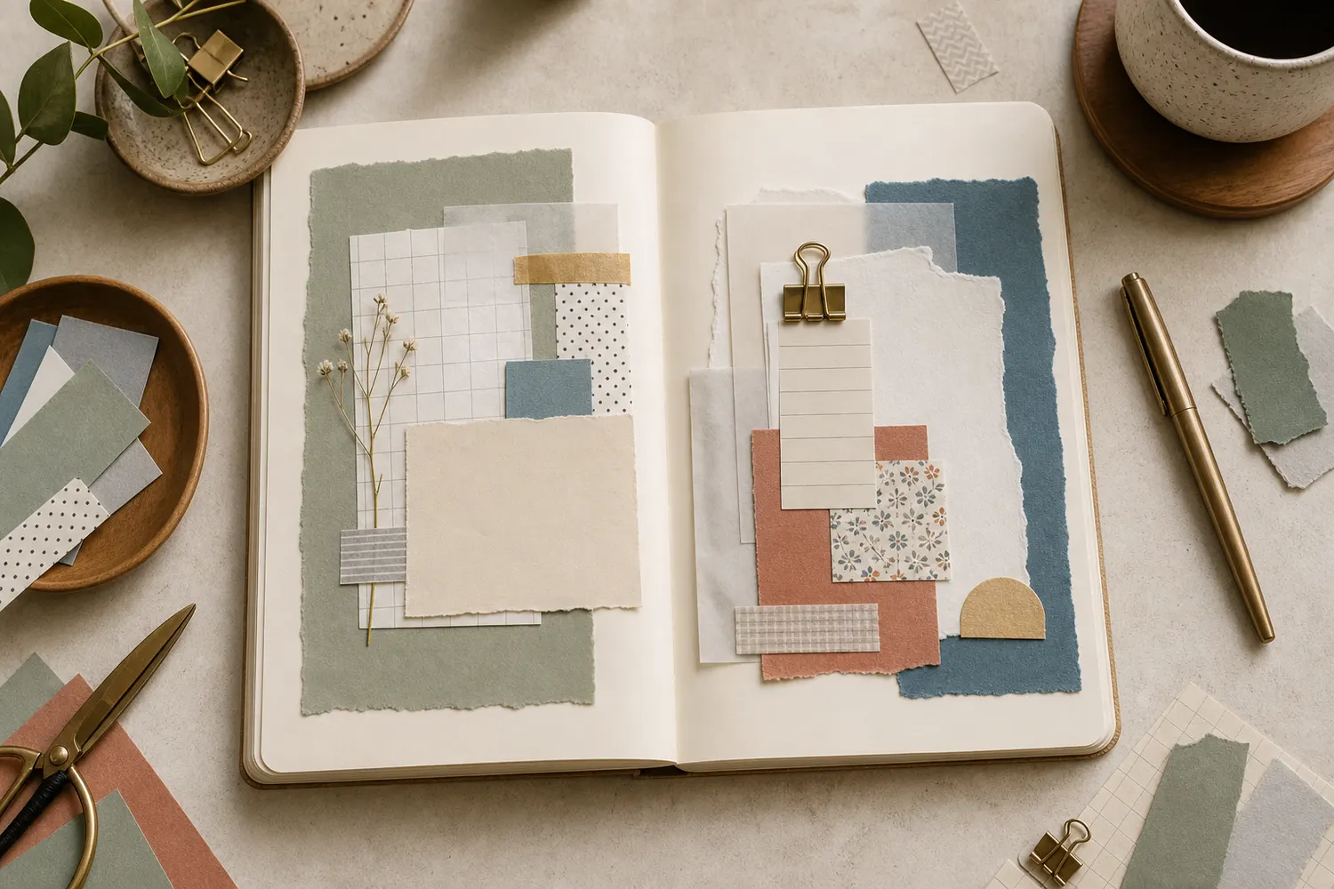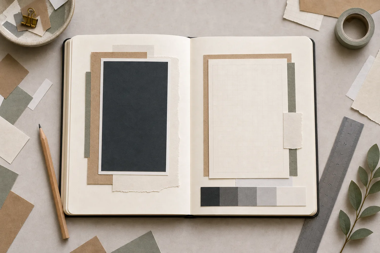
Gather a few things See what you’ll need
- A few paper scraps in different lightnesses
- Your main photo or card
- A plain writing scrap
- The pen you’ll actually use
- Optional: a phone camera
Choose an exercise 4 things to try as you read
Look past the color for a moment
Set your scraps side by side, from the ones that seem darkest to the ones that seem lightest. This lightness is usually called value. Navy, forest green, and deep brown can have similar values even though their colors are different.
You can half-close your eyes to blur the detail, or take a photo and view a black-and-white version. These are helpful comparisons, not precise judgments. Your camera and room lighting can change how things look, so check the actual page under the light where you’ll read it too.
ONE WORKED EXAMPLE
A cream edge gives the photograph room
You want a dark evening photograph to lead a page made from navy and brown scraps. The photo is already interesting, but its outer edge almost disappears into the surrounding paper.
Before
Changing between several dark hues leaves the photo’s boundary difficult to distinguish, even though each paper looks different when viewed alone.
After
A narrow cream scrap sits immediately beneath the photo, with enough edge showing to separate it from the brown support. A real sentence remains on plain paper nearby. The navy scrap moves farther away, where it no longer crowds the photograph.
What changed—and what to check
The important change is the immediate neighbor’s lightness. It reveals the photo’s edge without asking every paper in the spread to become brighter.
Try this check. Find the photograph’s boundary in the actual reading light, then read the nearby sentence at its intended size.
Something for a future page?
The Washi Tape ShopAffiliate links: we may earn a commission if you buy through these links.
Decide what you want to notice first
Choose the piece you want to notice first and try it against its immediate neighbor. If a dark photo merges into brown paper, slip a narrow cream mat behind it. If a pale label disappears on white, try a darker backing instead.
Change one neighbor before rebuilding the palette. You are looking for comfortable separation around this piece, not the greatest possible contrast around every scrap.
See the differenceSeparate the photo from its immediate neighbor
Separate the photo from its immediate neighbor
Switch on a pale mat while keeping the dark photograph and surrounding paper.
Read the words in this example
Dark beside dark
- photo
Dark beside dark
The two dark areas have little lightness separation in this schematic. Different real colors can have the same problem when viewed as light and dark shapes.
“Navy, forest green, and deep brown can have similar values even though their colors are different.”
Try your pen on the writing paper
Write a real sentence at your usual handwriting size. Dark ink often reads well on plain light paper, but fine gray pencil may still look faint. A dark writing card can work with a reliable light pen; test the actual combination rather than assuming the pen will cover evenly.
Notice the pattern as well as the color. Small flowers and printed words can interfere with your letters even when the paper seems pale. If you have to search for your own sentence, use the reverse side or a plain paper patch. Readability is a good reason to leave that lovely print partly covered.
Try the exampleTest the writing separately from the palette
Test the writing separately from the palette
Change the ink, paper lightness, and pattern, then try a plain backing.
Read the words in this example
- Ink against paper
- Keep one small
- memory.
- Words on the paper
- Digital samples; test your actual pen.
Ink and plain paper have a digital contrast ratio of 6.79:1.
Sample text: “Keep one small memory.” Pattern marks change the background locally; the two shown tones give ratios from 3.33:1 to 6.79:1. The ratios use actual sRGB sample colors. They cannot predict paper texture, ink bleed, handwriting, or individual vision. The ratio describes the digital gray samples only. Your pen coverage, paper texture, room lighting, and handwritten size still need a real sample.
- Ink color
- #404040
- Background under words
- #d1d1d1
- Plain patch ratio
- 6.79:1
- Two-tone ratio range
- 3.33–6.79:1
GO A LITTLE FURTHERLet the other scraps have quieter parts
Let the other scraps have quieter parts
Place one or two middle-value papers around the main piece. They might become a mat, a narrow strip, or a small patch under a corner. Keep enough of their edges visible that they look intentional without building a large stack.
If you want to repeat a color, try different amounts of it. A broad muted blue area and one tiny blue label can feel connected without becoming two competing blocks. You can use a small bright accent, but check whether it steals your attention from the photo or sentence you meant to emphasize.
Change the neighbor before changing the whole palette
If dark pieces merge, move them apart or try a pale layer behind the main one. If the page feels faint, test a darker title or a small border beside what matters. A new hue is optional; the useful difference may be lightness.
When a writing card dominates, keep its comfortable writing space but try a softer border or fewer dark neighbors. A pale card can be very conspicuous on a dark background, so “lighter” does not always mean “quieter.”
Compare the optionsChange one neighbor for the problem you see
Change one neighbor for the problem you see
Choose a problem and compare its specific adjustment.
Read the words in this example
- place
- entry
Give the pale label a darker immediate backing.
The label can remain pale while a small darker mat defines its edge against the page. Use enough backing to make that particular label readable, then compare it with the main piece. A strong border on every label would change the page’s hierarchy.
Read the actual page where you expect to use it
Look at the full spread in its usual reading light. Find the intended main piece and read a real sentence at your normal size. A grayscale photo can help compare arrangements, but return to the actual colors and materials before choosing.
Attach the version that lets the words and main piece do their jobs. Keep a rejected backing loose with the unused scraps; it may help a different photo even though this particular pair did not need it.
Try a what-ifThe phone preview looks clear; the page does not
The phone preview looks clear; the page does not
Choose which version needs to decide the final arrangement.
A black-and-white phone photo makes your layout look clear. At the desk where you journal in the evening, the actual fine gray writing is difficult to read.
Compare the three choices
Which check should guide the next change?
- Increase the phone screen’s brightness and compare again.
That changes the display rather than the paper you will read. It cannot settle whether the actual writing is comfortable.
- Test clearer ink or plainer writing paper under the evening light.
The real sentence and reading conditions reveal this problem. Keep the photo as a comparison aid, not the final judge of your materials.
- Keep the layout because its grayscale values are separated.
Separated large shapes do not guarantee that fine handwriting reads clearly. The writing needs its own real-material check.
Use visual previews as aids; let the actual writing and reading conditions decide readability.
What would you try?
Choose an option to see what it would do. You can explore all three.
Where this idea began
These references informed the tutorial logic, especially the difference between color matching, value contrast, focal emphasis, and readable journaling space.
Want to explore the techniques a little further? Here are the maker tutorials and references behind this guide.
- Design principleNicole Warrington: Make Your Page POP!
Nicole Warrington’s art-journal guidance informs the distinction between color choice and value contrast.
- Design principleGet It Scrapped: Scrapbook Layout Design
A broad scrapbook-layout reference; each guide’s exact arrangement is an editorial adaptation.
- Design principleGet It Scrapped: Design Principles for Scrapbook Pages
General scrapbook design principles inform emphasis, balance, and page organization.
- Design principleGet It Scrapped: Visual Triangle
Visual-triangle examples inform the placement of supporting accents.
- Design principleGet It Scrapped: Grounding Visual Design
Grounding visual elements informs the use of a strip or shared edge under a cluster.
- Design principleW3C WAI: Understanding Contrast Minimum
WCAG contrast guidance concerns digital content; this guide does not claim measured paper contrast compliance.
- Design principleW3C WAI: Understanding Use of Color
Web accessibility guidance on color-only signals informs adding a second readable cue on paper.
- Design principleMcGill University: Visual Hierarchy
Digital visual-hierarchy guidance supplies an analogy for making a notebook’s main content easy to find.
- Design principleGetty Museum Education: Understanding Formal Analysis
Formal-analysis vocabulary provides a background reference for composition and emphasis.
- Design principleDartmouth Mathematics Across the Curriculum: Simultaneous Contrast
Simultaneous contrast explains why neighboring colors can change perceived appearance.